Eden Left Loose

In the fall I had a chance to return to Eden for a short visit. I took the occasion to try another stab at that scene overlooking the lake, this time in oils and also this time in a vertical format. I also tried out the gray underpainting step which I found so helpful with the San Juan scene.

To get the view I wanted I had to set my easel and palette up at something like a 120º angle away from what I was painting. And I was on a pretty sharp slope so I had to twist back and forth and be very conscious of my balance the whole time. This was not how I typically would work and it make me perhaps less relaxed than usual. But the underpainting was actually pretty good as a start. It had a little bit of a Matisse feel to me.

IMG_2447.JPG

I tried a quick trick of converting a photo I had to black and white and then using an effects filter to check my own “read” of the tonal map of the scene. This is a useful thing to do in forested settings like this, where the shapes seem to get too cabbagy. So what I did had that early fauvist cartoonishness to the drawing. I liked the lavender and lime green and those grays in the early take. It would have been nice to find a way to finish the scene with that palette. It reminds me of Matisse’s more austere palette in Tunisia.

IMG_2452.JPG

So I worked on this a while and had that familiar moment where everything I did seemed flawed. This time I doused the whole thing in turpentine, first covering it with paper towels. It made the surface produce some really nice blurry transitions and some interesting grayscale effects. This was a tip in loosening up from Ellen L. Thanks! I somehow sensed there was enough right in this not to kill it with too much additional work. Also I only had limited time there, so I did what I could that afternoon and early the next morning and then went on my errand to Yazoo City. And then home.

IMG_2465.JPG

As I shared this with a few friends, the feedback was - great, don’t kill it. Leave it loose. Well, I did what I could to stay true to that. I left a lot more in a rough state than I normally ever do. I found a few places to add in so as to complete something started without moving into a different kind of painting altogether. But it’s such an iffy business. I suppose if I did 3 paintings a day I wouldn’t stress over these details. I’d just let it be the way it is. So in that spirit, I’m putting down the brush.

IMG_0492.jpg

San Juan II

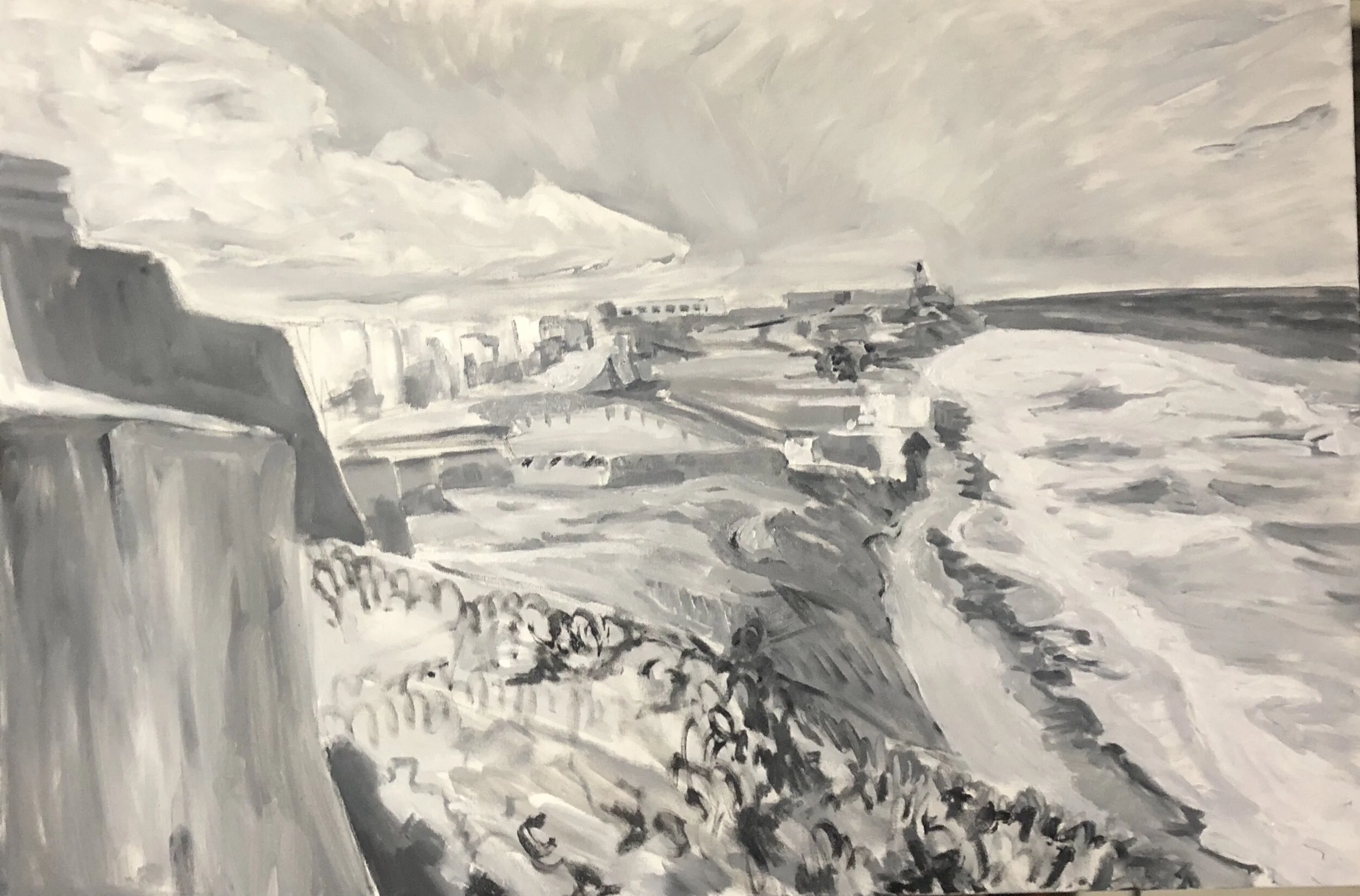
The day exploring Old San Juan some time ago has stayed with me for quite a while. I wanted to render that view in oils to see what would happen differently from the large acrylic and charcoal scene I did a few years back. The more I got familiar with oils, and the more about color I was learning, the more interested I was in improving upon scenes I had done in acrylics. I was looking back at photos from that trip and saw a shot that brought more of the shoreline into view, especially those wonderful beaches. So I tried it out, starting with a gray-tone underpainting. I really enjoyed doing this and decided to continue doing it on a few paintings afterwards.

IMG_2331.JPG

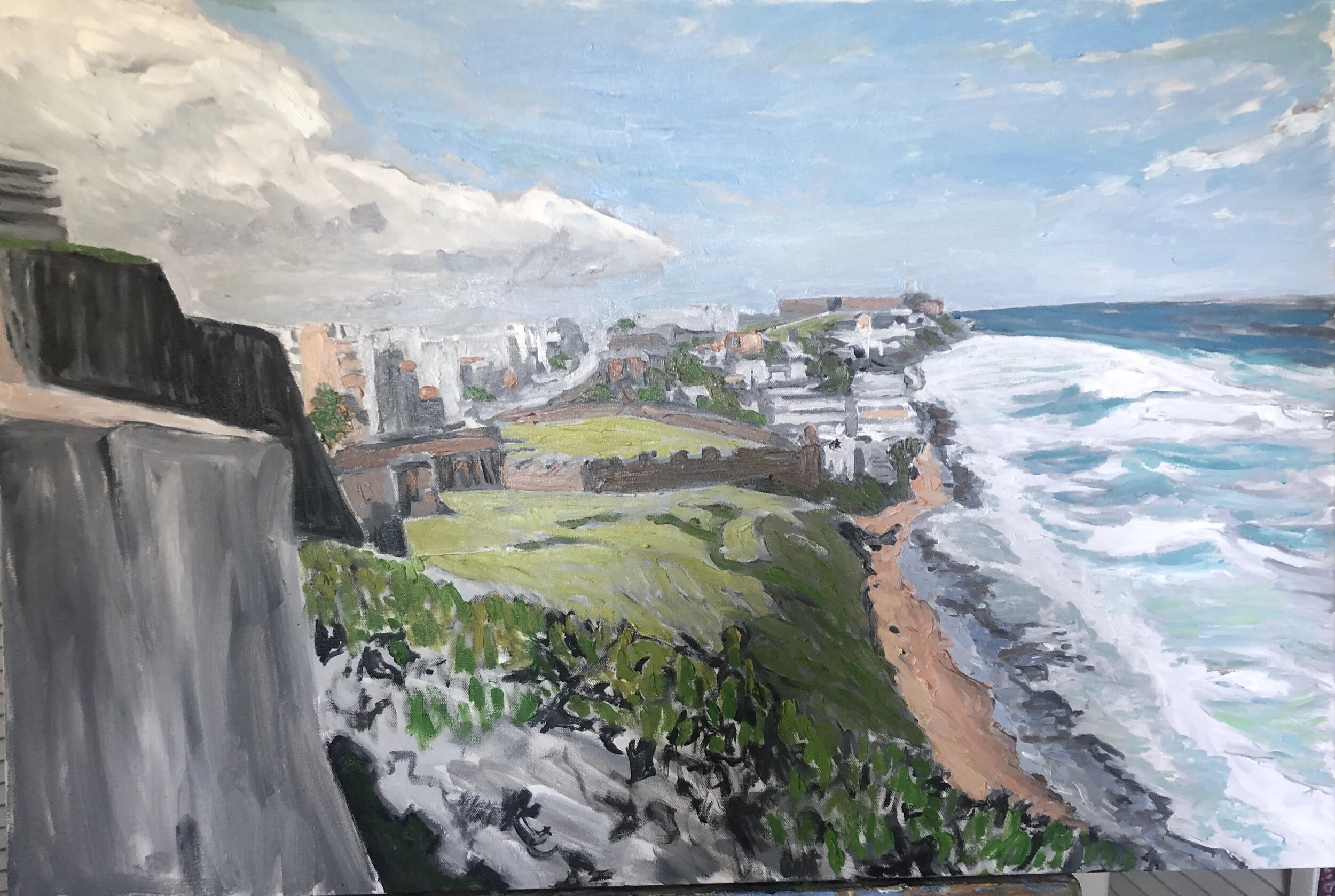
As I added in the color and refined the drawing, I did what I could to approximate the tone of the color to the tone of the underpainting. In some cases, I let the underpainting show through, and in the case of these fortress walls on the far left, I left the whole thing as it was, coming back later to add some detail. Perhaps one day I’ll have the nerve to simplify the color to match the undertone and flatten things out, to end up with something like what Fairfield Porter produces.

What the underpainting did was allow me to approximate a pencil or charcoal sketch in brushwork, another point of interest for me. In the early stages, I did the foreground as a rocky surface with little scrubby shoots coming up. That was actually really good, but I ended up abandoning it for something else later. Almost from the start, though, I had a really nice sky, thanks to a silvery effect that came from the gray at the horizon. I also got lucky with how the clouds on the right came out. The gray undertones also strengthened the beach and the waves. I ended up with something I liked early on there and got to refine it along the way.

IMG_2334.JPG

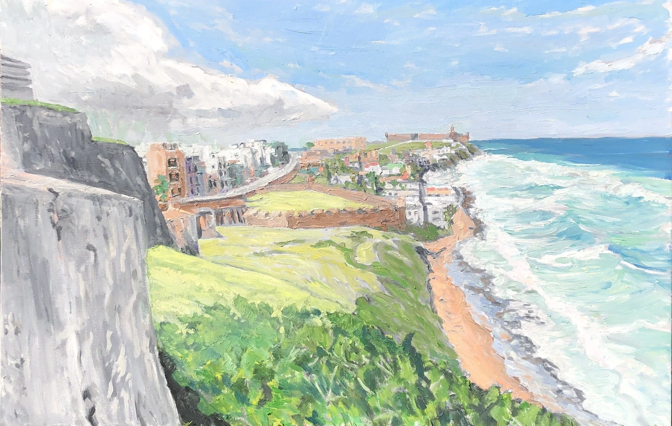
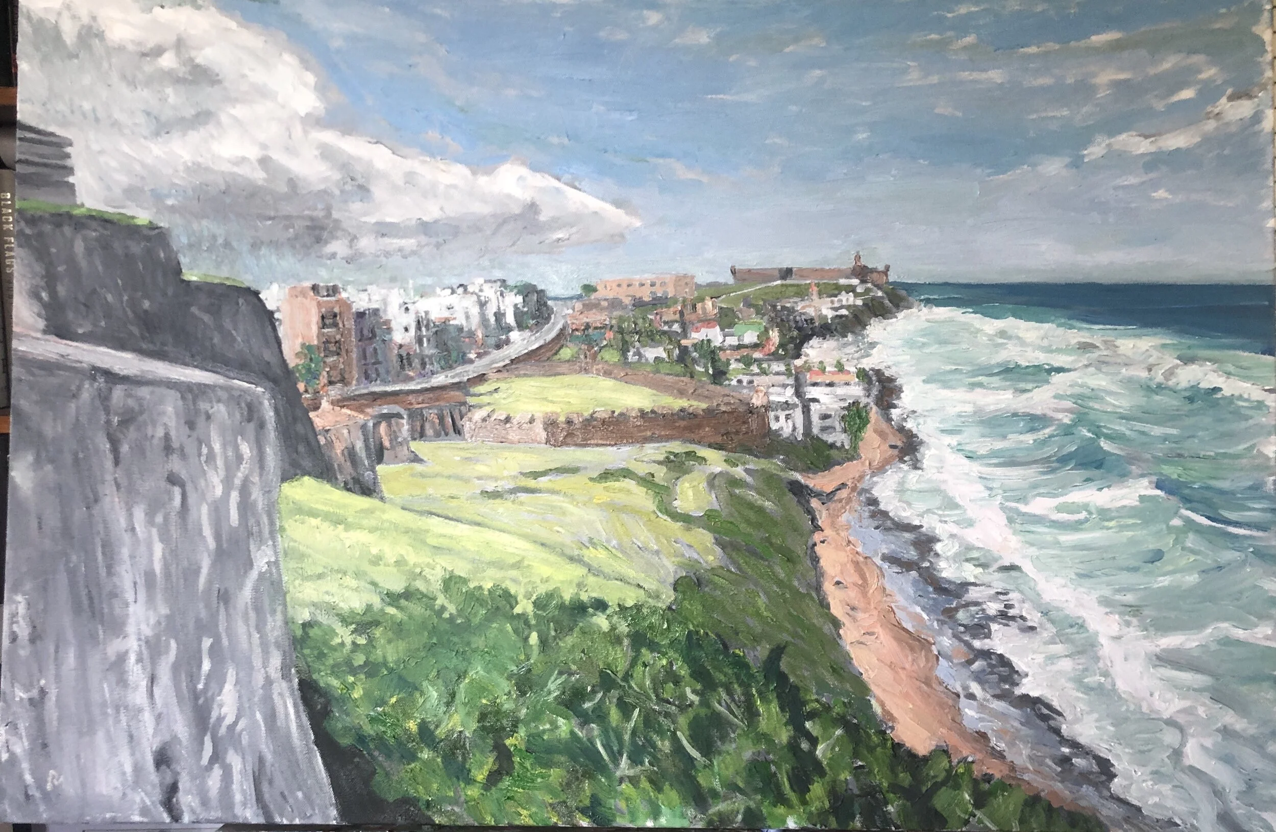
A problem area for me was the foreground, which I could have left in the rocky motif, but didn’t want to. Oh, at first I did, but then I listened to my most reliable critic who said the rest of the painting looks more finished than this. So generating the right level of foreground detail was the problem- how to avoid drawing attention away from the middle and far distance, the real point of the painting, This painting had a lot of zinc white in it. And so when I put it in the sun it had a pastel feel to it. In inside light, the painting tended to read darker. Below are two shots that show the difference. Also as I got further into this one I worked pretty hard on all the structural sections, the old town modern buildings, the fort walls, and the favela between the two forts.

IMG_2414.JPG
IMG_2417.JPG
I was really happy with this and decided to bring it with me on a rare weekend trip to the Delta. I worked on a painting there and on the way back I picked up another painting I had gifted to a friend in Yazoo City and left the San Juan scene with h…

I was really happy with this and decided to bring it with me on a rare weekend trip to the Delta. I worked on a painting there and on the way back I picked up another painting I had gifted to a friend in Yazoo City and left the San Juan scene with him until I could remedy the thing that irritated me with the the gifted painting. I finally did get that done and returned it to him about 2 weeks later and retrieved this San Juan scene.

Bon Secour revisited- part 1

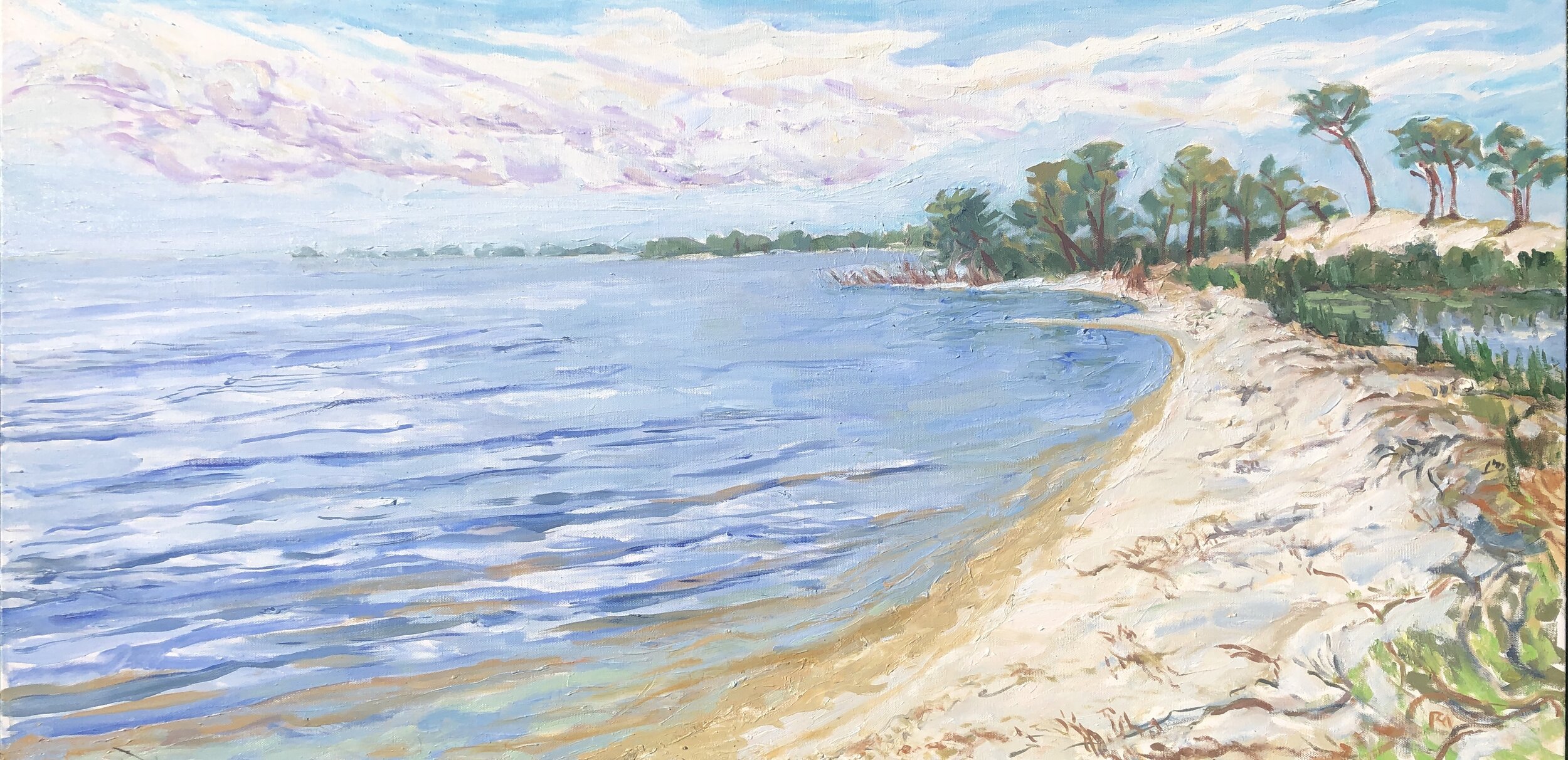
This is an area that we enjoy visiting for beach combing and kayaking. The locations where these two scenes are set look toward St. Andrews Bay, which is a smaller part of Bon Secour Bay. I shared some details about one of these paintings in the Quarantine Quartet post. As we chafed against the continued lockdown, we would slip away for a day for some remote time on the beach or on an isolated shore in this area.

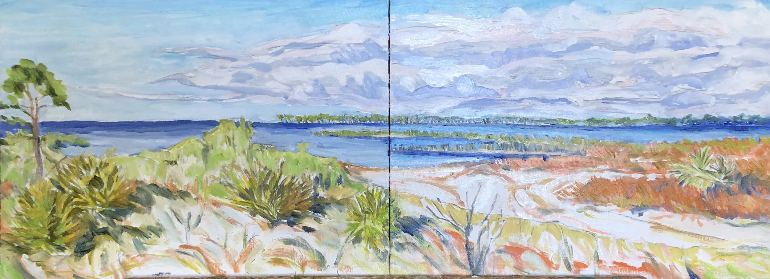
I had done one of my 2 panel studies at the kayak put-in awhile back. I really liked it a lot. It had an interesting vivid color scheme and hints of the twisting brushwork both of which recall Walter Anderson or even Van Gogh. I wanted to put this scene on a single large canvas. The interesting thing about this study was that I didn’t have time at the site to apply any color so it was a pencil sketch only. Here is what that looked like. it was late afternoon just before we had to get back on the ferry to go home. It was the last canvas available from a getaway weekend we took. The light was vivid and the clouds were long smooth streaks with bunched up clusters beneath.

IMG_0771.jpeg
IMG_0146.jpeg

Here again with the greens in the foreground I am working with zinc white and zinc yellow. I liked the arcs of orange and pale yellow in the foreground. I was too heavy handed with the deeper orange on the far right. It all got started with orange as a result of trying to get the right color of the row of grasses on the right foreground and then I just splashed some orange around elsewhere. I like the shapes in the sand that appear here and wish I had held onto these a little better. Another feature of this version I like is the large amount of white showing through the foreground shrubbery. It was not so in real life. Overall, except for the heavy orange, I like how these colors work together. I wonder sometimes if I should just stop and step away after an hour and declare parts off limits. I also like the spiky bushes in these lighter yellow and blue hues.

IMG_0797.jpeg

As I moved ahead with this I lost some of these nice effects but ended up with a piece that I still like a lot. There is a stronger painting of the palm bushes and the fingers of marsh grass as well as the sky. I also dialed back on the intense orange (my high school team color, one I did not especially like). I did like the very pale cerulean water that seemed to pop nicely against that grey green marsh grass underlined by ultramarine blue. What is missing is a level of detail on the left hand side that takes you somewhere. Here is the next stage of things.

IMG_0798 2.jpeg

Soon afterwards, I went over to see my brother in Pensacola and a launch of the America’s Cup contender from the New York Yacht Club. It was a glimpse of futurism, like a recovered craft from a crash site. Seeing it take off across Pensacola Bay was a wonderful sight. About 10 days later I returned to this piece over a weekend and zeroed in hard on the spiky bushes. I got a couple of good parts done with interesting combinations of yellow ochre, lemon yellow, and a variety of greens, blues, and browns. I also worked more on the clouds and water.

IMG_2762.jpeg

In some further work I brought it to the point I now have. I have to say I really like this piece despite the good things that were left behind to get there.

IMG_0859 2.jpeg

Months later, this piece was in line for my plan to convert two piece works into larger one piece ones. The initial efforts tended to track the study pretty closely. Again the cartoonish start showed through.

IMG_1696.jpeg


Almost immediately I doubted my plan to follow the original approach and reverted to the colors at the scene, which were brown and gray and put in overdark shadows. Wrong on color and wrong on tone. I changed tack and went over most of that with white to re-establish the approach in the study. This is an example of the kind of mis-step that I made over and over early in my painting life when not painting from life. I had a French art prof who scolded me with a line something like, “Si l’on peint un paysage, on doit le faire devant la scène.”

IMG_1858.jpeg
IMG_2018.jpeg

Partially erasing what is below is a thing I toyed with at length with an iPad app called Paper. These tend to be a lot of fun as doodles.

Paper.Journal.15.png
Paper.Journal.32.png

I appreciate more than before serious painters like Rauschenberg and Johns and others who worked with complex layerings. What they did was extraordinarily bold, liberating, and bracing. Not for his lack of trying did my art teacher at Millsaps fail to tune me into the power of these artists’ work.

IMG_9072.JPG
IMG_5346.JPG

Back from this digression - I continued to work towards a faithful recreation of the sketch and got pretty close. Here are a couple of stages, starting with the most faithful one.

IMG_2028.jpeg

OK, so I got there but somehow I wasn’t happy. Those clouds for example and other things that annoyed me. So I tried to de-emphasize the clouds and work more on the foreground. I did a little more of the crosshatched brush strokes and it was ok but again, I wasn’t where I wanted to be. It felt artificial.

IMG_2057.jpeg

So when the opportunity came, I decided to take it with me on a trip back to the site where the scene was done, as the French art professor had instructed me to do.

IMG_2103.jpeg

I ended up reworking it pretty significantly, taking it back to nature. Much more impasto, much deeper colors overall, and some key changes, including the foreground, the tree, and the orange grasses, now covered in a lime green. Here is what I brought back to the studio.

IMG_2116.jpeg

I liked this foreground a lot more and also felt like the sandy path was better. I could have stayed with that. But, I had to tinker more. Here is where I finally ended up, I wanted to make that tree better and I needed to choose a better outcome for that row of bushes on the right. I maybe went a little too dark in the foreground and lost some interesting features in the process, but this is where my impulses led me.

IMG_2176.jpeg


3 Mile Harbor- floating dock

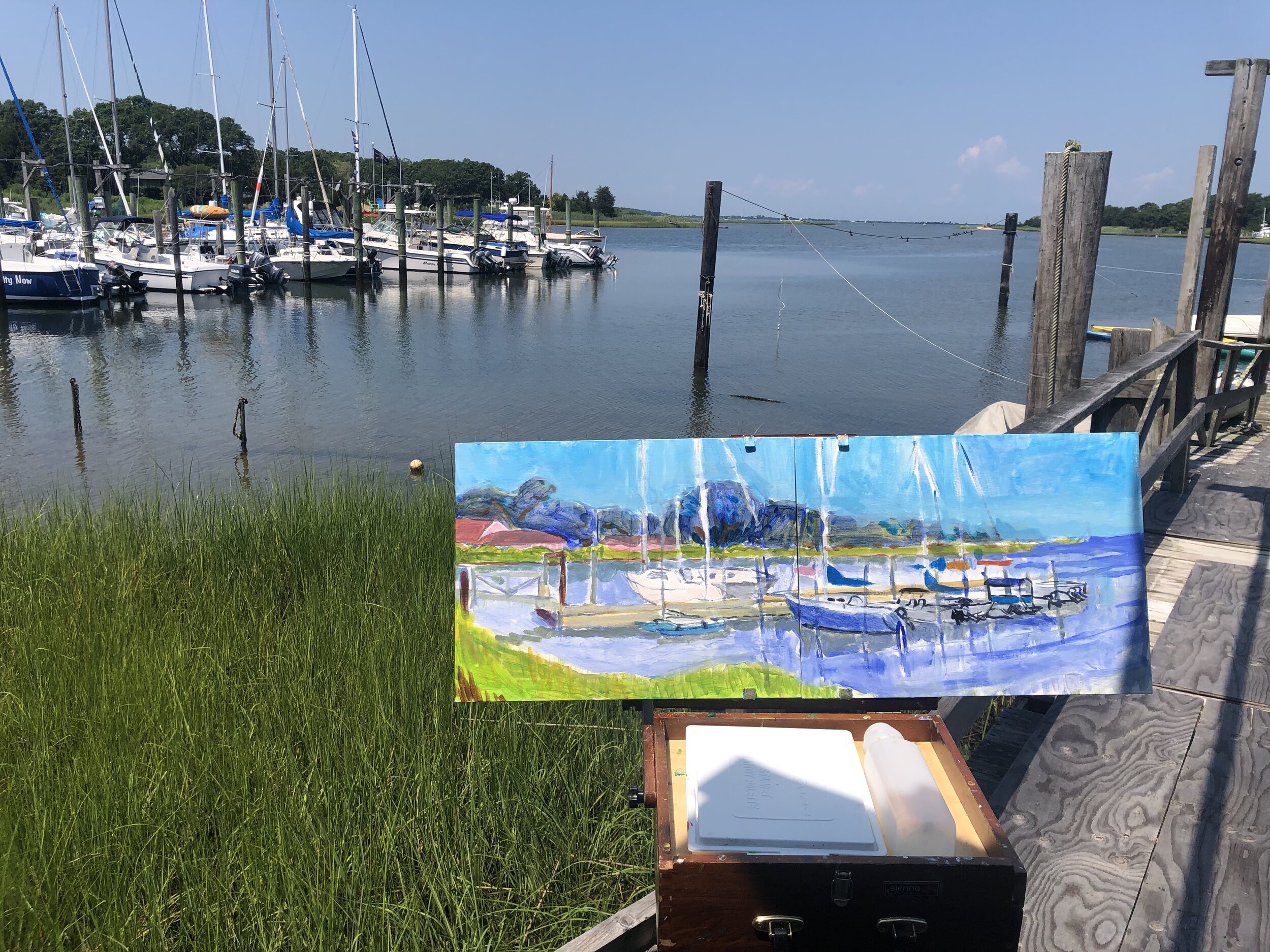
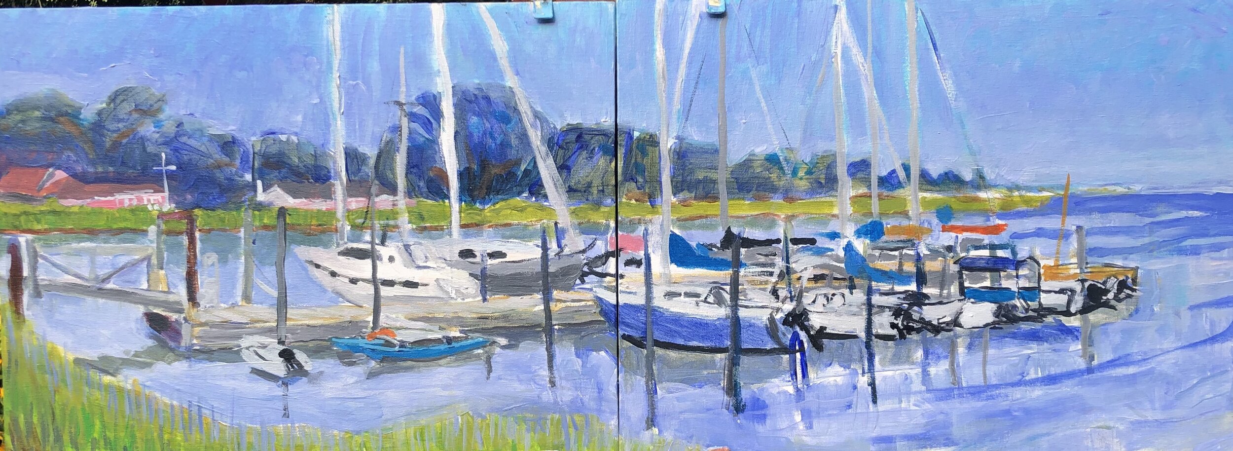
On my last visit to Springs, I did another of those little 2 panel studies of 3 Mile Marina. This is the floating dock where some of the larger sailboats are found. I painted it from the foot of an adjacent floating dock. I started it in the afternoon and finished it the following morning. By that time the light was very soft and gentle.

IMG_9374.jpeg

I overdid it with the cerulean blue and later spent some time getting the sky and water into balance back home. I really liked the softness of the water and the trees behind the masts and rigging. This harbor had both swans gliding along and a family of ospreys in a rugged nest atop one of the pier lights.

Back home I tightened up the drawing and the color balances. I worked off the effects from the thin washes of the harbor water in the foreground. I got closer to the sky I wanted but I was unhappy with the rigging. Just a study, though, so I left it alone. I also left out a lot of other rigging and the pier lights. I was still playing with cerulean and lavender in the sky. Here it looked ok, just a little too dark a tone.

IMG_9550.jpeg

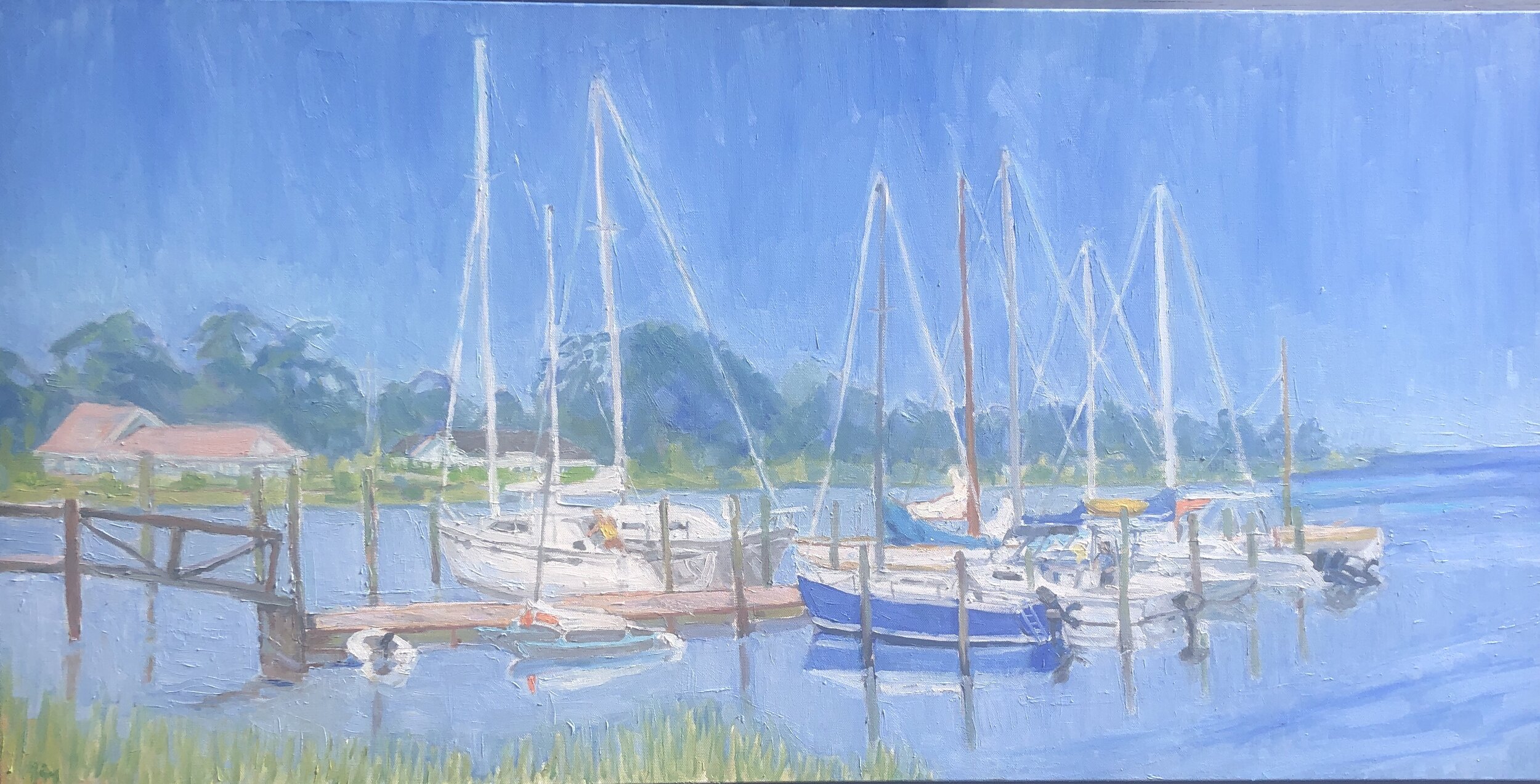
Almost a year passed before I turned back to this scene. So much had happened - COVID lockdown, changes at work, changes in how we live- so when I turned to this scene it was more than just converting a 2 panel study into a single bigger painting. In a way it was for a sense of escape, ease, and tranquility. It wasn’t my home harbor, but it reminded me of moments in childhood spent with Dad, Mom, and people involved in sailing on a daily basis. There is a lot of poetry involved in sailing- the curves, the passing effects of light and water, the surprises emerging from both elements. And that feeling of comfort when you are securely moored back at the dock.

When I go bigger, I realize how cartoonish I often am, how crude the lines, and over-bright and flat the colors. It’s interesting to see what survives the initial effort. I’d say nearly everything changed except the very basic elements. It is becoming more enjoyable to realize how much space a bigger canvas gives me to work things out. It would be something to work on a canvas so big that the block in brushes I use would in fact be the fine point finishing brushes. This would have to be something 4 or 5 times bigger than I currently do. There would be a lot more expressiveness in the finish work.

Very soon after I got started I moved to a very pastel set of values and this is what guided the remainder of the painting. This was a product of using a lot of zinc white. I really liked the light grays and the gentle blue greens that came through this zinc white filter.

IMG_1710.jpeg

From this point forward it was essentially a matter of tightening up the overall painting and working out how the sky and water would appear in final form. This sky was the right value but I wanted it to look like that eternal deep early morning sky light and this first shot was too much like impending showers.

In between that stage and the next, the George Floyd murder occurred, triggering protests everywhere in the nation, including all corners of Mississippi, for the first time in my memory since the 60s. It was so powerful that it broke down the resistance to changing the state flag. So there was a gap of a couple of weeks and I returned to this right about on the 4th of July as Christina and I were about to leave on summer getaway. I did some interesting but also odd choices in this version. I liked them a lot and think they improved things. There were some details that I had to take out before reaching the end. One of them was my old nemesis the cerulean blue sky, this time with random lavender patches. I had to rework that. Another was to lower the line of reeds at the far left to show more water. Looking back at this, I do like the extremely pale water and reflections and if I could get it right the very very light sky.

IMG_1812.jpeg

And only a day before I left, I got it to the point I wanted. At least I thought so. It’s like a piece of writing. I have to go back and proofread it. In this case I liked how everything looked, except I overlooked that the the piling on the far left stopped show of where it should have to enter the water. I realized this later and fixed it. This one hangs near my bed and so I see it often. I think at some point I may take some of the fuzziness out of the rigging, but for now, it gives me a good restful feeling. I really like the diamond shapes formed by the rigging on the right side of the sky. It’s almost an argyle pattern. I ended up with a deeper blue in the water and sky than the previous stage, and perhaps this was a mistake. But I like the deeper blue color a lot and the gauzy effect it has on the overall scene.

IMG_1853.jpeg

a quarantine quartet

Just before the shelter in place orders we did a little darting around here and there. One trip to Fort Morgan yielded this view looking east along the shore of Bon Secour Bay. It was a breezy day but the waters were laying down. I worked on the effect of small waves lapping on the shore with the golden undercoat before they fold over.

IMG_0977.jpeg


The Sunday before the statewide order took place, C and I kayaked over to Deer Island and I went pretty far to the east and started a piece that was bleaker than usual for me. It was damaged pine trees with the Biloxi point in the distance.

IMG_1111.jpeg


I had one more piece in mind, a Mardi Gras Indian as a housewarming gift for our friends. This one gave me enormous pleasure to work on. It was no more than 2 days work and it had a wonderful feeling all along the way.

IMG_1255.jpeg

Finally I had a quick study back at Bon Secour bay last weekend, using oil on paper. It produced a very interesting surface, and I enjoyed this little study a lot. I first did a loose quick sketch to shake off the nerves, and then drew it out with charcoal pencil, then painted it with a small brush.
IMG_1367.jpeg