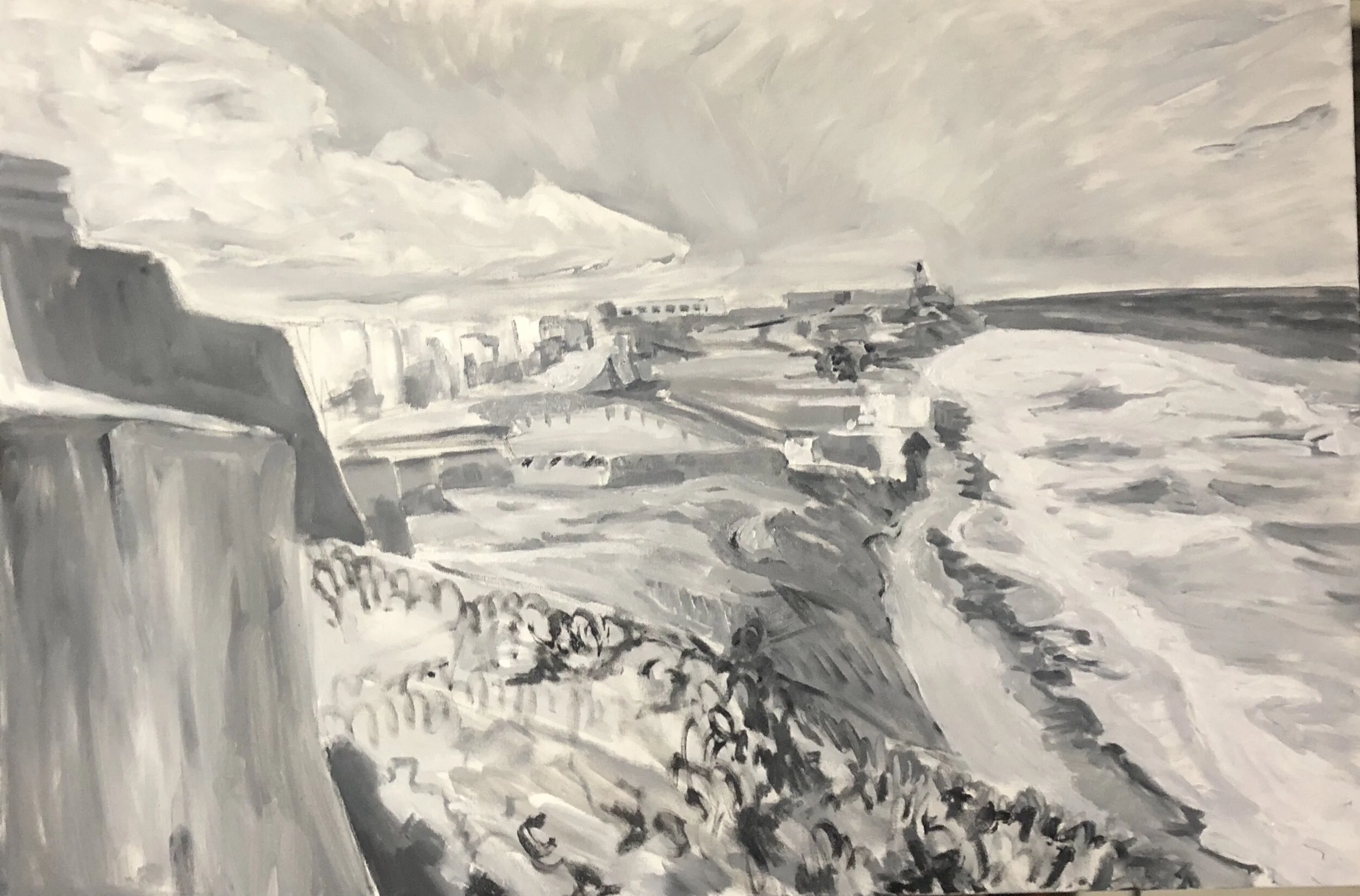
The day exploring Old San Juan some time ago has stayed with me for quite a while. I wanted to render that view in oils to see what would happen differently from the large acrylic and charcoal scene I did a few years back. The more I got familiar with oils, and the more about color I was learning, the more interested I was in improving upon scenes I had done in acrylics. I was looking back at photos from that trip and saw a shot that brought more of the shoreline into view, especially those wonderful beaches. So I tried it out, starting with a gray-tone underpainting. I really enjoyed doing this and decided to continue doing it on a few paintings afterwards.
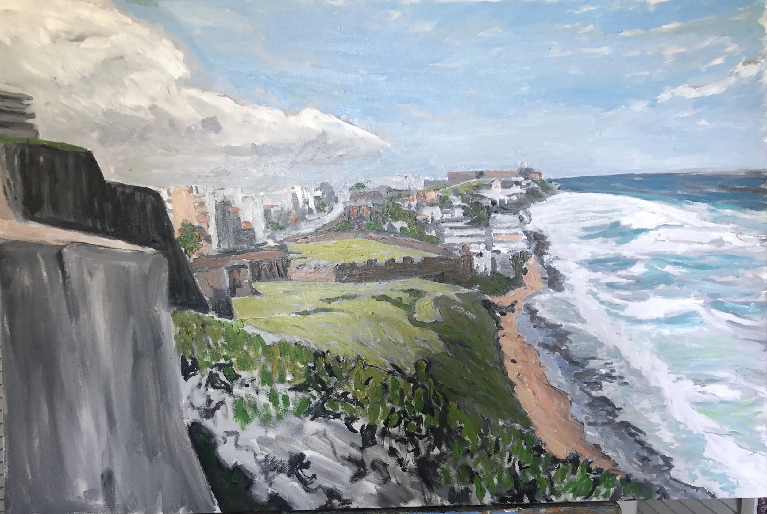
As I added in the color and refined the drawing, I did what I could to approximate the tone of the color to the tone of the underpainting. In some cases, I let the underpainting show through, and in the case of these fortress walls on the far left, I left the whole thing as it was, coming back later to add some detail. Perhaps one day I’ll have the nerve to simplify the color to match the undertone and flatten things out, to end up with something like what Fairfield Porter produces.
What the underpainting did was allow me to approximate a pencil or charcoal sketch in brushwork, another point of interest for me. In the early stages, I did the foreground as a rocky surface with little scrubby shoots coming up. That was actually really good, but I ended up abandoning it for something else later. Almost from the start, though, I had a really nice sky, thanks to a silvery effect that came from the gray at the horizon. I also got lucky with how the clouds on the right came out. The gray undertones also strengthened the beach and the waves. I ended up with something I liked early on there and got to refine it along the way.
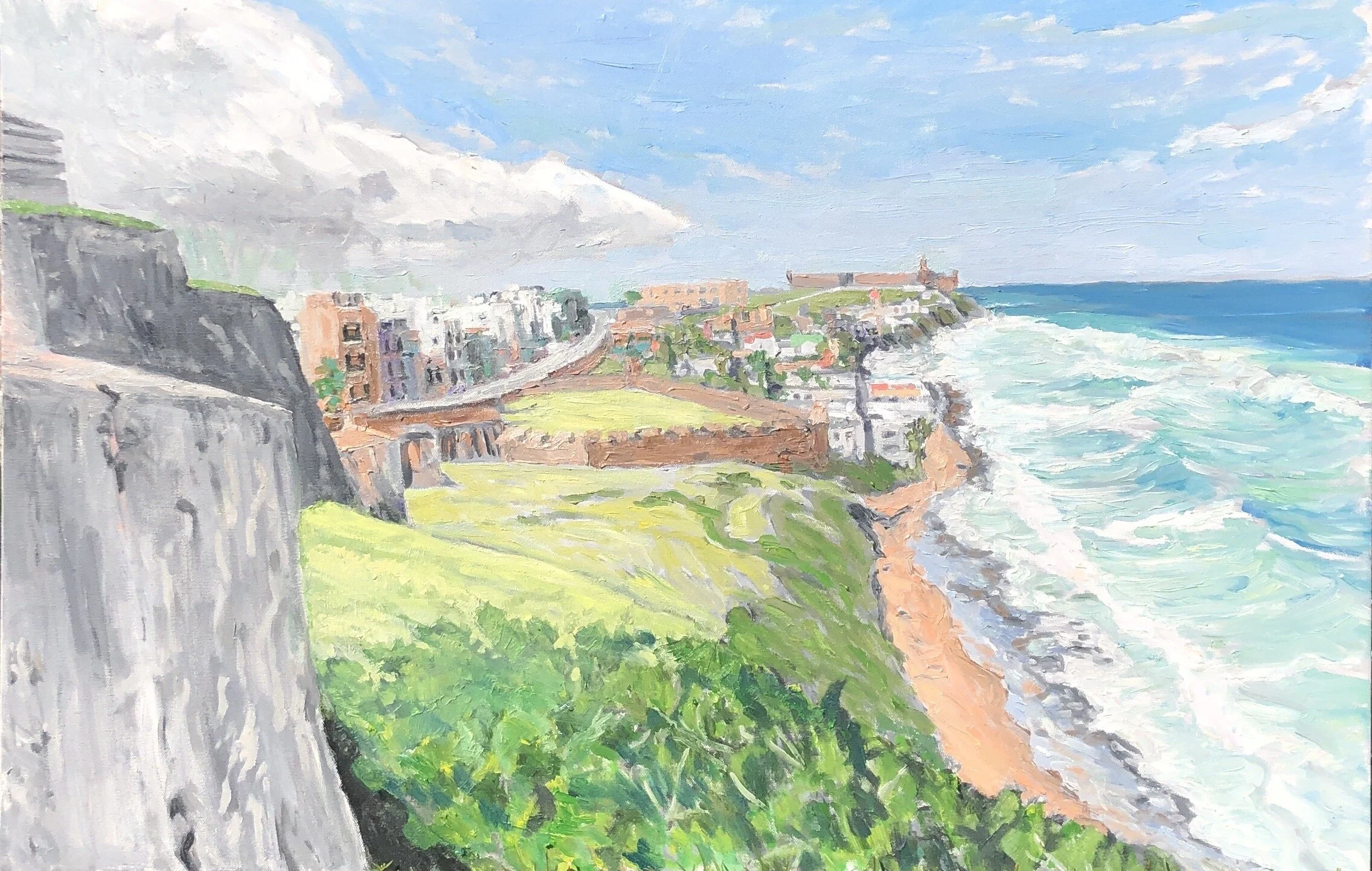
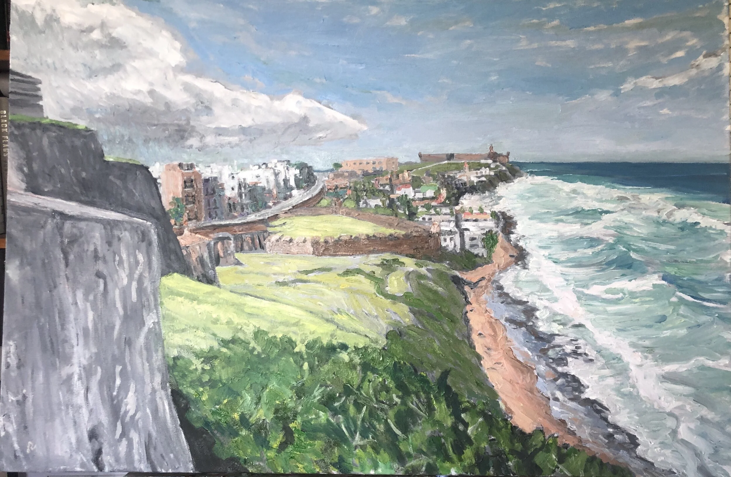
A problem area for me was the foreground, which I could have left in the rocky motif, but didn’t want to. Oh, at first I did, but then I listened to my most reliable critic who said the rest of the painting looks more finished than this. So generating the right level of foreground detail was the problem- how to avoid drawing attention away from the middle and far distance, the real point of the painting, This painting had a lot of zinc white in it. And so when I put it in the sun it had a pastel feel to it. In inside light, the painting tended to read darker. Below are two shots that show the difference. Also as I got further into this one I worked pretty hard on all the structural sections, the old town modern buildings, the fort walls, and the favela between the two forts.
I was really happy with this and decided to bring it with me on a rare weekend trip to the Delta. I worked on a painting there and on the way back I picked up another painting I had gifted to a friend in Yazoo City and left the San Juan scene with him until I could remedy the thing that irritated me with the the gifted painting. I finally did get that done and returned it to him about 2 weeks later and retrieved this San Juan scene.


