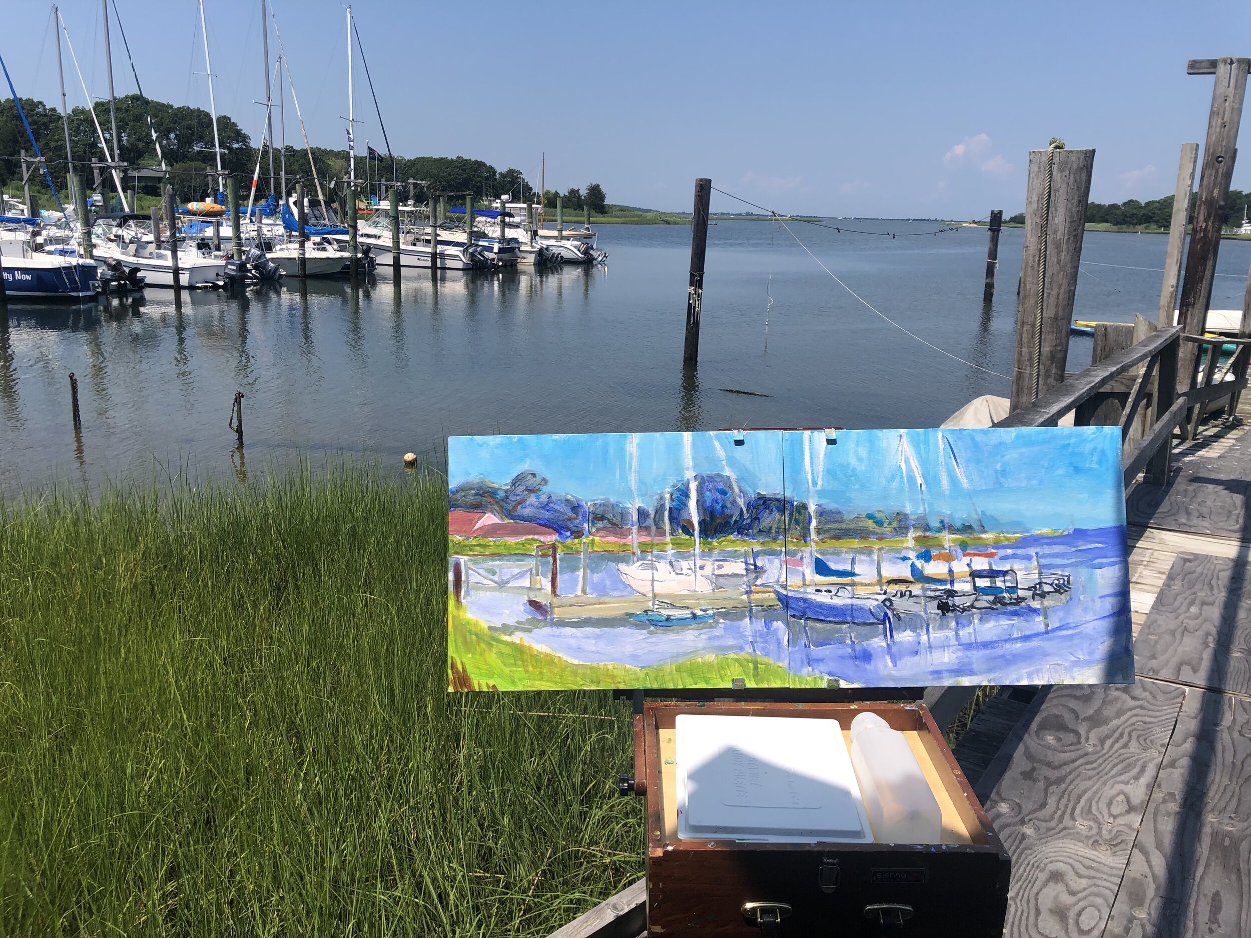
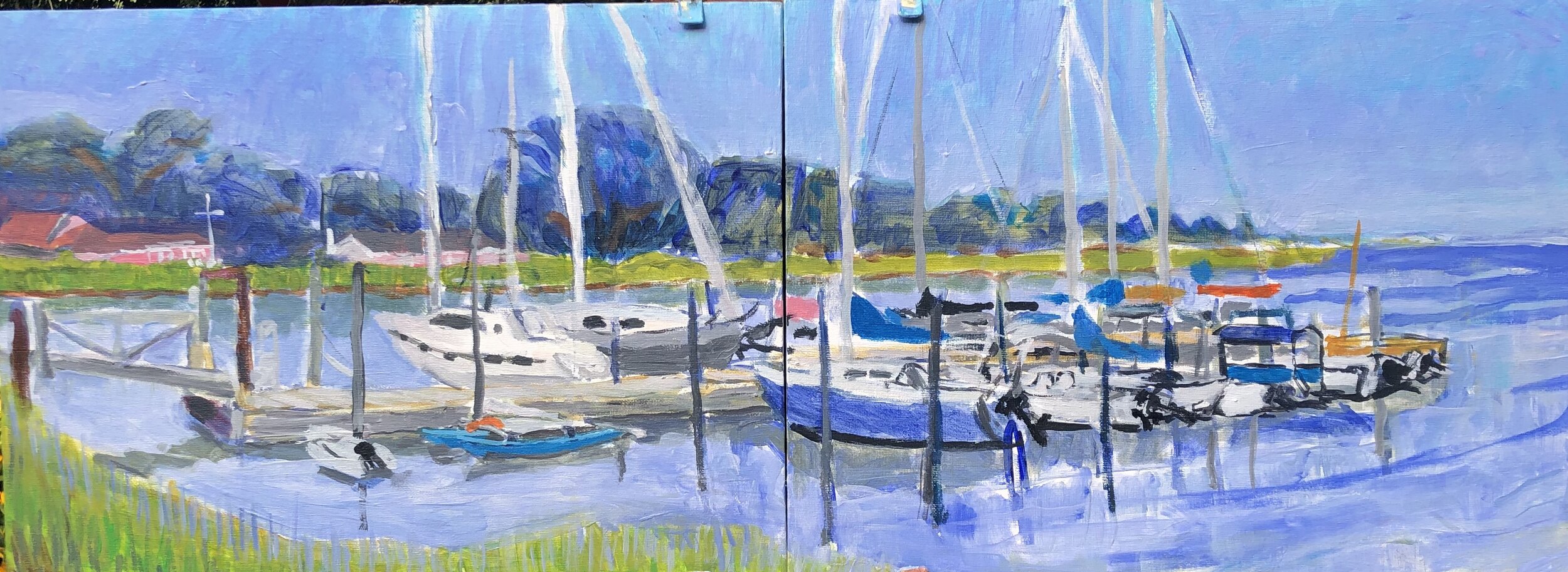
On my last visit to Springs, I did another of those little 2 panel studies of 3 Mile Marina. This is the floating dock where some of the larger sailboats are found. I painted it from the foot of an adjacent floating dock. I started it in the afternoon and finished it the following morning. By that time the light was very soft and gentle.
I overdid it with the cerulean blue and later spent some time getting the sky and water into balance back home. I really liked the softness of the water and the trees behind the masts and rigging. This harbor had both swans gliding along and a family of ospreys in a rugged nest atop one of the pier lights.
Back home I tightened up the drawing and the color balances. I worked off the effects from the thin washes of the harbor water in the foreground. I got closer to the sky I wanted but I was unhappy with the rigging. Just a study, though, so I left it alone. I also left out a lot of other rigging and the pier lights. I was still playing with cerulean and lavender in the sky. Here it looked ok, just a little too dark a tone.
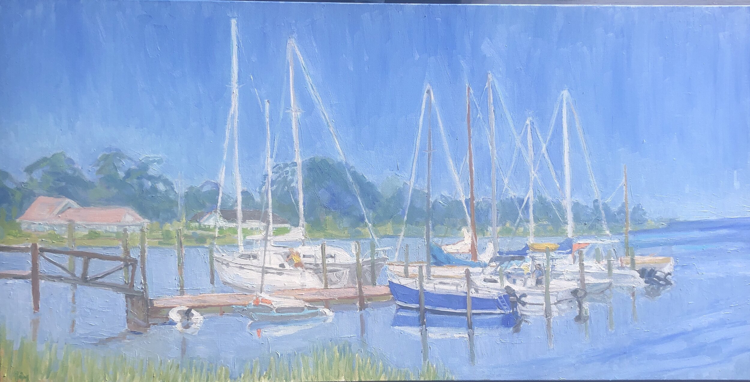
Almost a year passed before I turned back to this scene. So much had happened - COVID lockdown, changes at work, changes in how we live- so when I turned to this scene it was more than just converting a 2 panel study into a single bigger painting. In a way it was for a sense of escape, ease, and tranquility. It wasn’t my home harbor, but it reminded me of moments in childhood spent with Dad, Mom, and people involved in sailing on a daily basis. There is a lot of poetry involved in sailing- the curves, the passing effects of light and water, the surprises emerging from both elements. And that feeling of comfort when you are securely moored back at the dock.
When I go bigger, I realize how cartoonish I often am, how crude the lines, and over-bright and flat the colors. It’s interesting to see what survives the initial effort. I’d say nearly everything changed except the very basic elements. It is becoming more enjoyable to realize how much space a bigger canvas gives me to work things out. It would be something to work on a canvas so big that the block in brushes I use would in fact be the fine point finishing brushes. This would have to be something 4 or 5 times bigger than I currently do. There would be a lot more expressiveness in the finish work.
Very soon after I got started I moved to a very pastel set of values and this is what guided the remainder of the painting. This was a product of using a lot of zinc white. I really liked the light grays and the gentle blue greens that came through this zinc white filter.
From this point forward it was essentially a matter of tightening up the overall painting and working out how the sky and water would appear in final form. This sky was the right value but I wanted it to look like that eternal deep early morning sky light and this first shot was too much like impending showers.
In between that stage and the next, the George Floyd murder occurred, triggering protests everywhere in the nation, including all corners of Mississippi, for the first time in my memory since the 60s. It was so powerful that it broke down the resistance to changing the state flag. So there was a gap of a couple of weeks and I returned to this right about on the 4th of July as Christina and I were about to leave on summer getaway. I did some interesting but also odd choices in this version. I liked them a lot and think they improved things. There were some details that I had to take out before reaching the end. One of them was my old nemesis the cerulean blue sky, this time with random lavender patches. I had to rework that. Another was to lower the line of reeds at the far left to show more water. Looking back at this, I do like the extremely pale water and reflections and if I could get it right the very very light sky.
And only a day before I left, I got it to the point I wanted. At least I thought so. It’s like a piece of writing. I have to go back and proofread it. In this case I liked how everything looked, except I overlooked that the the piling on the far left stopped show of where it should have to enter the water. I realized this later and fixed it. This one hangs near my bed and so I see it often. I think at some point I may take some of the fuzziness out of the rigging, but for now, it gives me a good restful feeling. I really like the diamond shapes formed by the rigging on the right side of the sky. It’s almost an argyle pattern. I ended up with a deeper blue in the water and sky than the previous stage, and perhaps this was a mistake. But I like the deeper blue color a lot and the gauzy effect it has on the overall scene.


