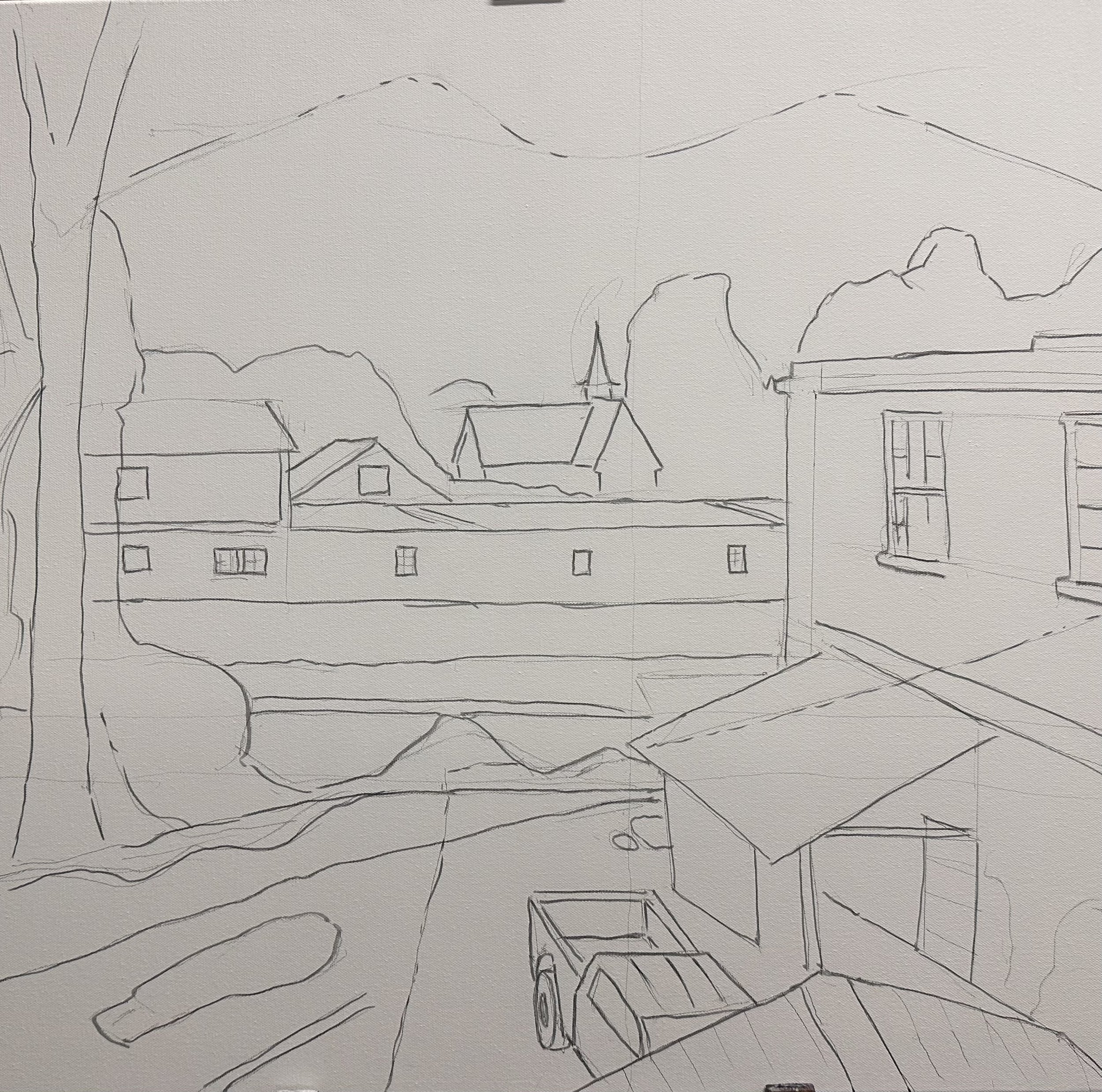
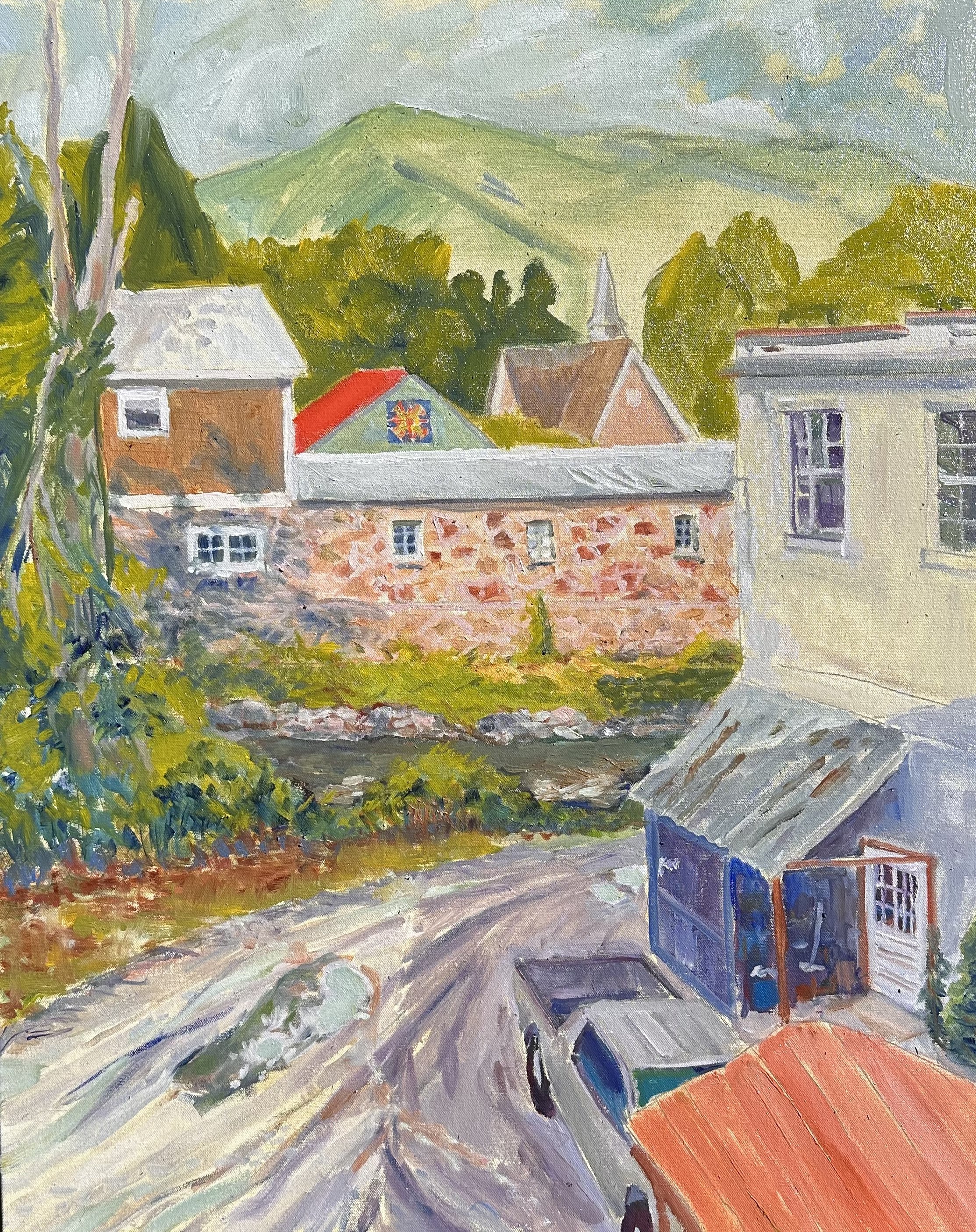
A little more than a year ago, we came up to stay in our new studio, but until it was ready we had to stay in a little apartment above a store in downtown Hot Springs. To get there, we climbed stairs between two buildings and then more stairs to the landing of the apartment. The view west out of the kitchen the next morning was wonderful and so I started a scene there in acrylics. I really liked how it turned out and wanted to do a larger one in oils. So, a few weeks ago I sketched out the same scene onto a larger canvas and took it into town three mornings in a row. I gave it a very pale green undercoat.
I couldn’t actually return to the apartment window, so I had to settle for a ground level position. Still, I stayed with the original vantage point and simply looked around to fill in the colors and details in the foreground. It was easier than I expected.
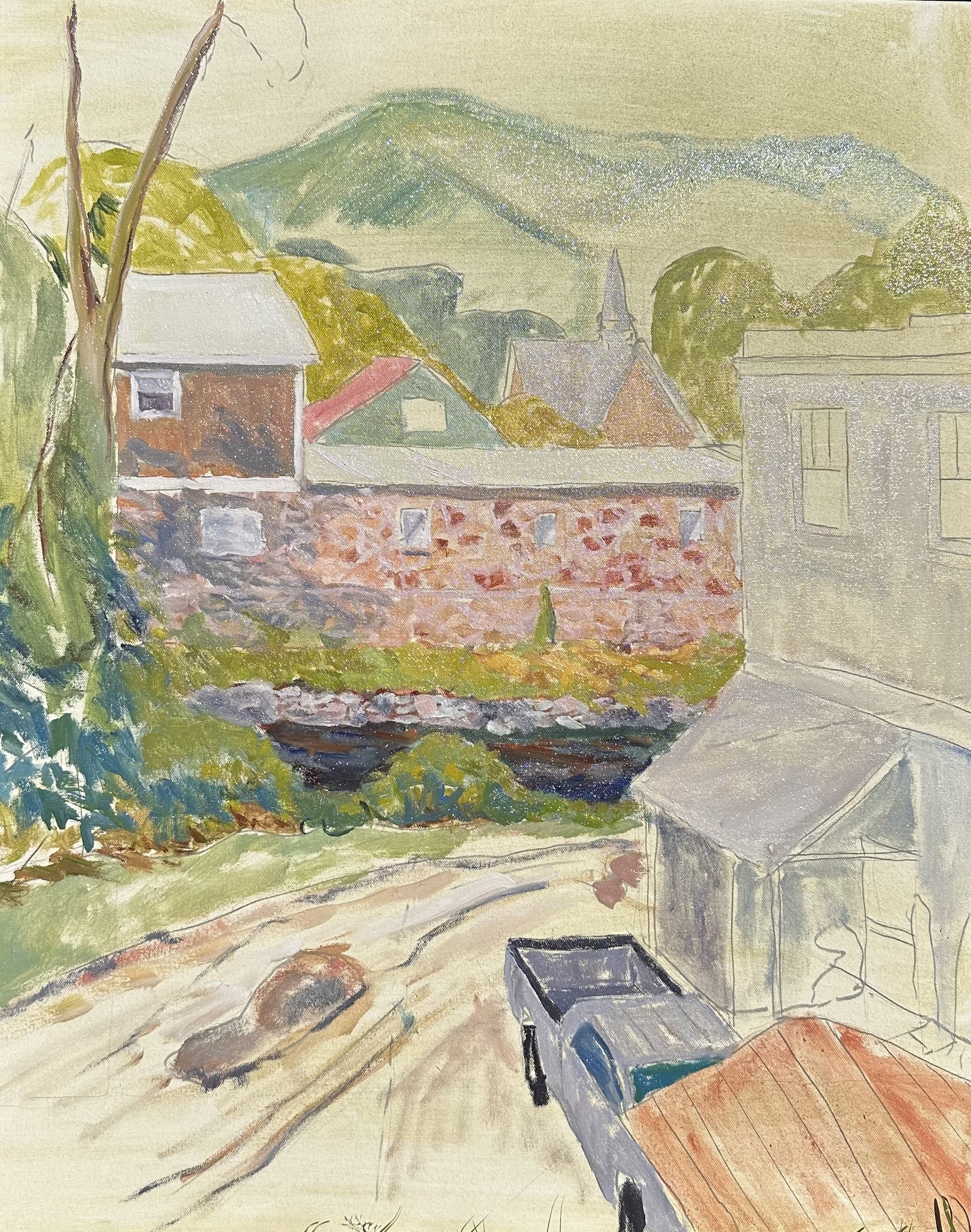
The main task this time was to properly paint the stone wall of Gentry Hardware. In the acrylic scene, I copped out with a flat finish. This time, getting the colors right wasn’t hard, but it was hard to form the shapes and generate the texture of stone so that it still hung together. Things like this start messy and the task is to allow that and then move ahead to shaping and unifying it. So I did some touches all across that surface in various rust and ochre hues and then went back with pale lavender grey lines of mortar to shape and glue it together. I probably used too much oil to get this done, and it had too many beads of light in it. I spent some time on the windows with similar taches followed by shaping lines.
The foreground went pretty smoothly. I had a lucky outcome when I added dark cerulean into to the greens of the shrubbery and vines on the near side of the river. I also liked how the dirt parking area and the ridge line began. Here is where things stood early on.
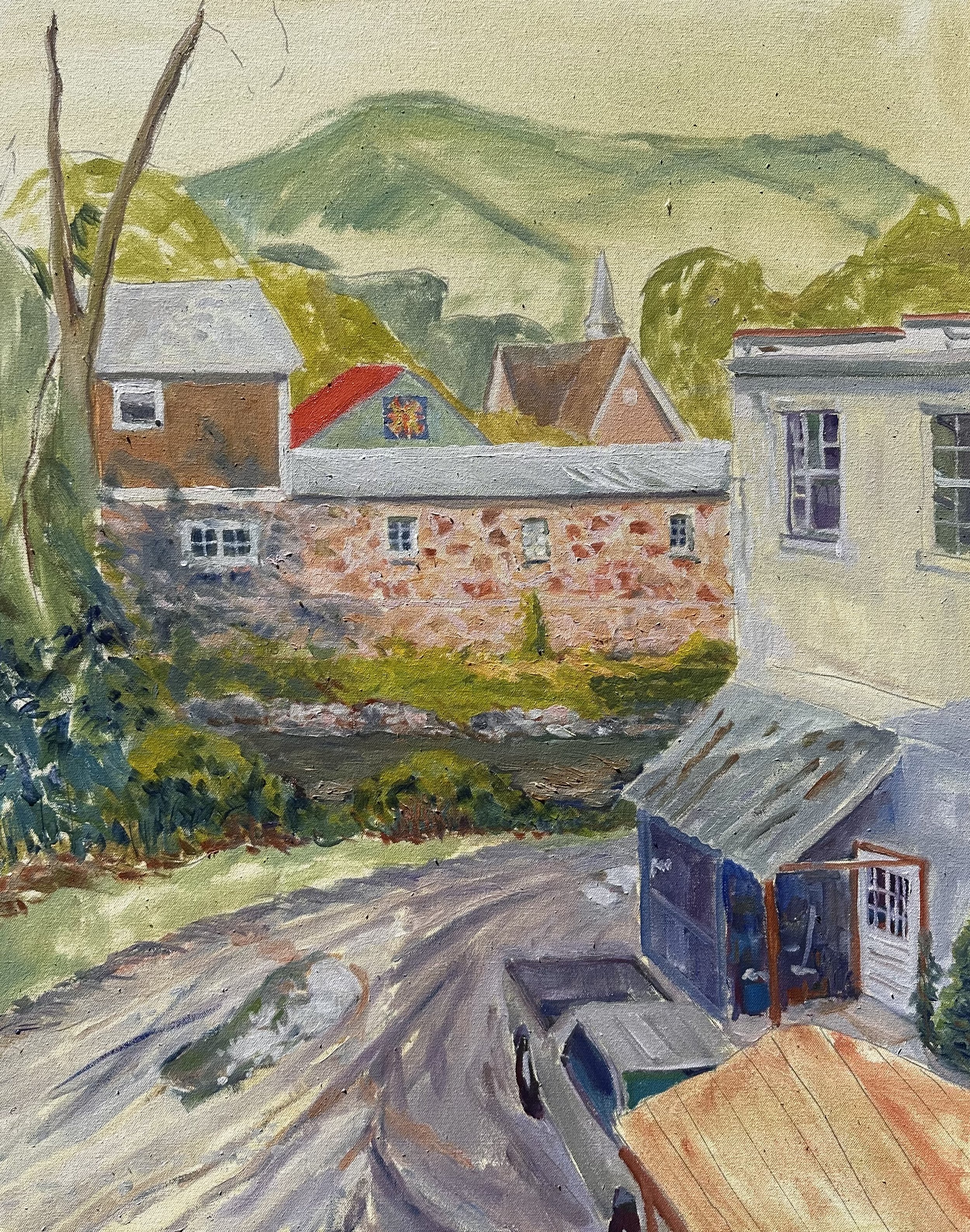
The next stage was to start in on some details and the shadows . This was mostly done on the second day.
Back at the studio I worked on details in the windows, the quilt pattern in the green wall behind the hardware store, and the truck.
I got it to a good point by the third day and I could have called it quits here. I especially liked the washed out light effect of the mountain ridge and the sky. That very pale yellow in the lower part of the mountain is soft and sweet. But that nagging little voice in my head said, you’re in the Blue Ridge mountains, and that ridge doesn’t say blue ridge, does it? I decided one more trip to see what I actually perceived was necessary. Here is what I took in on that day.
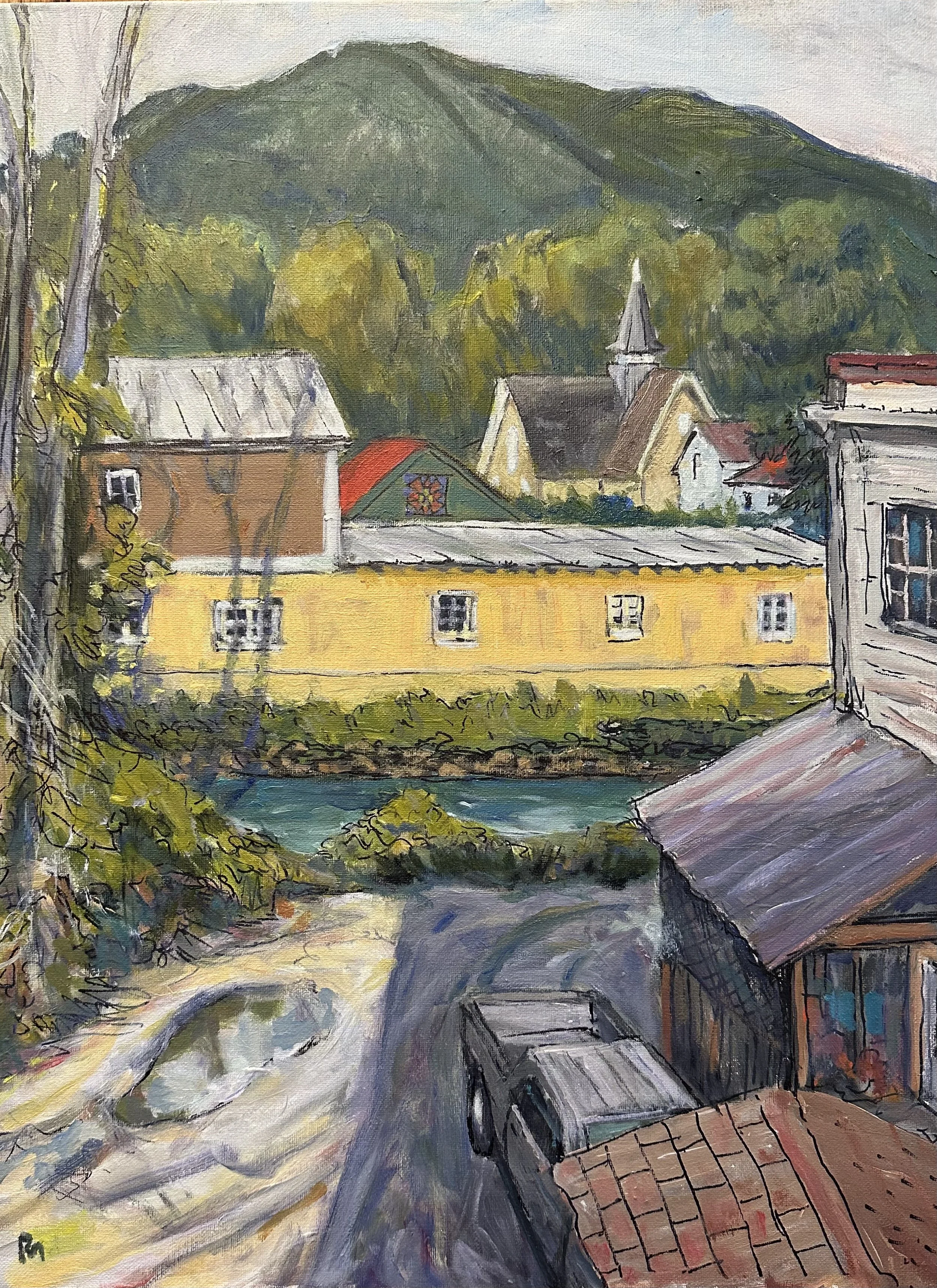
In fact the nagging voice was right as far as perception went. The ridge was a darker hue and closer in color to the middle ground trees. So that led me to try a glaze with a darker blue green on top with a wide brush. The paint laid down in a funny rectilinear way that suggested the forest covering the mountains, and so I stayed with that a while. It seemed I needed to shape the mountain more than just a stroke or two to suggest direction. So I spent time on that. Finally I worked on the church, which also seemed under-developed. It reminded me of the “cheat” of drawing a person with hands in pockets because I couldn’t draw hands well. So, I spent time to make that little church do something on its own. I still am unsure that was the right move, but at some point there’s an infinity of moves and you need to stay with what you have. And this is what that ended up for this scene.
