Several years ago the Sun Herald did a wonderful profile on Christina’s gardens at our house. I loved her smile from the photograph in that story and kept a copy on my shelf. Last month I decided it was time to work on a portrait of her and picked that image to start with.
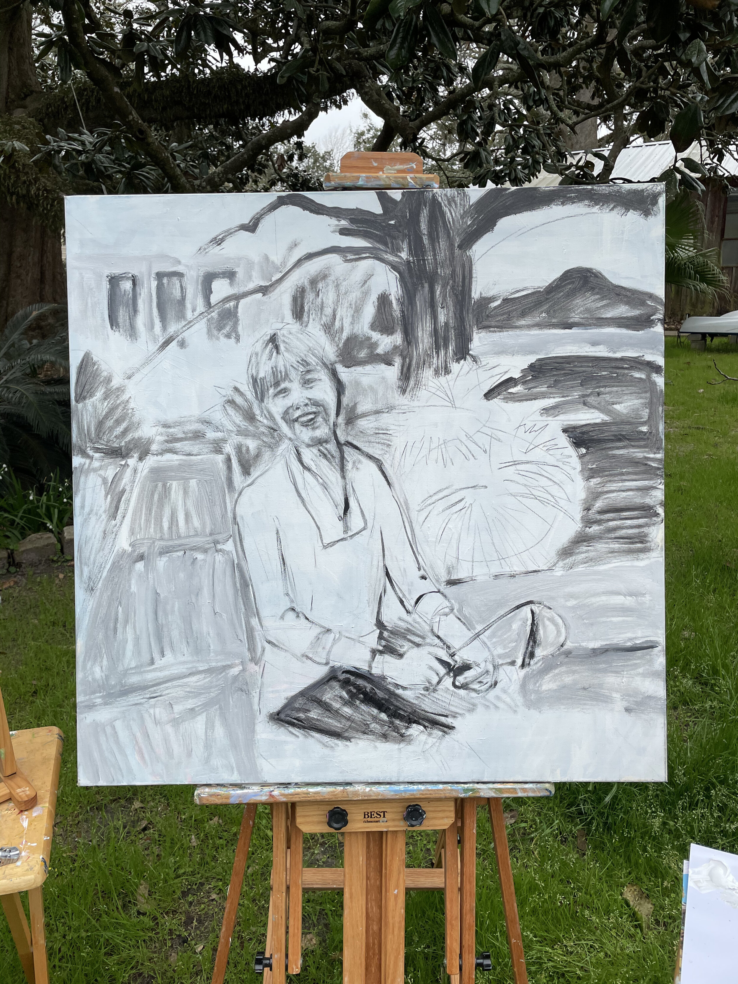
To begin with I converted it to grayscale and painted it free hand onto the canvas, shown below, then spent some time tightening up various parts.
I wanted to resume the approach from the painting of Dad and Uncle George, this time, using a red and green limited palette. Almost from the beginning this became difficult to stick to in an outdoor scene. But it is an interesting approach. If I could reproduce multiple underpaintings and do series work a la Warhol, I might try that. But I got under way with the following as the starting point.
The problem was there was a lot of blue in the scene and I couldn’t completely ignore it. Or so I thought. I went ahead with the blue and also deviated to get the golden brown hair. I liked the silvery gray tips of the palm leaves in this state but I ended up passing that by. From the beginning there was a strange phenomenon where from a distance the face looked off -blocky- but close up it worked well. This state sort of worked, but I was troubled by the gloomy distance. I wanted there to be more sunlight.
There were so many details to adjust in the face to get what I wanted. It made me newly aware of all the nuances of portraiture. There just is no fudging accuracy if you are working in this way. From the first basic state I seemed to have done a few things right and I managed not to lose them as I refined the other pieces. It is an intimate experience to pay this much attention to all the elements of a person’s likeness.
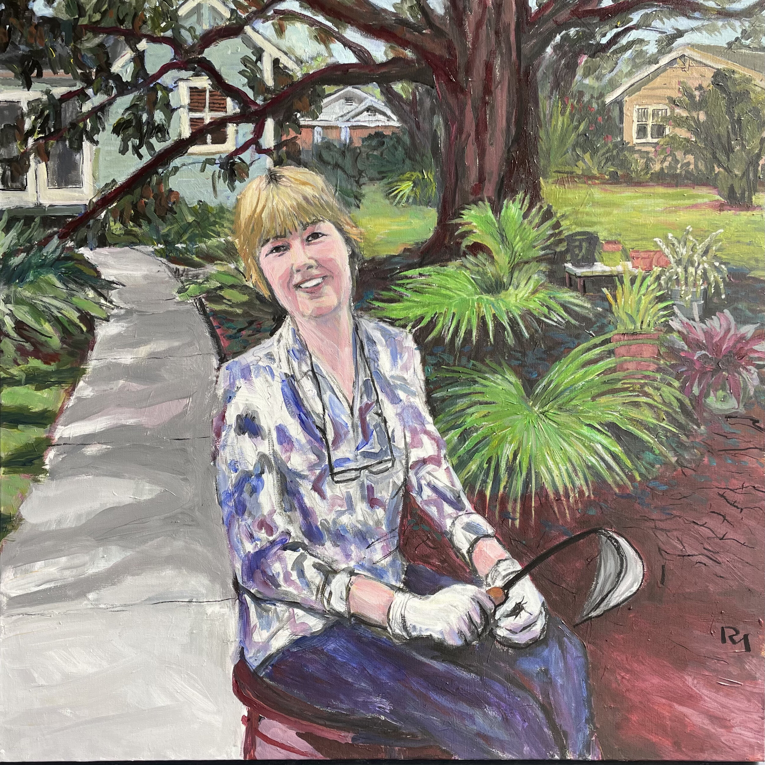
After I got this far, I felt like I needed to go back to the original plan, or at least revive the original plan where I could, and de-emphasize the other colors besides red and green. So I reverted the color scheme of our house to its prior state, a kind of gray-green-blue, and I tried to find ways to shift other blues into paler or darker versions, or else, take them in the direction of violet as with her clothes. And then I filled in greater detail on the plants, the middle distance, the neighborhood, and the shadows on the sidewalk. It took quite a while and yet I think I kept the basic piece pretty much alive throughout all the revisions. So I am happy with it.
One step more. A friend pointed out that the sidewalk on the right was unnecessary. Another example of “just because it’s there doesn’t mean you have to include it.” So I took it out and added some more plants and ground cover.


