In the late 80s or early 90s I went out to Chandeleur Island with a group of friends and did a number of sketches. One of my favorites was a sunrise over Chandeleur Island from the stern of CAVU. Nearly 30 years later I turned that sketch into a painting. Here is the sketch. 7 by 16”.
To move quickly, as I only had a weekend, I used a projector to put the barebones drawing onto a 24/48” canvas. I worked outside in the back yard while Christina and Alexandra gardened. It was a mild and beautiful day. I had the sketch book propped open and I started in on the scene with blues and yellows.
As I added more colors the color scheme intensified and moved into a Fauvist vein. Even though the sketch originally was pretty bold, thanks to the prisma color pencils, it was the richness of the oil colors that pushed me to go further. I had an interesting purple, green, yellow combination going on for awhile. And then I had to figure out the transition beyond the green in the sky, and that’s where the pale blue began to come in. I actually pulled out some of the art monographs I have to see how Derain and Van Gogh managed that kind of transition. I don’t have one on Derain, so I will have to look for that.
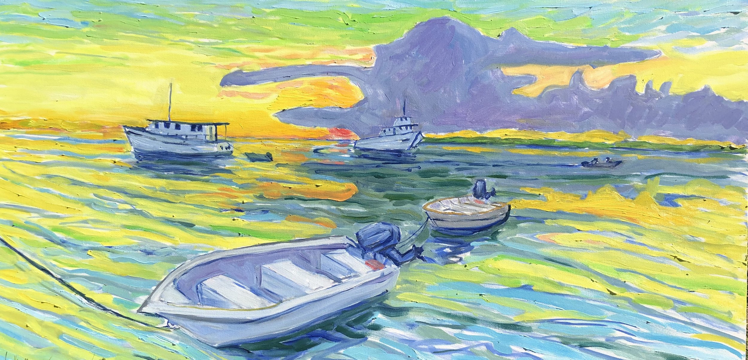
I always liked the composition. The boats and skiffs take the eye into opposite directions like the four points of a compass. That huge cloud with the red eye of the sun peeking beneath was an interesting shape and it seemed to hold everything else in place. Expressing the expanse of water and its changing colors was a big attraction. This very sketchy state is where I ended yesterday morning.
Today I decided to strengthen the olive greens in the water and go in strong with the yellow on the water on either side of the clouds. I realize that I haven’t ever used that much yellow in a scene before and it gave me a thrill. I also had to go in with yellow, orange and red in the sky around the cloud and work more on the sky transition from yellow to green to blue.
I filled in the cloud with a slightly greyed and zinc-ed down ultramarine blue and painted the shape flat with no strong brushwork. The shape of the cloud alone was enough.
As is usual, when I look back I see things I wish I’d kept. I do like the overall color harmony in this last state, but I wanted to go further with several ideas. These included getting the water reflections to better mirror the sky. and simplifying some of the areas that had become thickets of individual lines. I also worked on the interior of the foreground skiff and the shapes of the other two vessels on the horizon. This was a pretty quick piece of work, just as was true of the Captain Bob piece. Both took about 8-10 hours all told.
Here is where I ended up with the sunrise scene.
This is the second consecutive painting from the notebook of that trip. Here they are together.


