Captain Bob

About 30 years ago I went on CAVU a old style charter boat for a weekend to Chandeleur Island with friends. I was the odd man out in that I didn’t come loaded down with fishing gear. I came to sketch. As was always true with other activities, this left me last when it came to team up and go out on the skiffs. On the first morning Bob Hatch saw this happen and said come on let’s go. He fished and I sketched. It was a beautiful day. Although by reputation he was irascible, we had a really nice time that morning.

He was a jumbo sized guy - how he fit in a fighter cockpit I’ll never know. I started a sketch of him on one pair of pages from the waist up and then did another sketch of him from the waist down on another pair of pages. Ever since I have thought about trying to paint him from those two pairs of sketches.

Screen Shot 2019-03-10 at 4.20.05 PM.png


Last week Bob died after a long life, outliving his wife by a few months and leaving behind four daughters with whom we’ve been connected in different ways for a very, very long time.

Yesterday afternoon, I ran down and assembled those sketches to make a painting for the youngest daughter Sharon, who was particularly close to me through my sister Millie and through her own career as an attorney on the coast. .

I sketched it out in oil on a 24” by 24” canvas and approached it as though I were using prismacolor pencils, just as I had done in the original sketches. I got about this far by the end of the day yesterday.

fullsizeoutput_3462.jpeg

This morning I worked on finishing up the piece and realized I had to do some studies to get a real likeness. I found a few photos from family events we had attended together and used a full face view to work on how to reshape and resize things. I did a lot of the painting with just one small bright brush and then switched over to some line brushes and one larger bright to finish the sky. I enjoyed working on this study and got to completion in part because I had a solid color study to work from.

Here is how it ended up.

Captain Bob Cavu.jpeg


Bayou Bernard stages

This is another example of a two-panel field painting converted into a single canvas in the studio. Here are the two panels done mostly outdoors about 2 years ago. I like the left side especially although I wish the houses had been better drawn.

IMG_6010.JPG

And here is the final product after many revisions.

IMG_7923.jpeg

I worked up this second piece as a gift. I began it as an acrylic on canvas, basically following the original treatment of the scene. As I worked it in further I became more traditional in depicting the scene and tested out the addition of fishermen on the bank and a skiff coming around the bend in the bayou. Neither of these was satisfactory. I had the color palette pretty tightly bound to the original color scheme, which meant deep olive greens and subdued other colors except for a bold sky and reflections in the water. The stage immediately after I eliminated the skiff (0:20) is my favorite in acrylic. The original had fresher brush strokes than the second version at its terminal point in acrylics but the second one had a peaceful depth that I still like.

When I switched over from acrylics to oils, (0:30) I brightened and lightened the colors working from right to left. I was mostly interested in getting the sky and water to be reworked in oil, but once one starts that, it’s necessary to go over the whole thing in oils to make the piece hang together. I enjoyed working with oils for the first time in a very, very long time. The intensity of the paint and the fluidity and richness of how it goes on were things I had forgotten about.

As I moved to the left side, I found myself doing much more fine drawing with brushes which led me to use a yardstick in place of a mahl stick. This became necessary because the underlying oil paints weren’t dry.

I reworked the two houses to better develop their design and details. I also eliminated one of the pavilions at the end of a pier, which opened up more lawn and enabled me to show oak trees in better detail in the middle distance. In the original painting the perspective is drawn to lift the buildings, but in the second piece they are basically in line with the horizon.

After trying several times to add figures back onto the little spit in the middle of the painting, I took them out and then added a pickup truck in front of the house on the left. I made various adjustments to account for relative size and perspective of buildings, trees and people along the way, and then worked a lot on the water, settling for a pretty flat surface in the open bayou and a reflection effect in the little inlet.

Here is a progression of stages of the Bayou Bernard landscape with a transition from acrylic to oil in the last few.

A restoration

Among the paintings my father-in-law bought while at auctions and garage sales in New Orleans and on the Gulf Coast was this odd portrait of a girl with toys by Hulda Gibson of Mobile. A search revealed that it was called the “Flower Child” and it won a portrait prize at an art show at the Edgewater Mall in 1971.

When the details sink in - the girl’s ambiguous expression, the doll longing for a hug, and the smiling puppet pointing a gun at the girl, let alone the mysterious lighting - it gives off a Night Gallery mood which strongly appealed to Alexandra. The top left corner of the painting was eaten away while in storage and so it was deemed damaged goods.

IMG_7705.jpg


Earlier this year Al asked us to repair it. We couldn’t afford a professional restoration and so, without knowing how, I agreed to try. Over Christmas holidays I read portions of Ralph Mayer’s handbook on art techniques, ordered rabbit skin glue and other supplies, and set up tables to do the work.

Back in Aix I had primed a few canvases with rabbit skin glue but I hadn’t worked with it in forty years. Mayer’s instructions were complex and the steps were sometimes out of sequence so I had to reread it and construct the correct order. The rabbit skin glue had to be dissolved in water overnight, heated, and then combined with a mixture of wallpaper paste and Venetian turpentine. I was using some of Christina’s kitchen containers and tools which provoked anxiety. Part way through, I went over to David Art Center in Metairie to get some specialty supplies, and new stretcher bars.

aeKaw52GQ0ylNyfDtXYXBg.jpg

The new surface had to be primed on a larger frame and then coated with the mixture. The old canvas had to be trimmed and cleaned and the back side had to have a light coat of glue, and be carefully placed within the lines drawn on the new surface. The surface had to be smoothed and the excess glue squeezed out with a rubber roller. Mayer insisted that a 20 pound tailor’s iron be used to bind the two layers but I didn’t have this implement. With the face of the painting covered by a layer of mulberry paper and plywood fitted on top of the old canvas and behind and inside the stretchers of the larger canvas to provide support, I then compressed the painting to the new surface for several hours.

IMG_0740.JPG
IMG_0741.JPG

Next I primed the canvas outside the edges of the painting and when that dried, I cut the canvas out of the larger frame with a box cutter and stretched it onto a new frame of the original dimensions, 32” by 38". I used a pneumatic stapler to stretch the canvas and got it pretty close to the original position. There are a few places of poor adhesion and lifting away from the surface but on the whole it holds up ok. I added another coat of prime on the area eaten away and then pulled out the oils received as a Christmas present and added the background colors, getting a pretty close match.

rt0qY0XzSfOiK2QtMZN44w.jpg
ZFzlNOAUQlWS9m1R0rqLTQ.jpg

What I learned from this was that I have been very reluctant to try new things, learn new techniques and work from someone else’s instructions. At some point I realized that no professional curator was going to come behind me and pass judgment so I just got on with it. Before coming to this point, I was very unpleasant company as I struggled through new things, but once I let go of that notion of being judged on the work, it ended up being interesting.

2019 will be a year when I work more in other media, mostly oils, but also perhaps watercolor and other media. It also will be a year where I work more human figures and man made objects into my paintings. After so many years of painter’s block, this is a hopeful prospect. Thanks to Christina for encouragement and patience during my times of frustration and doubt.

Redo and Repro

A redo.

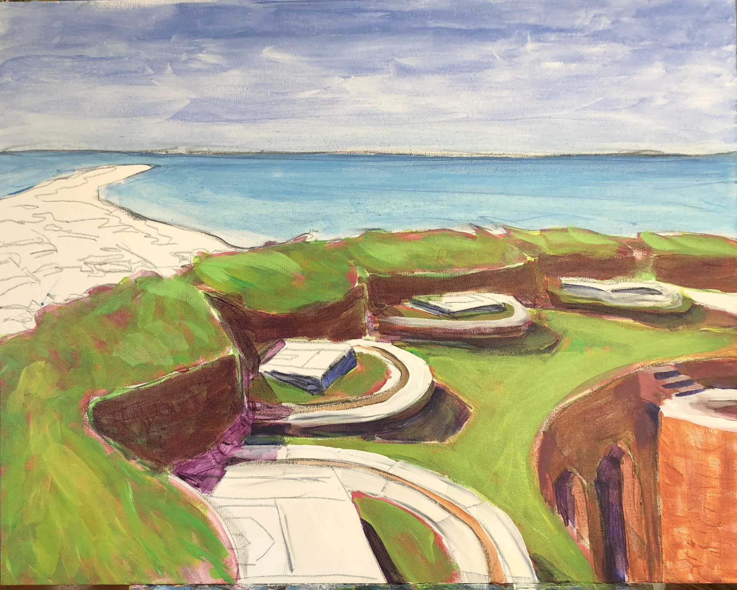
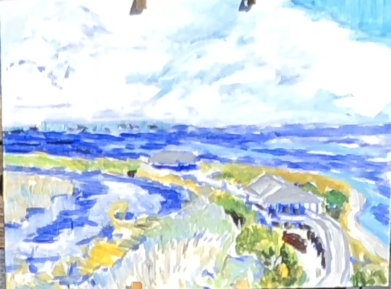
I wanted to make a gift to my brother Stan, since we are all that remains of our immediate family. I asked him to pick a piece from the gallery and he chose the Fort Massachusetts view from inside the fort looking west to the tip. There was one thing about the original scene that I wanted to improve - a better glimpse of the brick staircase on the right. So, I shifted the rest of the painting several inches to the left and put in half the column that holds the staircase. This is the stage with the reversed colors underpainting for the fort.
Nf2xyKnSTB6x82Aopt7o1w.jpg


I added the next layers of color and the preliminary shadows with a round brush. I did the water and sky with the blues lightened and limpid using zinc white and some medium. All this is in a rough cartoonish manner with some of the underpainting showing through. I wanted to keep the painting thin and flat like the original. 

fullsizeoutput_2e5a.jpeg


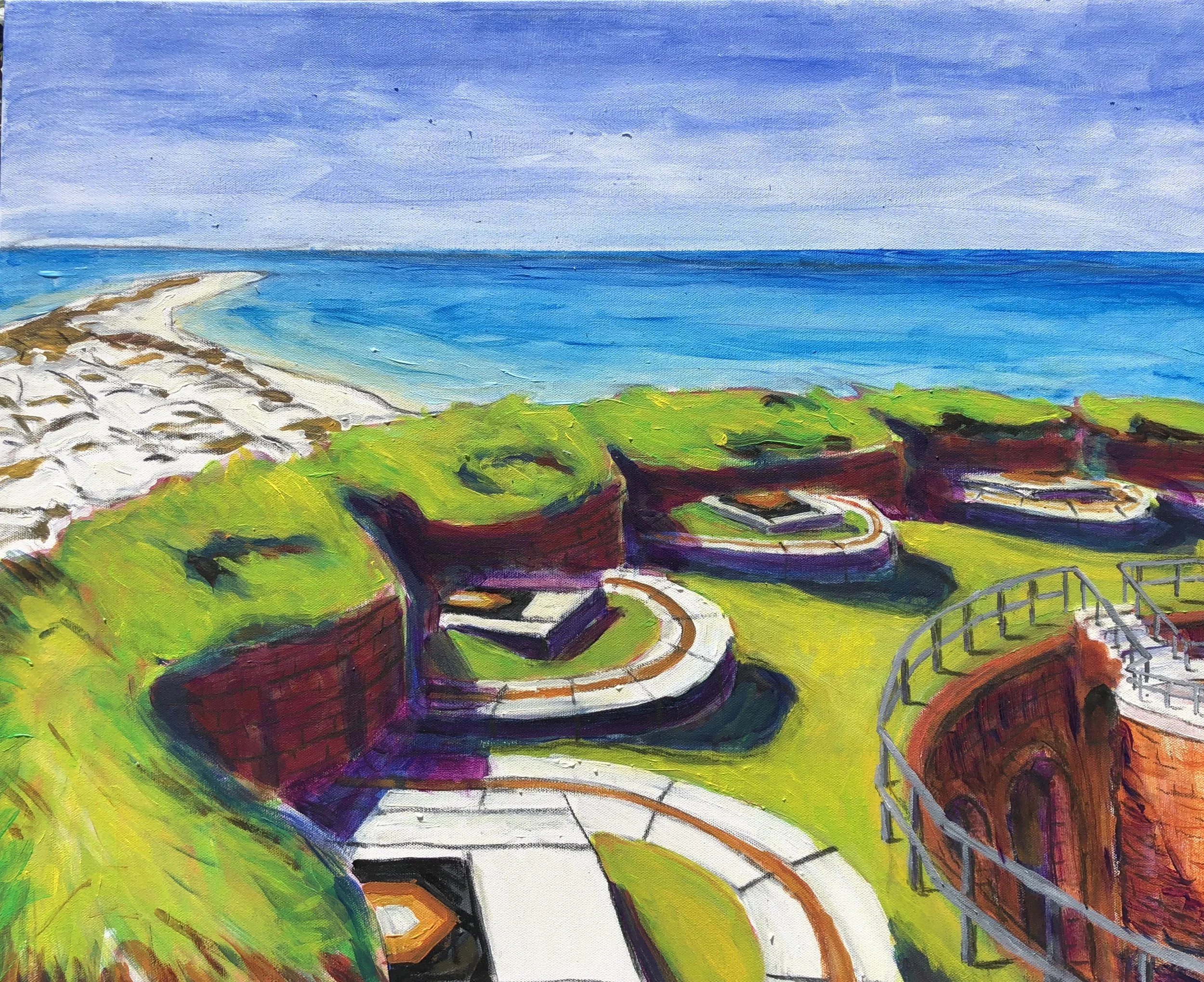
When I got back from North Carolina and New York, I sat down to get the painting finished. I liked how the brickwork shadows turned out on the stairwell and inner wall.   I spent a good bit of time on the rails and realized after the first try that I had made them too small on the stairwell. I also was aiming for a different effect on the shoreline. I used a mist spray to dampen things before putting in the sky.

fullsizeoutput_3042.jpeg


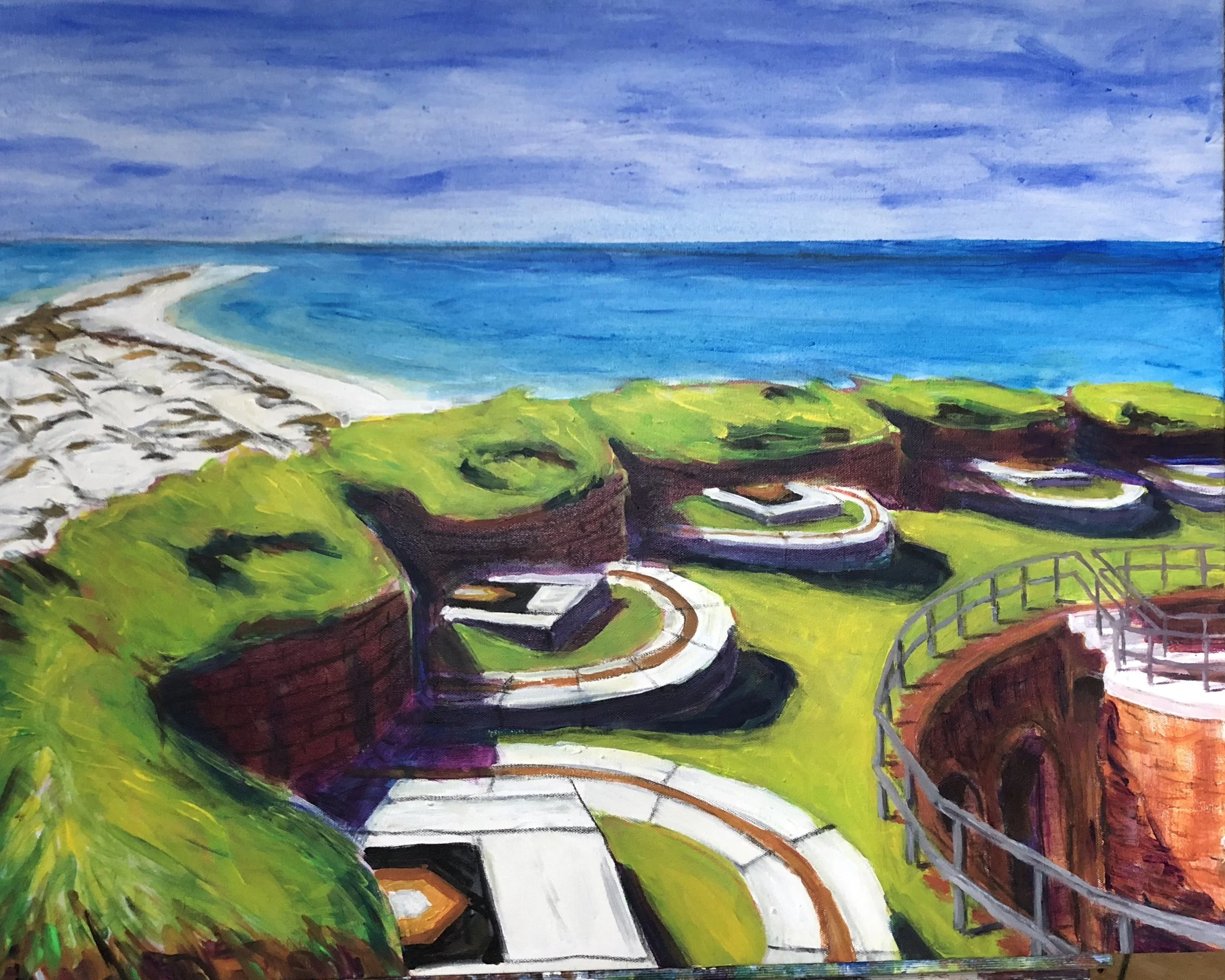
On the final effort, I used a measuring tool to help me get the stairs and the rails done correctly. I also reworked the water and the shoreline. In the end, I think I improved upon the original by adding the stairwell and rails. It's not a practice I plan to repeat, but it was interesting to rework a scene I had already done.

The repros. (Really, these aren’t reproductions as in duplications of the original. They’re more like more fully realized works, without the seam in the middle. Vistavision versions)

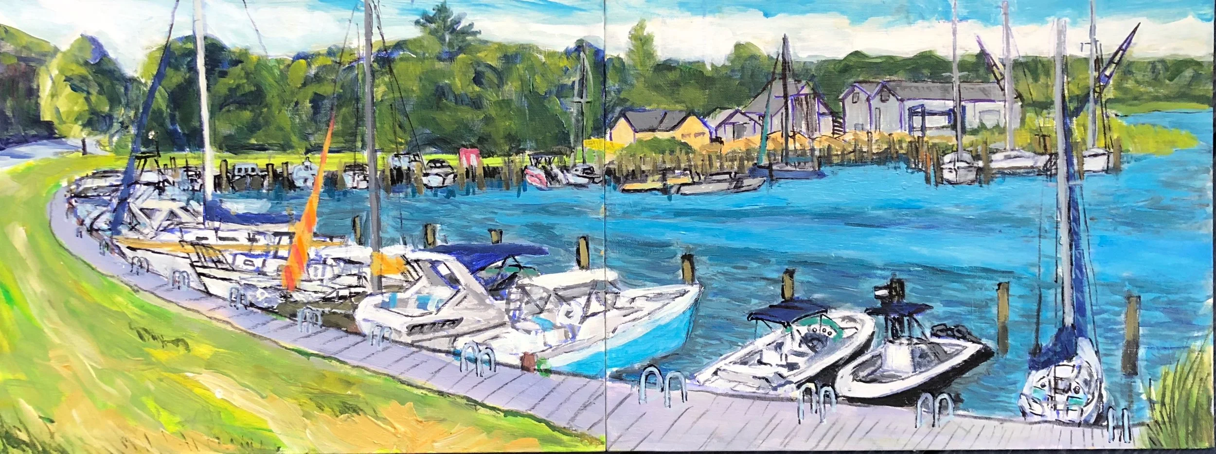
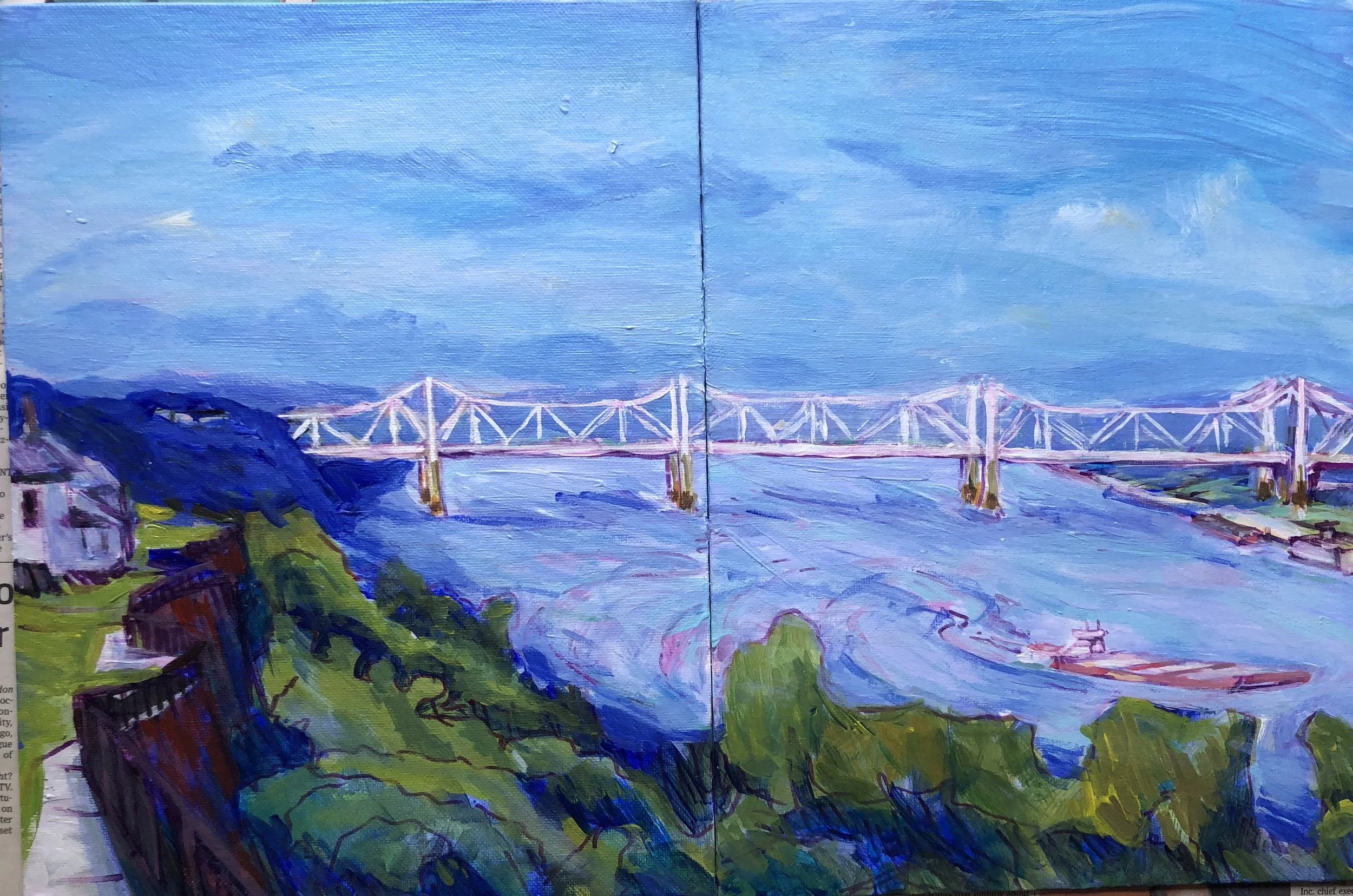
When I work with the pochade box the canvas panels are so small that I have to use two to get a scene done. I had two scenes I liked a good bit from Long Island and Natchez and decided to paint them on bigger canvases. So, this is a little like the previous episode, but I am not trying to reproduce a copy of the painting. Here are the two field studies.

IMG_6911.jpeg
fullsizeoutput_310d.jpeg

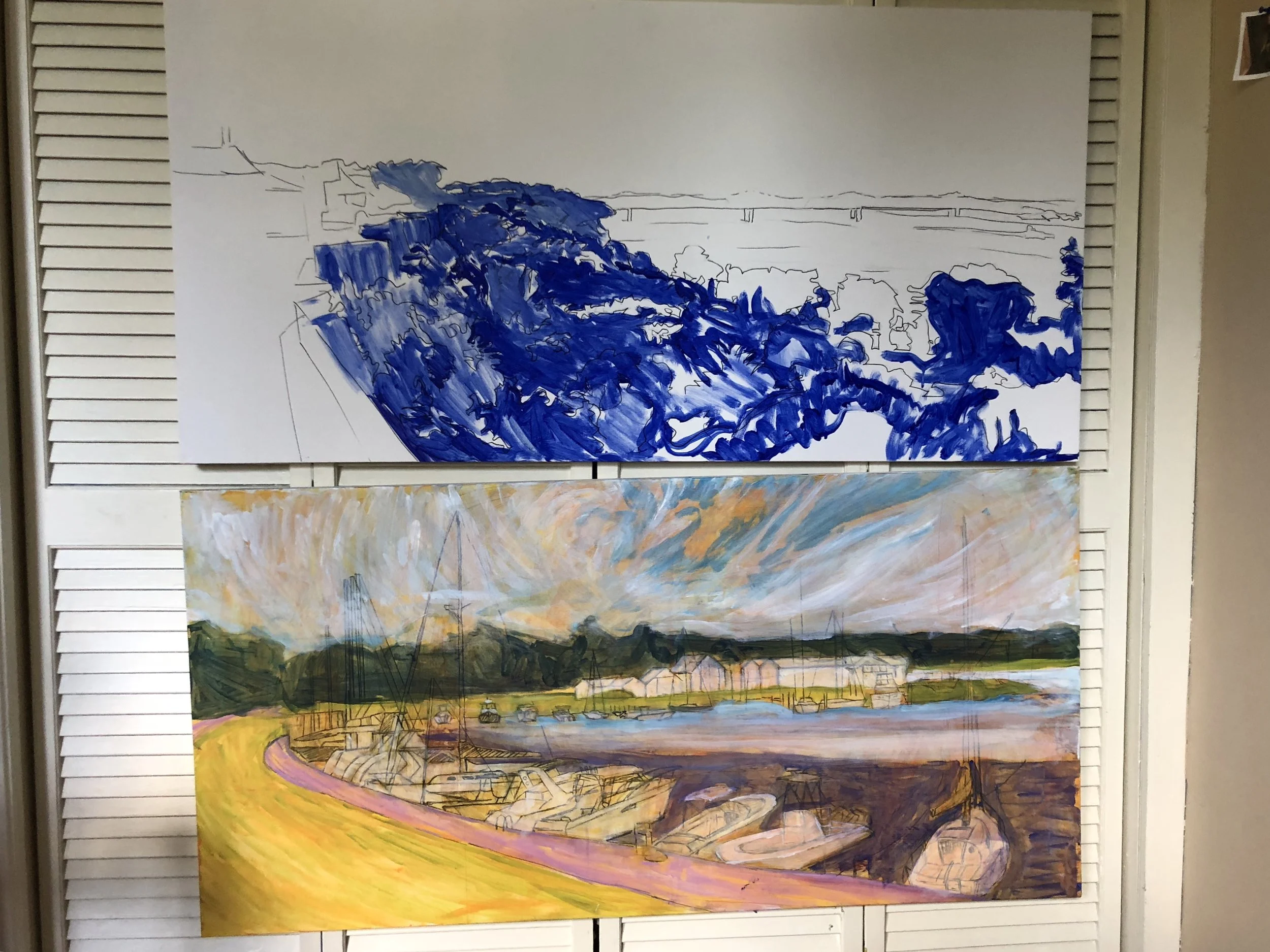
And I have started to put the full size paintings together with the beginnings looking like this.

fullsizeoutput_315d.jpeg

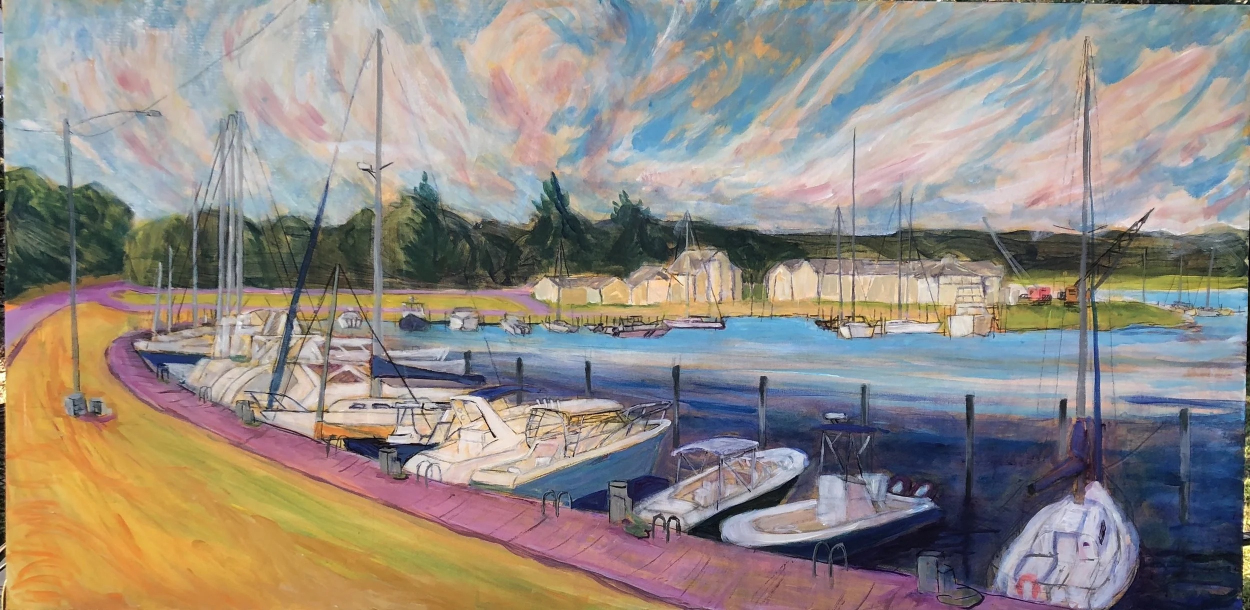
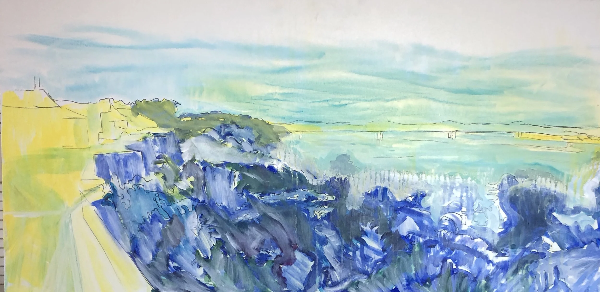
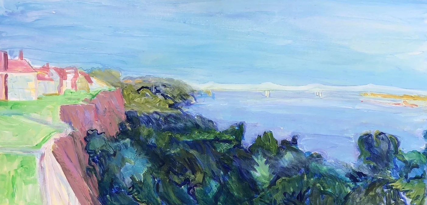
I worked more on the 3 Mile painting, and managed to hold onto enough freshness from the first pass and keep the overall approach thin. The thinness reminds me of the Fort Morgan scene overlooking Bon Secour bay, the first piece in this gallery.

fullsizeoutput_31e0.jpeg

One thing that has nagged at me is the yellow and pink in the foreground. I like it and value what it does for the overall color harmony. Still it seems wrong. I tried various alterations out using the tablet app and the only thing I learned was that burnt sienna and pink are an interesting combination - something I could have learned from any number of Matisses. Not the only thing, actually, I learned that whatever the issue with this yellow/pink foreground, every other choice I would make would weaken the painting.

One side effect of working on the pink bulkhead is that I accidentally added some diluted burnt sienna to the sky. This was a nice touch.

On the Natchez scene, I’m still working on the under painting. I had turned the foreground into a bank of blue cabbage. So I began to erase that. Also I worked on getting a sort of golden glow on the lower part of the sky using a mister and light passes of yellow. I let this drip down into the river and it kept going further down penetrating the white I had laid down to make room for more river.

IMG_8245.JPG

Several passes later I got to this level, thalo blue and some other tricks added to create the odd lighting. I decided to put this aside for the time being and return to it later.

IMG_7482.JPG

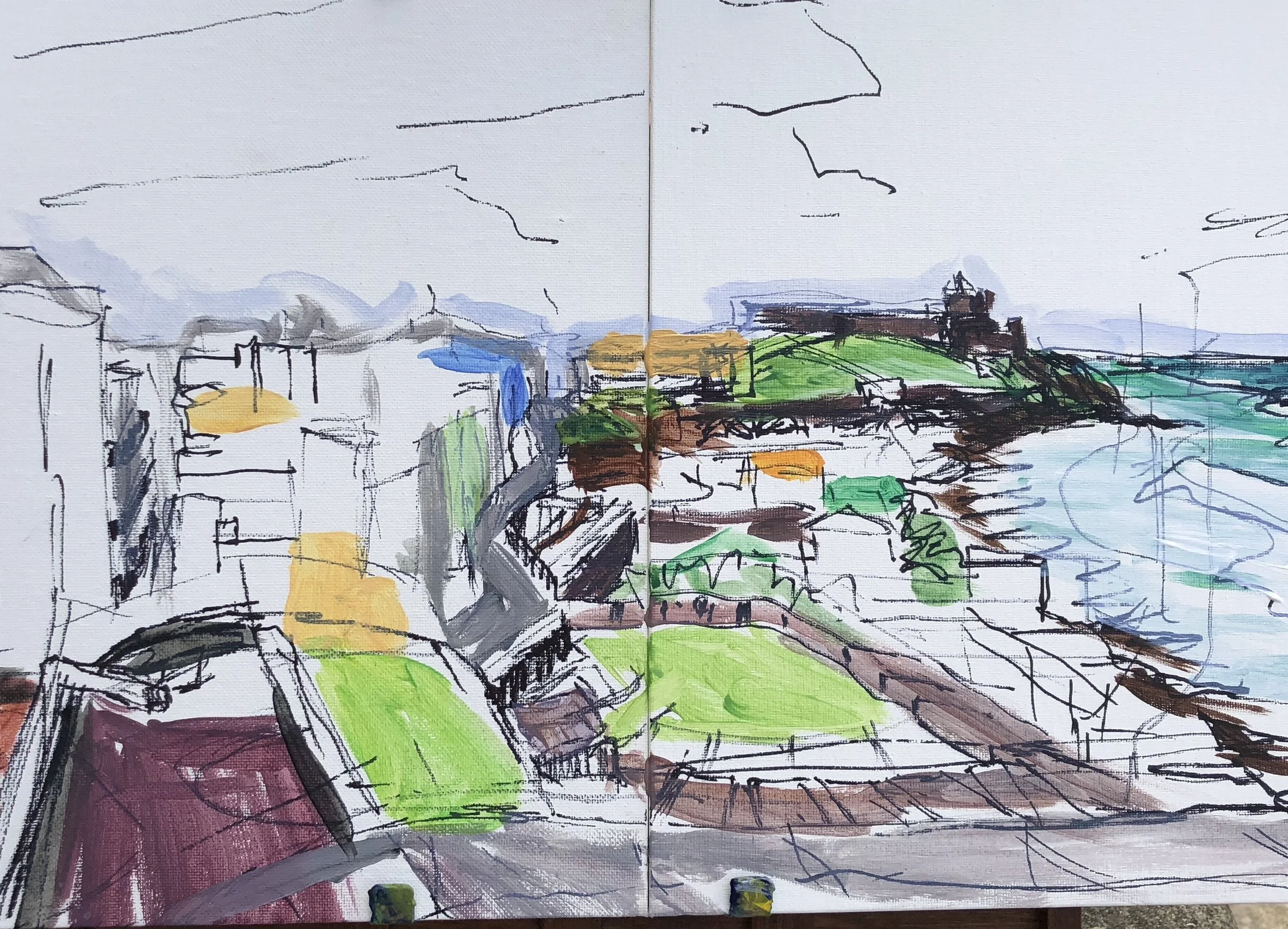
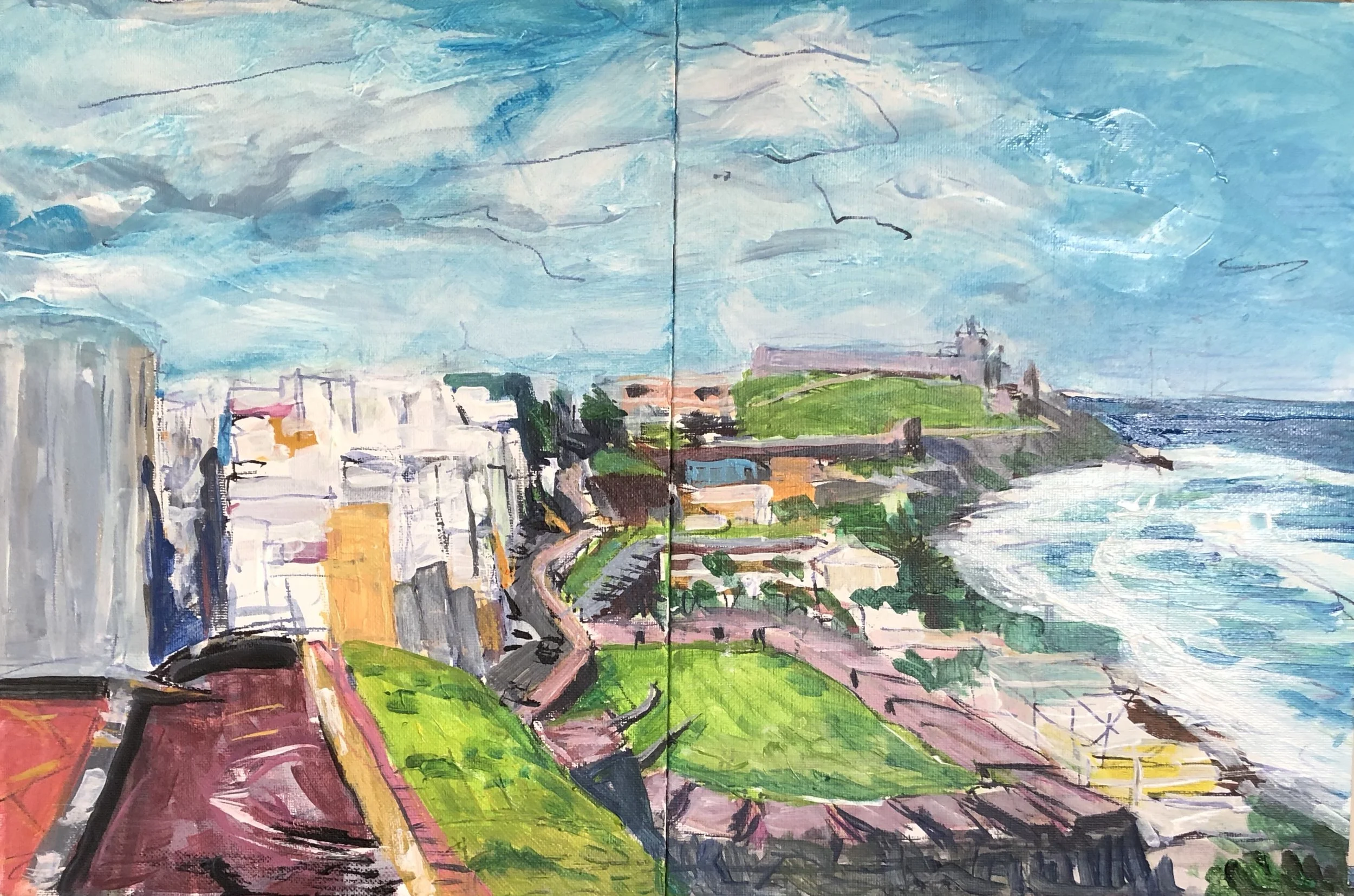
Next is this scene from the Castillo de San Cristobal. Something I noticed from my early days is that I tended to cram things into the scene especially when working small. This piece is a compacted version of what I saw and I will enlarge it by placing the composition into a large square canvas. Here is the sketch.

fullsizeoutput_3195.jpeg

And here is the scene filled further in. I must say I’d like to find a way to enable more of the sketch to show through when I go large. Stay tuned.

fullsizeoutput_3196.jpeg

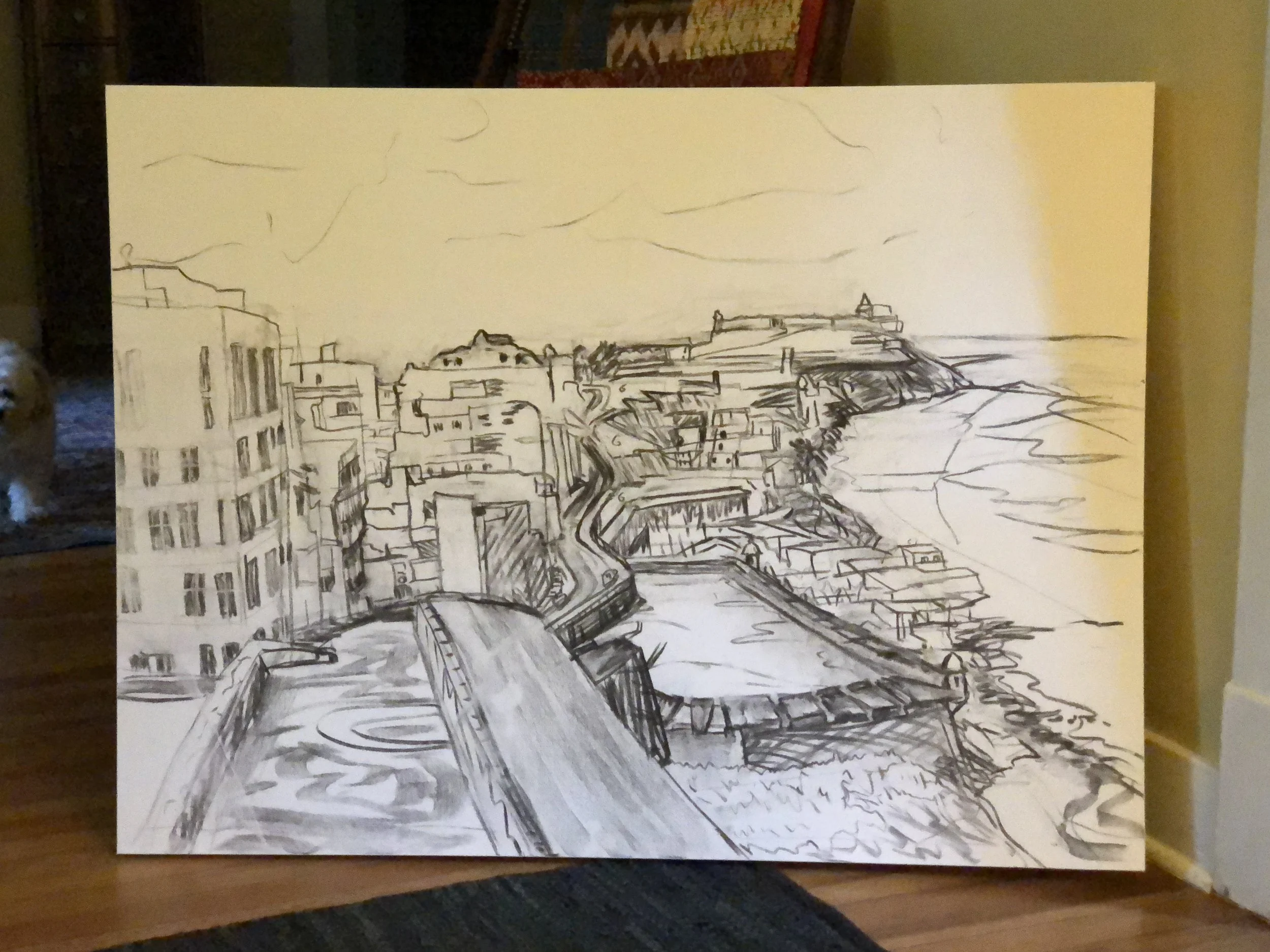
I moved this one up to a larger canvas as well, 36” by 48”. Here is the drawing.

IMG_7512.JPG

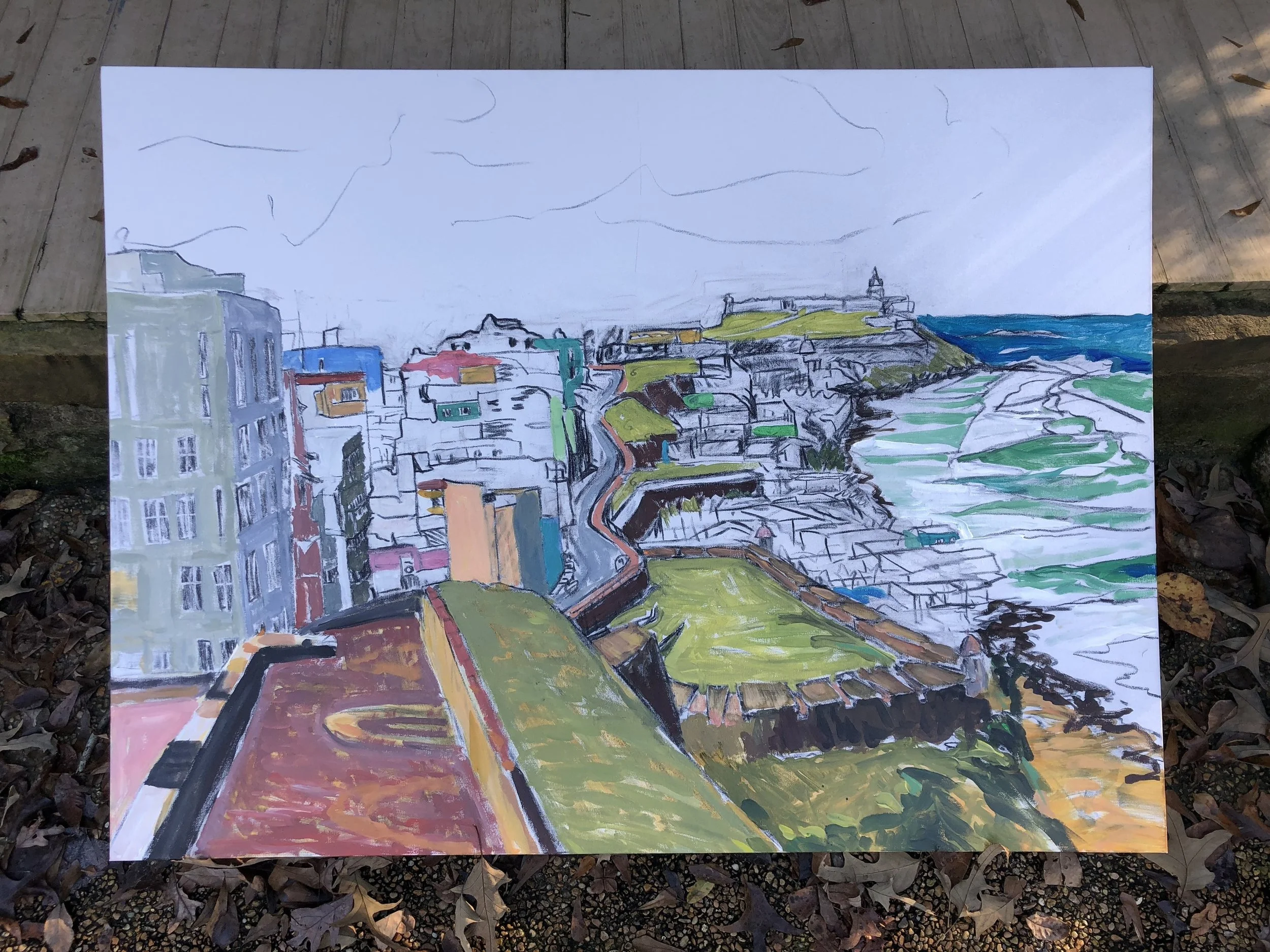
I worked this in with only a small amount of undercoating because it smeared the charcoal drawing. Fixative did not solve the problem.

IMG_7523.JPG

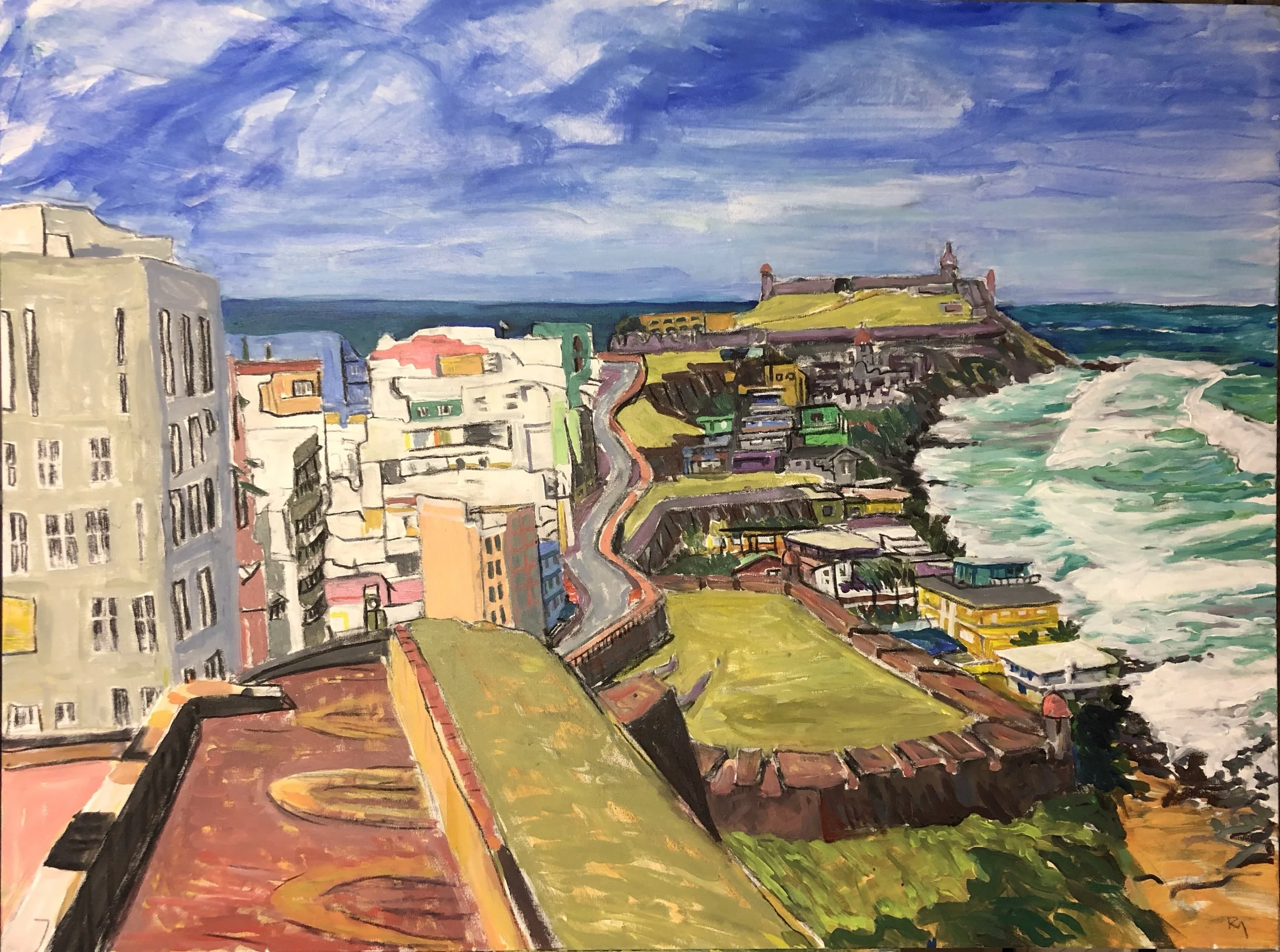
Left side stayed pretty thin and right side got a little looser. Here is where I am now.

fullsizeoutput_32d8.jpeg


Pisgah esquisses

Here are some sketches from our time off in the Pisgah National Forest plus one larger painting. In all but one case I began the scene in situ and then finished it the next day back at the cabin. This stretch up here has been closer to the pace of painting I had as a college student. I have enjoyed it a great deal. 

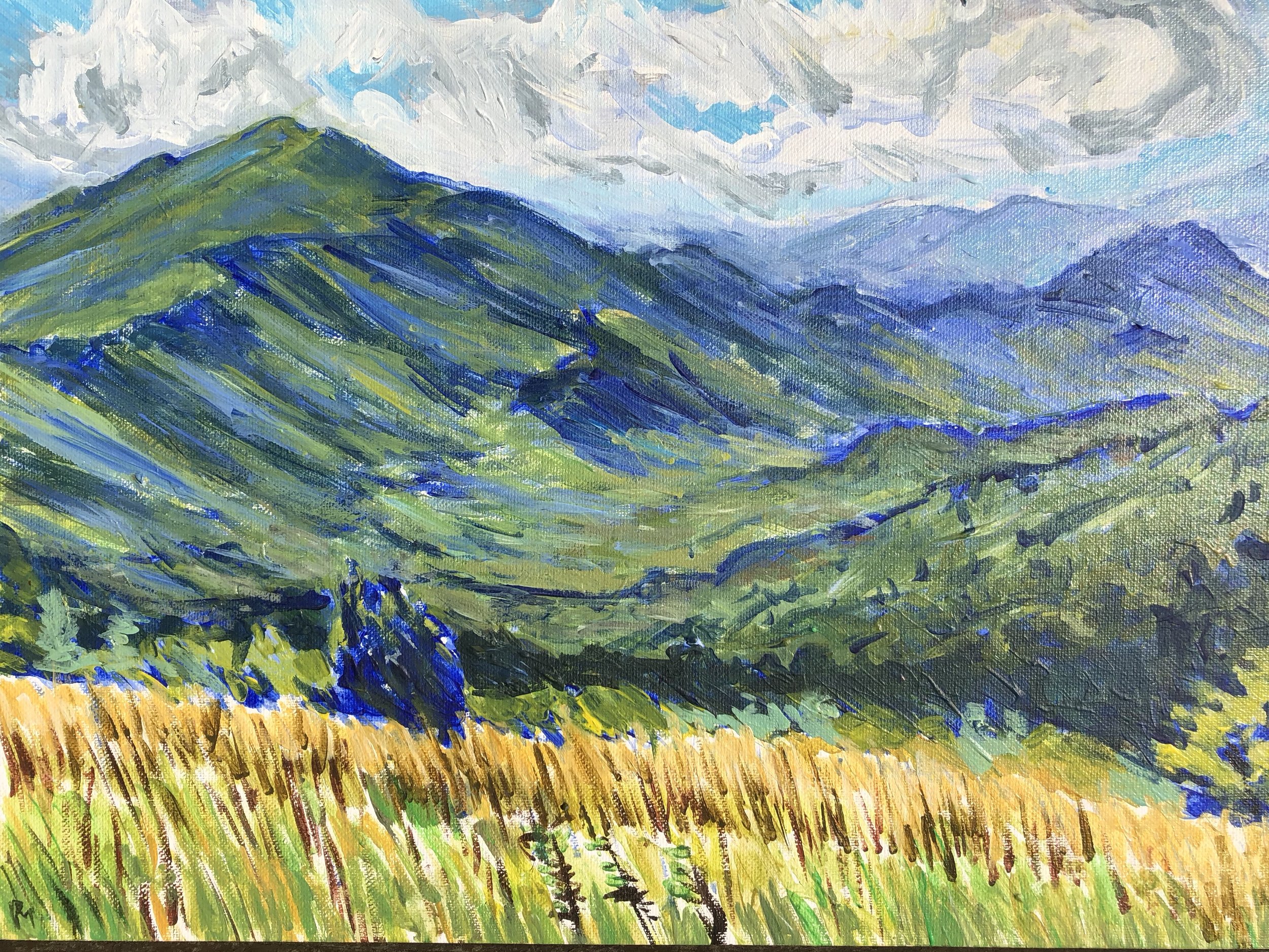
The first one is Max Patch looking west toward the Tennessee line. Christina and I went up there with Pearl and slowly made our way to the top. It was blustery and very cool. Lines of clouds swept past, surrounding us. For a memorable time we were alone. A young woman hiking the AT approached from one direction and then a group of about 30 teenage girls came from the opposite direction. Christina and I went down the hill and I set up to start a painting. 

I didn't go for the softer texture that the mountains usually have here. Instead I used the small paintbrush like a colored pencil and so the piece has a texture mostly of short slanted lines.  This stage has my favorite state of the distant pe…

I didn't go for the softer texture that the mountains usually have here. Instead I used the small paintbrush like a colored pencil and so the piece has a texture mostly of short slanted lines.  This stage has my favorite state of the distant peaks on the right. Those colors are so soft and beautiful. I laid it out in a blue drawing and spent about 3 hours filling it in and then walked down to meet up with Christina in the trailhead parking lot. 

Back home I worked on the contours of the mountain faces and tried to keep the colors on the light side. I also worked on the foreground and came up with a combination of layers that worked well. It ended up having a stubby line texture and a mixture of blues and wheat yellows that people sometimes associate with Vincent. 


fullsizeoutput_2eec.jpeg


On this same hike, I took a photo of Christina with Pearl lying down looking to the north. I sketched something out very rough but didn't paint it at the site. Instead I came home and worked on it sometimes using a reference picture. This is unlike how I usually work. The scene of Christina lying down before a bank of grasses has a little echo of Andrew Wyeth's Christina's World, and Christina would empathize with her namesake's affliction.  In any event, I knocked out the first version of this based on the drawing and tended to exaggerate the curves and paint in (for me) a comic book style.

fullsizeoutput_2eeb.jpeg

In he next stage I de-emphasized and moderated the curves of the hills in the middle distance, separated Christina a little more from Pearl and eliminated the backpack. I spent a while getting the mountain in the distance to a satisfactory state.  This is kind of a sentimental scene for me but I am looking for ways to add more humans into the work. 

I like this sky and the undulation of the mountain. I also like Christina's arms and the yellow straw hat. I regret leaving the bank of tall grass so underpainted, but I didn't want to risk making things worse.The third scene, also done on Max Patch…

I like this sky and the undulation of the mountain. I also like Christina's arms and the yellow straw hat. I regret leaving the bank of tall grass so underpainted, but I didn't want to risk making things worse.

The third scene, also done on Max Patch was from a visit several days later. I was alone and found a spot looking to the east near the place where the trail intersects the AT. I took a path about 30 yards down from the trail and that was enough to keep away most passers by. 

It was a day that threatened rain. I picked the scene because of the three trees in the foreground, and the layers of mountains behind them. I had fun exploring this scene and finding ways to simplify all the details before me. I used one of those viewfinders to frame the image and help me keep the composition within the proportions of this little canvas. I went through several stages quickly in this scene mainly because the sky was threatening rain and so the shadows cast on the scene before me shifted quickly. As that warning cold wave of air came along, I quickly covered the foremost mountain in a dark blue black and then packed out.  I like very much how the distant range blends in with the cloudy sky here. Wish I had held onto that.

fullsizeoutput_2f00.jpeg

 Something weird took hold of me on this one when I came back to it. I spent a while trying to get the mountains into balance and to make them look more realistic. Then at some point I was stuck on the sky and I turned the piece upside down to work on it- something I do when I need to detach from representational work.  After doing this I found a piece of charcoal stick and re-established the lines of the mountains and I liked that. It was very flat however and the scene seemed to have more of a color woodblock appearance. I went ahead and finished it in that spirit and ended up with this.

fullsizeoutput_2f26.jpeg


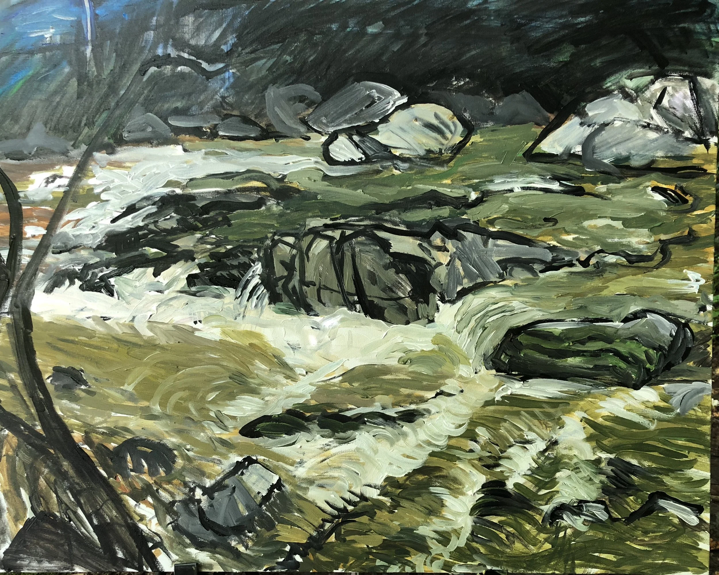
The final piece (unless I squeeze one more in on my last day here) was a view of Laurel River. For the first time, we were obliged to hike more than a mile down the path to get to the public portion of the river. I set up just in time for a rain that warped the little canvas board I had so I set that aside and waited. I unwrapped a 24x30"  canvas and set about studying how water moves among the rocks in the river.  I could probably do this for a long, long time. It is so hypnotic and calming. A few years back I had a success on a small scene from the Laurel River and so I wanted to try something larger and more complex. I spent about three hours on this and had to pack out. I was working on some painterly nuances in the river flow and becoming annoyed with how mushy it had become so I picked up a big round brush and used black paint to reestablish the lines of the scene. Some of those lines were really good and gave the work a zesty edge. 

fullsizeoutput_2f3d.jpeg

I liked this a lot but I wanted to do a better job on the water and finish the tree. I spent about 7 or 8 more hours on this over a couple of days to get the various paths of water to work together and this required very intentional (a cliché I hate) strokes of paint and a lot of close mixing of colors to get things to have volume and movement. I think this is a decent job and would love to have the chance to really master painting transparency, foam, and water movement. It is simply wonderful. 

fullsizeoutput_2f8a.jpeg

Turns out I did have one more to do. Christina and I went to Zimmerman's farm so she could pick blackberries. No one was there except a few cautious dogs and someone on a distant tractor. Christina strapped on a basket and walked down the rows marked with flags as approved for picking. She got beautiful results. I followed her with a little 9x12" canvas and did two Sharpie studies of her. 

IMG_6673.JPG
IMG_6677.JPG

Back home in Gulfport, I added some basic colors to this little study and will let this sit for a week or so before I finish it.

IMG_0703.JPG

Odogalisques

I will share a bit of history with green dogs. Here is Curvis, Cathy's dog, circled in red below. Curvis sits in the middle of the cul de sac at Bratton Circle, behind the Beacon restaurant in Oxford. He was a good dog, though I didn't appreciate him at the time. I was a highly distractible and confused law student who hadn't yet let go of the impulse to paint things. So when Curvis barked, which was often, I complained and became unruly. Neighbor Chris, always up for unruliness, joined me to hold Curvis and tint him with some green food dye color. It didn't make him bark any less. Later I did this painting. Apart from the carpet on the tin roof, and the garden stakes on the right, the interesting part is the patchwork of gravel, busted asphalt, and dirt. After putting in the shadows in an underpainting in deep blue, I did a series of quick strokes in cerulean blue, brown, and pale yellow. When it was over I "saw" in these strokes snakes  emerging from the painted gravel and the grass. In the middle of the cul de sac, I added Curvis. 

IMG_1667.JPG

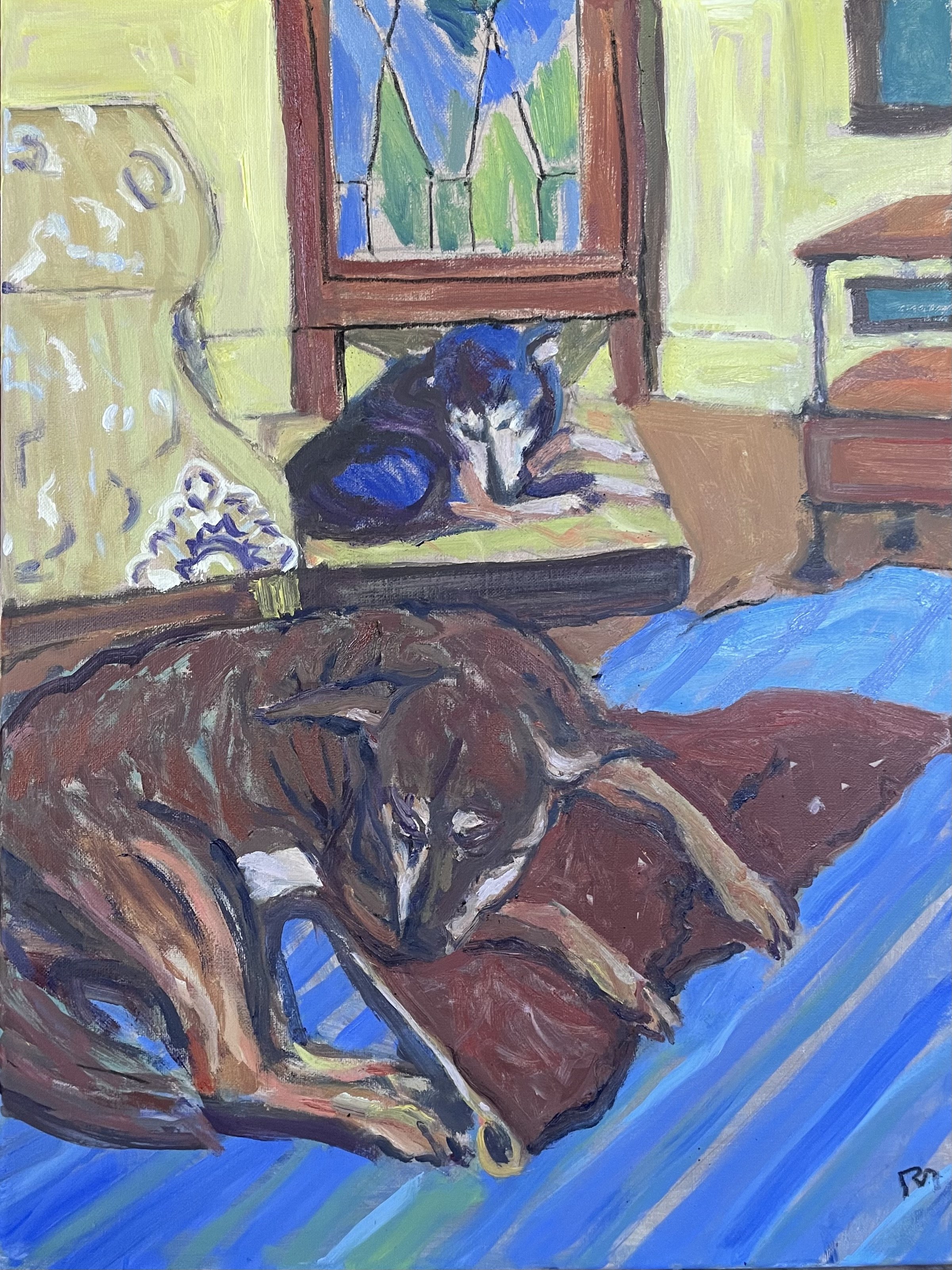
In this painting below, I didn't paint the actual dog green, just the image on the canvas. I started out painting Nash with a green forehead and torso, but couldn't make this work. Then I painted over it with the browns and maroons.  I am still trying to work out why the green and blue underpainting works with the top coats of fur.. Perhaps it is that the reddish brown complements the green and the brownish maroon is an analog to the blue. I'm sure there is a finer theoretical explanation for it buried in a book or a color wheel. For now I am just happy with the end result. 

I don't have a history with odalisques, sad to say, except for admiring those of Delacroix and Matisse. A couple of friends thought this scene owed something to Matisse, so I cooked up a pun. These dogs can't be called odalisques because these are boys, and not ladies of the seraglio. But they are lounging lazily around on cushions, they do get lots of attention, and the painting style is bright, flat, and filled with  patterns, like some Matisses. So, ok, they are dog odalisques, or odogalisques.

IMG_6235.jpg

Several years later, my older daughter Meghan asked for a copy of this painting as a birthday present and I obliged. Not something I typically do, but I went for it. I like very much how it turned out.

I actually have a painting from my very earliest days that reminds me a little of this scene. It was of a Weimaraner named Wolfgang asleep on an easy chair in my teenage bedroom. It has a much more subdued palette (plenty of green, just none on the dog) and is the work of someone who had been painting less than 2 years.. 

IMG_4675.jpg