Pruning

At the very beginning, I would take a sketch pad and a pencil or marker into some nearby woods, sit down in the brush, and draw what was right in front of my face without discrimination. I ended up with a lot of scenes of tangled bushes and grasses  as dense and chaotic as what I saw. There was no way in. Later on, I’d aim for the “perfect point of view" but there usually were flaws, things blocked, out of balance, or just unnecessary.  Getting to the point of leaving something out was a slow lesson for me. Like, years. 

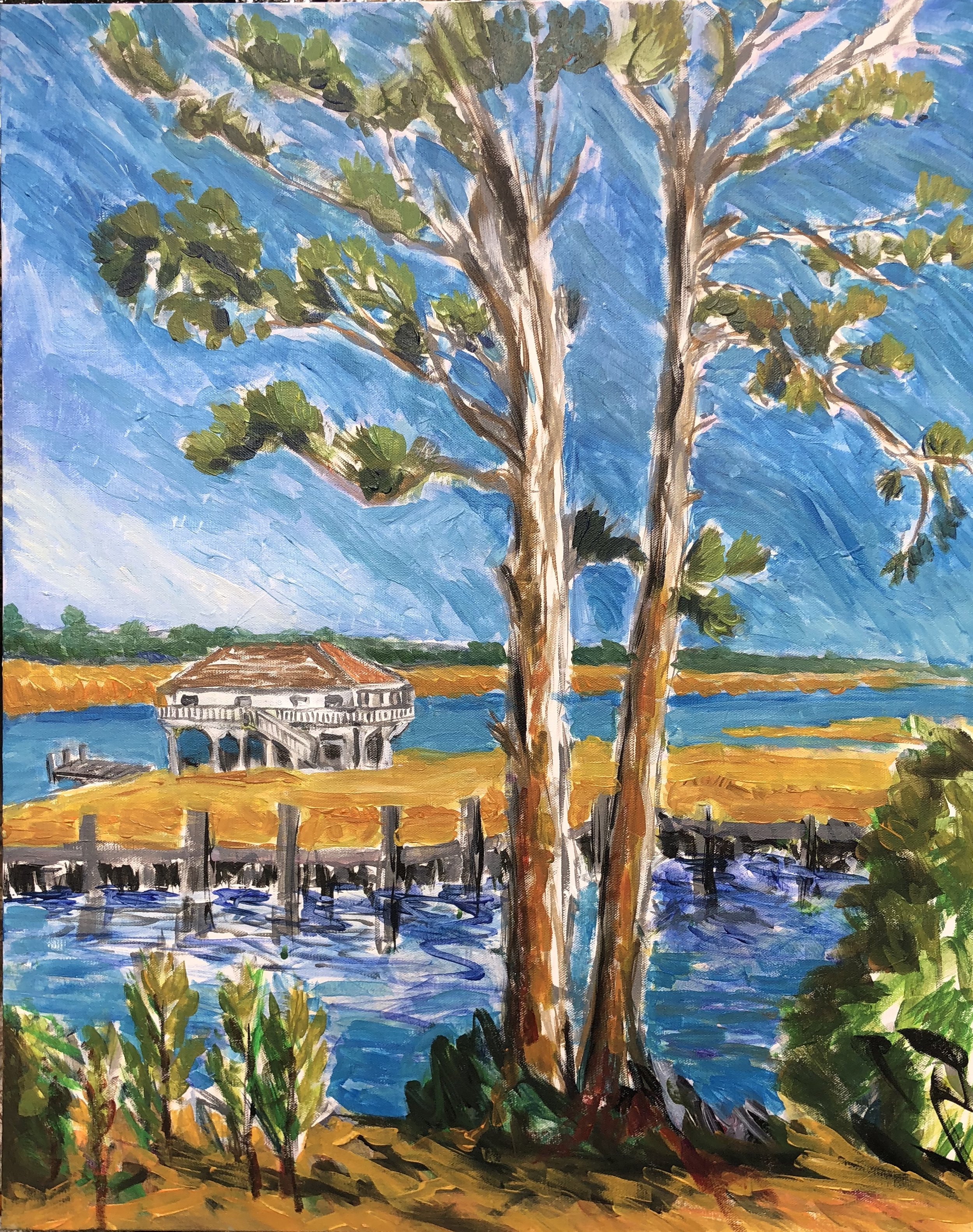
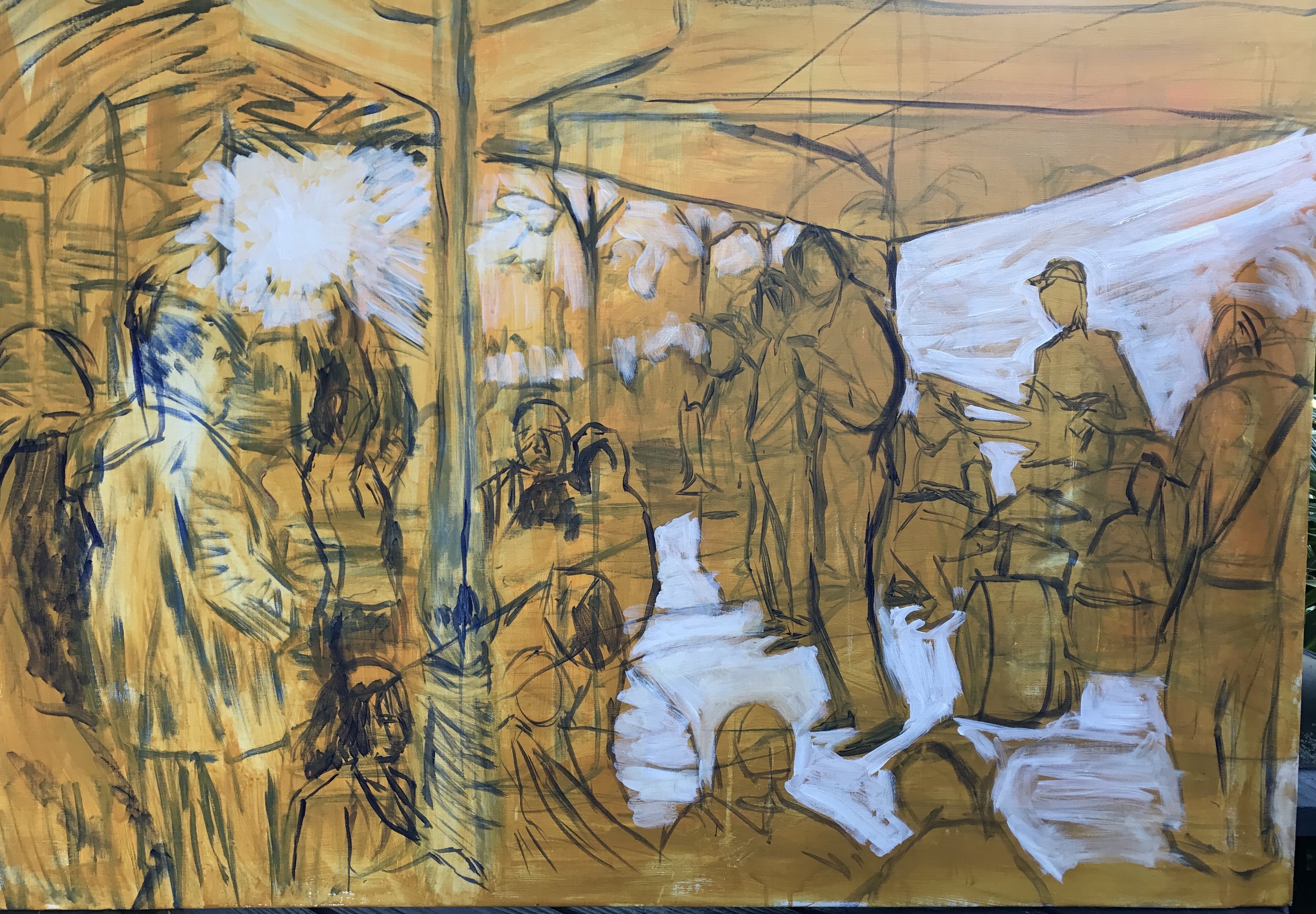
Between the holidays, I went out to Delisle and did a scene of the Wolf River. It felt at first like I was regressing into old inspirations and themes- pine trees and bushes, but what I wanted was something to see between and through the pines. I started this one out with a gray under drawing and aimed to keep the colors thin and light. This is on a 24 x 30 canvas.

fullsizeoutput_296e.jpeg

As I moved ahead all the underbrush in the foreground and middle distance began to tug at me urging me to pay attention to its chaotic half shaped tumble weeds and I went along for awhile even though it obscured the opportunity to express the freedom of travel on the river. This took me to something like this. 


By this time, my time on scene had run out. Back home at the studio I decided to do some pruning. It began by doing the sky and cutting into the tree and leaves in places. At first I did it in a lavender sky but that didn't work and so I went from white to full on cerulean with touches here and there of ultramarine. I put it in with a very small brush that felt a little like Van Gogh at first (regression, maybe, but always plenty to learn) but it didn't have that effect when finished. It felt like the blue was more intense than the yellow green of the trees and was overpowering it, an effect I struggled with in the Bryant Grocery painting. So I darkened the fans of pine needles. The piece came together when I realized I should just clear away everything blocking the house and the horizon. I used the yellow ochre and orange to do the reeds and middle  and part of the foreground. I did some softer greens for the far tree line and added a few blue strokes in the space between the yellow and green. And then I added a sky blue for the water which worked nicely with the yellows and oranges. I painted the whole house, eliminating the two trees on the left side. I used the blue in the canal to push back on and shape some of the clutter and blockage of the underbrush.  I liked the light browns in the trunk and was hoping to hold on to some of those colors along the way. This took me to this point.

fullsizeoutput_296d.jpeg

I did most all of this without using reference photos. In the final push I added red browns into the trunks and branches, put some notches into the far marsh at the waterline, put in a small road and a figure on the pier in the middle distance and worked on the foreground bushes and saplings for awhile. I used charcoal to add some graphic accents on the pier and the tree trunks.  This got me to here, and here it will stop.

IMG_4967.jpg

Bits and memory, unseen lines

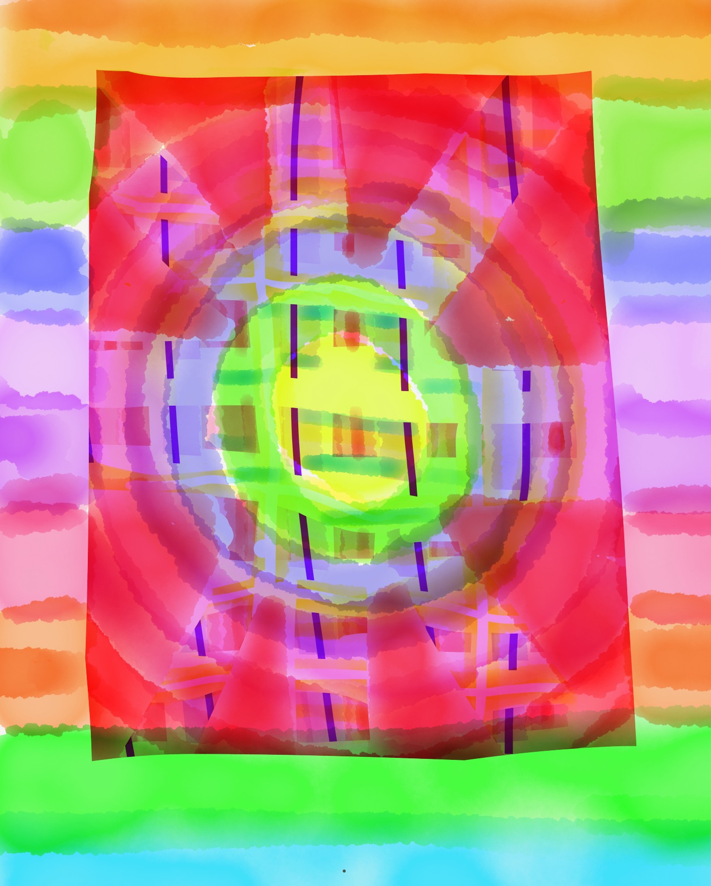
When traveling or watching TV, I sometimes doodle on a tablet app. It has wakened me up to several things. One, laying down color and then erasing around or through it to create shapes. Two, layering color. Three, accidental blending. Four, just the freedom to do any old thing and not be concerned about wasting materials. After all it's just bits and memory.

When I was unsure about how to try something on a canvas, I took a picture and imported it into the app and then used the color matching function to test out various corrections or changes. . Some worked, others didn't. In the process I also learned a bit about color matching and tonality.

For most of my life as a painter I never used black or Payne's gray. I also didn't using any mixing white. A few years back, when I started using that Julien easel, I began to use both a good deal and liked the results a lot. 

detail of Bryant Grocery


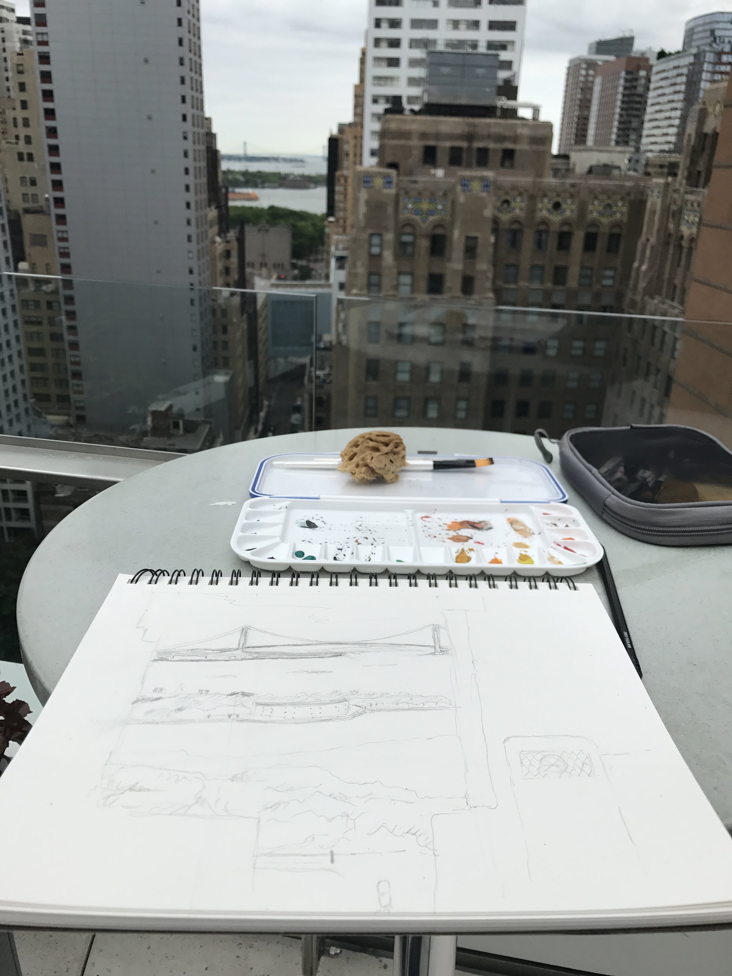
On a recent trip I took a small kit of watercolors and worked on a few scenes of the NYC stone and glass corridors. I have a way to go before I get to the facility that lets me be as free as I am with the tablet app.  But I really valued how much simpler and more portable it is. I just need to get free enough to try some of the ways of working with the tablet on a sheet of watercolor paper. 

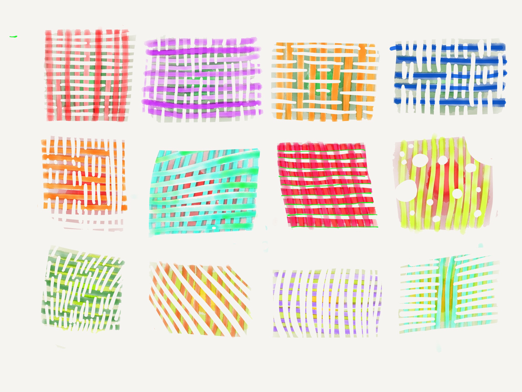
Forty years ago, a teacher encouraged me to find "The Painter's Secret Geometry" Recently I discovered PSG was back in print - for a while, I only saw lending copies and rare book offerings. It has some very interesting descriptions and analyses of how line and proportion are used across different eras in art. Until I found PSG I tried to use techniques in the Elements of Dynamic Symmetry.  This started several years ago in larger work using some basics in the EDS book, such as setting the mast and horizon in the Triage painting.

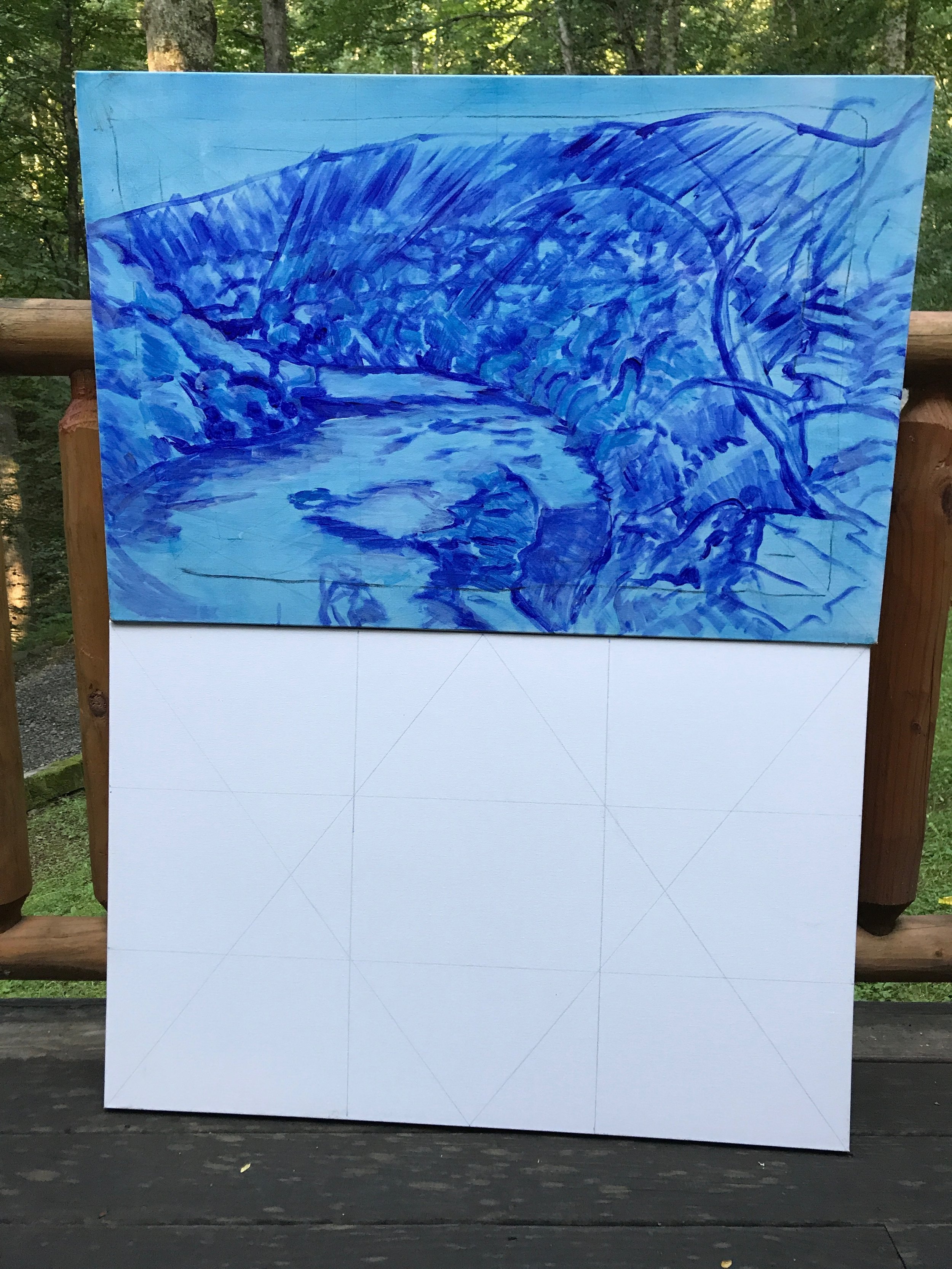
So now I am trying out some of the pieces in the PSG. The upper scene-in-progress is built on top of a grid roughly resembling what is shown in the lower grid.

Said and Not Said

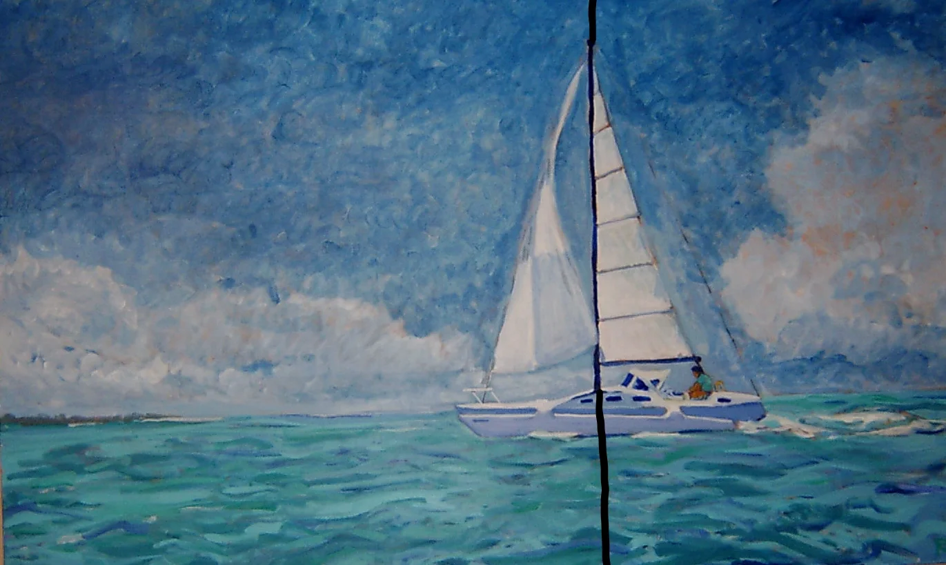
This past weekend, I went to Money, Mississippi to paint a location I have thought about for a long time. It is the roadside location of Bryant Grocery, where began one of the most notorious crimes in Mississippi, a 1955 murder that many believe helped to spark the civil rights movement.  An African American teenager from Chicago, Emmett Till, was visiting relatives in Money and entered the grocery with his companions. Till was the last to leave and a young white woman, Carolyn Bryant, later alleged that Till menaced, grabbed, and wolf-whistled at her. Within a few days, Till was kidnapped by white men at night from his relatives' home, brutalized, murdered, and dropped in a nearby river.  The men accused of the murder were tried by an all-white, all-male jury and acquitted, though they later admitted their crime in an interview with Look Magazine. In the 2000s this case was reopened and Till's body exhumed, but ultimately no further action was taken.

In a new book, the accuser, now 82, recants the accusation.  

Anyone traveling in the area can learn a lot from the excellent displays at the Emmett Till Interpretive Center across from the Sumner Courthouse. 

Across the road from where I was painting was a group of men salvaging the remains of a recent train wreck. One lane of traffic was closed and this sharply slowed down the trucks and cars that usually race down this road. A large number of people slowed to observe the painting under way, including 4 or 5 cars of people leaving a post-church lunch at the home next door to the Grocery. Not a single person mentioned (or asked me if I know) what happened there. People rolled down their windows and struck up a conversation for a few minutes. I did get some interesting questions, such as "Do you frame those?" or "Do you think my wife'd like something like that for Mother's Day?" or "Do you hire out?"

I may add some more to this later, including visits with Till's cousin, Wheeler Parker and his wife, whom I met on several MCJ road trips. But for now, I'll put up the painting as it came about. The main difference in this was to do the underpainting in gray and establish a tonal base. It produced some interesting effects early on to have the gray show through in places. I also painted this in a rougher-edged style, almost like carving out a woodcut, but the temptation is so strong to smooth out the rough edges. Once more I lost the edginess by working it a little too long. 

Here it is.


After the first touch

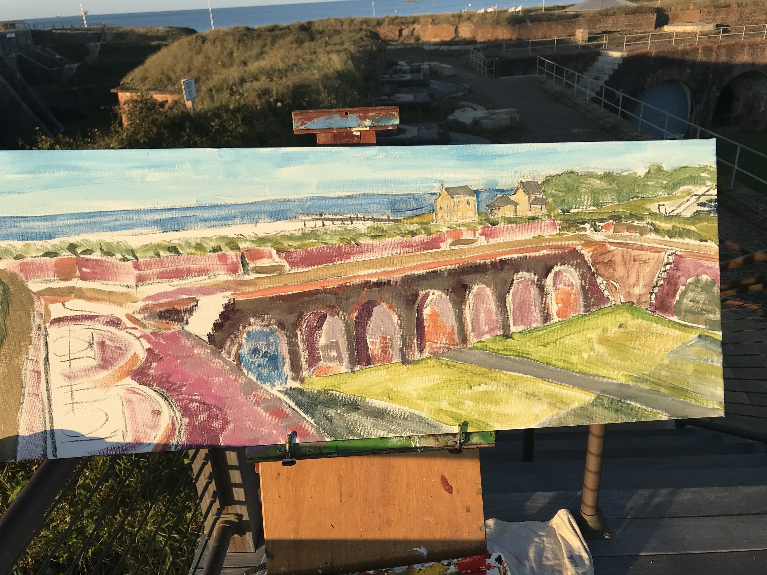
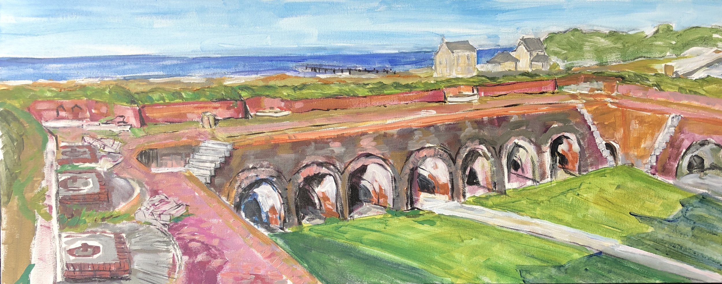
Yesterday I started a painting of Ft. Pickens. I sketched the outline in grey, then added zinced down cerulean blue for the water, a light gray with an ultra blue-green tint for the tree line, zinced down yellow  ochre and orange for the ground cover inside the fort, a sweet olive green in middle distance and on the oak tree and various orange and maroon hues for the brick fort walls. This was mostly applied in short strokes with the bare canvas showing through. Whatever shortcomings it had, this first set of touches had a nice feel and color harmony.

I have taken pictures of stages of work for awhile now as a way to learn what I am doing. There are painters who have the end product fully formed in their minds when they begin. That is an extraordinary talent. But it's not how I work. Every time, every stroke, every drawing and color choice is a product of the moment of perception and reaction. It could go in a number of different ways, bit by bit, provisional every step of the way. It involves a certain kind of concentration like contour drawing. At least, at my best, this is how it works. The one who was the best at this approach for my money was Cézanne.

Whenever I'm distracted from that moment of perception, or become tired, or decide to step back and look, then a different set of habitual thoughts kick in. These include "are the shapes right" "is that the real color" "is it sloppy there" "let me fill in that space" "does it need some drawing details," to name a few. So I'll carry on with these in no particular order. As I "fix" one thing, other parts of the picture fall further into or out of balance. There's a middle period after the first set of touches where I end up fixing some things and losing the fresh touch by housepainting, just moving back and forth with no attention to the vitality of the stroke.  There are times where I have to render something more carefully and the dilemma is to ensure that doing so still blends in with the fresher parts. At some point I arrive at a near end, then the final few tweaks and it's "done."

After painting this scene, I am thinking about using a rule to only do 2 hours at a time and then set it aside, so I can come back the next day and really appreciate what's good and fresh in the first touch.


Chladni plates, Klee, and Kyoto

"The vibratory impulse is the heart of the matter. It causes the sand to arranges itself in a corresponding rhythmical order. First in other words the vibratory impulse, the will or need for living action, then the transformation into a material event and lastly the visible expression in the form of newly arranged material." Paul Klee Notebooks, the Nature of Nature. 

Klee was steeped in music. Theme and variation, rhythm and proportion. The Chladni plates which prompted this passage must have fascinated him- the visualization of the vibratory impulse. 

Klee continues, "We are the bow, we represent the expressive impulse, mediated by the substance, with the sand figures as the final formal result. ... It is though matter were being fertilized and became invested under this dictate with a kind of life of its own."

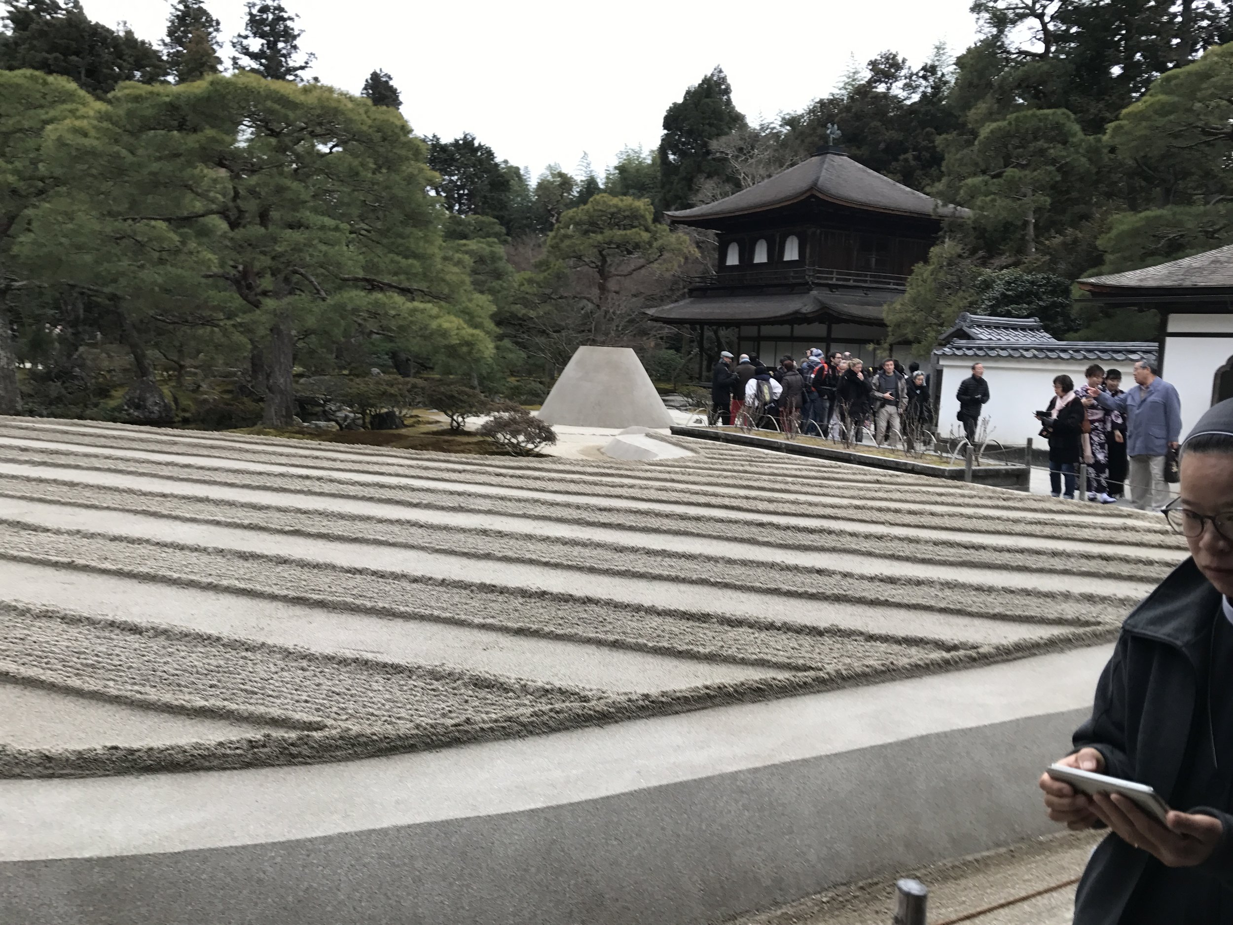
Last month I saw sand arranged in forms aimed at stilling or at least distilling  the mind's vibrations. Here are some examples. First at Tenryu ji Temple in Arashiyama then at Ginkasu ji Temple in Kyoto.

IMG_1639.JPG