When it comes to easel painting, I admire the artists who are able to create a scene from imagination or a combination of sources, such as sketches, photos, or other images. (Lately as I have done more civil war forts I have gotten interested in battle scenes.) This is not how I have worked for most of my life. Occasionally I'll work from a photo and maybe modify it a little, but it's the exception to the rule. This piece is something new for me.
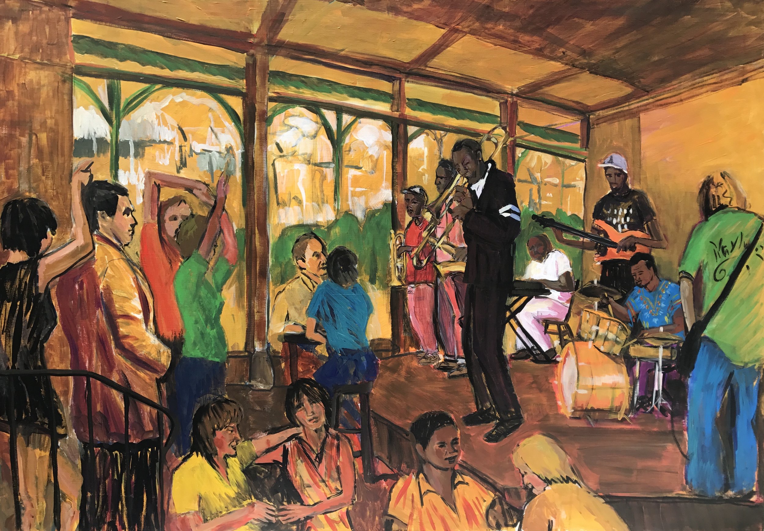
In this painting, which took me about 16 hours, I pulled a lot of different sources together. I horizontally flipped two photos from a trip to New Orleans several years ago- one of the man in the coat on the stairs (call him John, since that's who it is) and the other of the band - and reimagined the space as an interior scene looking out to the street. I populated the audience with people taken from imagination, memory, and a backlog of sketches in music spots and nightclubs. In a few cases, I used an unrelated photo or a sketch to fill things out.
Doing a scene like this was something that motivated me long ago as I was seduced as a teenager by the lively depictions of Parisian nightlife. I never got a piece done to my satisfaction, although I have a lot of sketches of old Jackson haunts like Poet's, CS's, the Dock, George Street, and other hangouts in New Orleans and along the coast. So, about 40 years later, I'm finally achieving something I had hoped to try for a long time.
Early on, it wasn't clear whether this painting would be the same as an earlier version I had done. Here it is.
In the earlier version I flipped only the figure on the left, John, and I didn't try hard enough to link the two sides of the painting. We're looking over the shoulder of John walking past an open nightspot and listening to the band. I liked both sides of this painting, but I wasn't happy that the left and right sides seemed so disconnected and the styles seemed very different. I also didn't try to do an audience- instead I have this strip of chaotic abstraction on the far right.
In the later version, I placed John inside the room, flipped the band, so they were facing each other, and created space between the two for an audience. To do this I took the point of view of the interior of the club looking out. This solution wasn't settled at the outset however, and for the first day I had an interesting push/pull between interior and exterior elements. There are some painters who can carry that off in a final work, like Diebenkorn. I'm not there yet. So somewhere in the second day I settled firmly on an interior scene, but I still held on for a while to the green lamp with the street signs, although I did modify the top to remove the signs and add the curved braces.
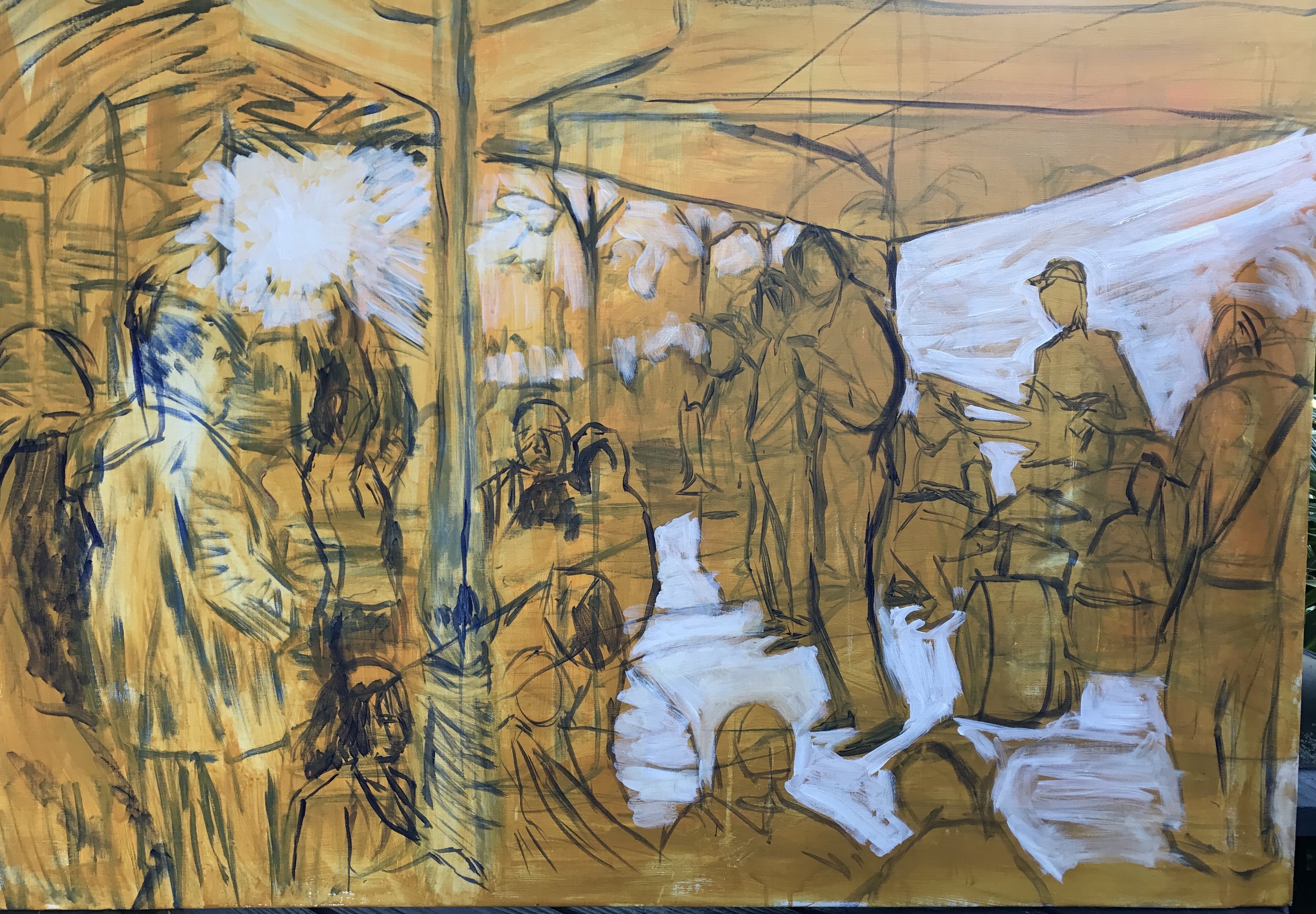
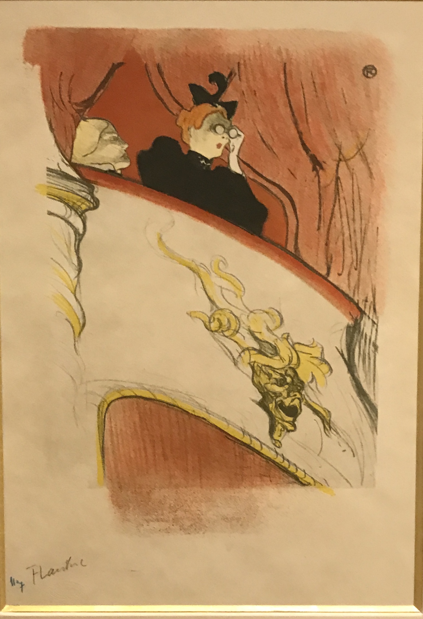
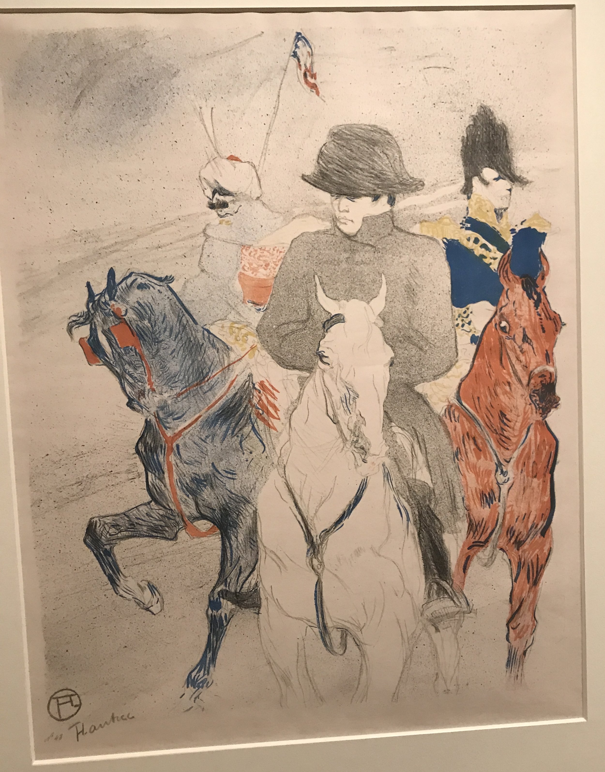
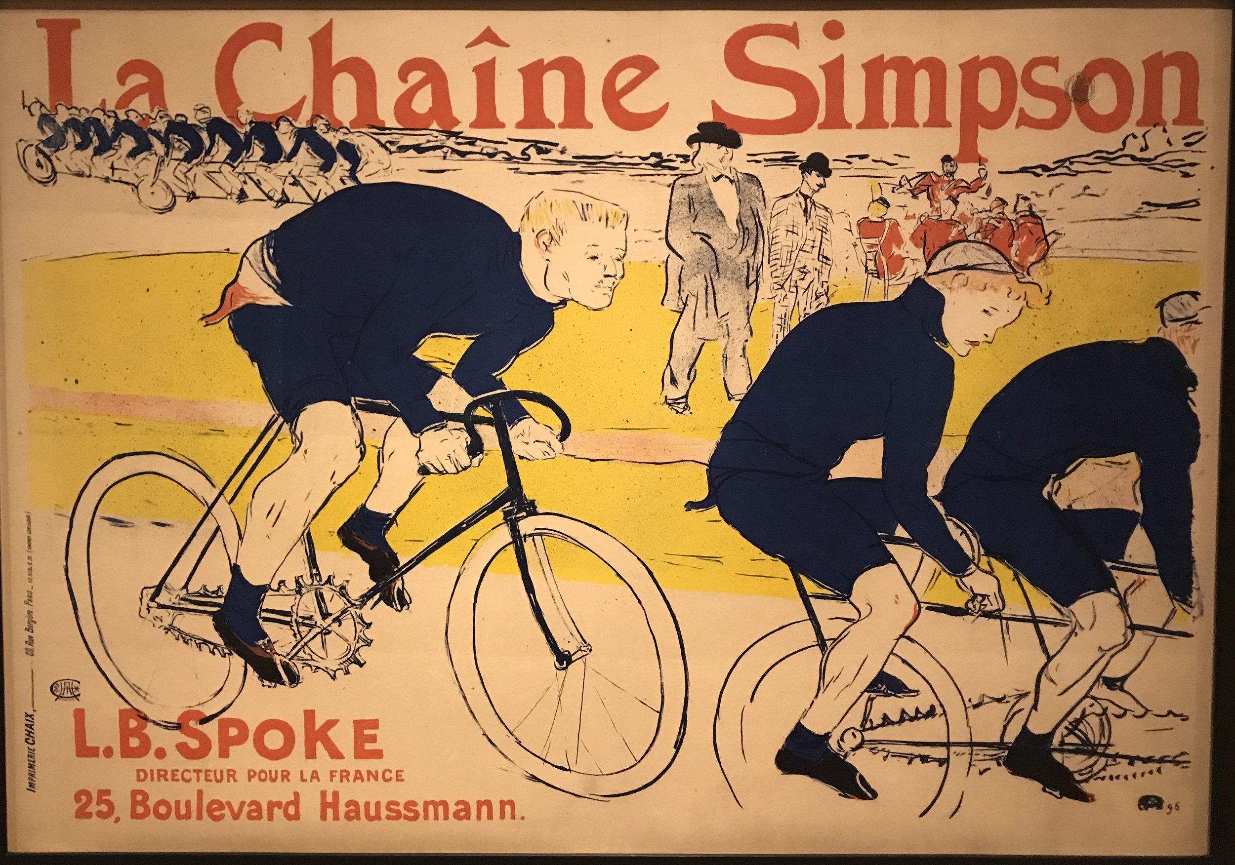
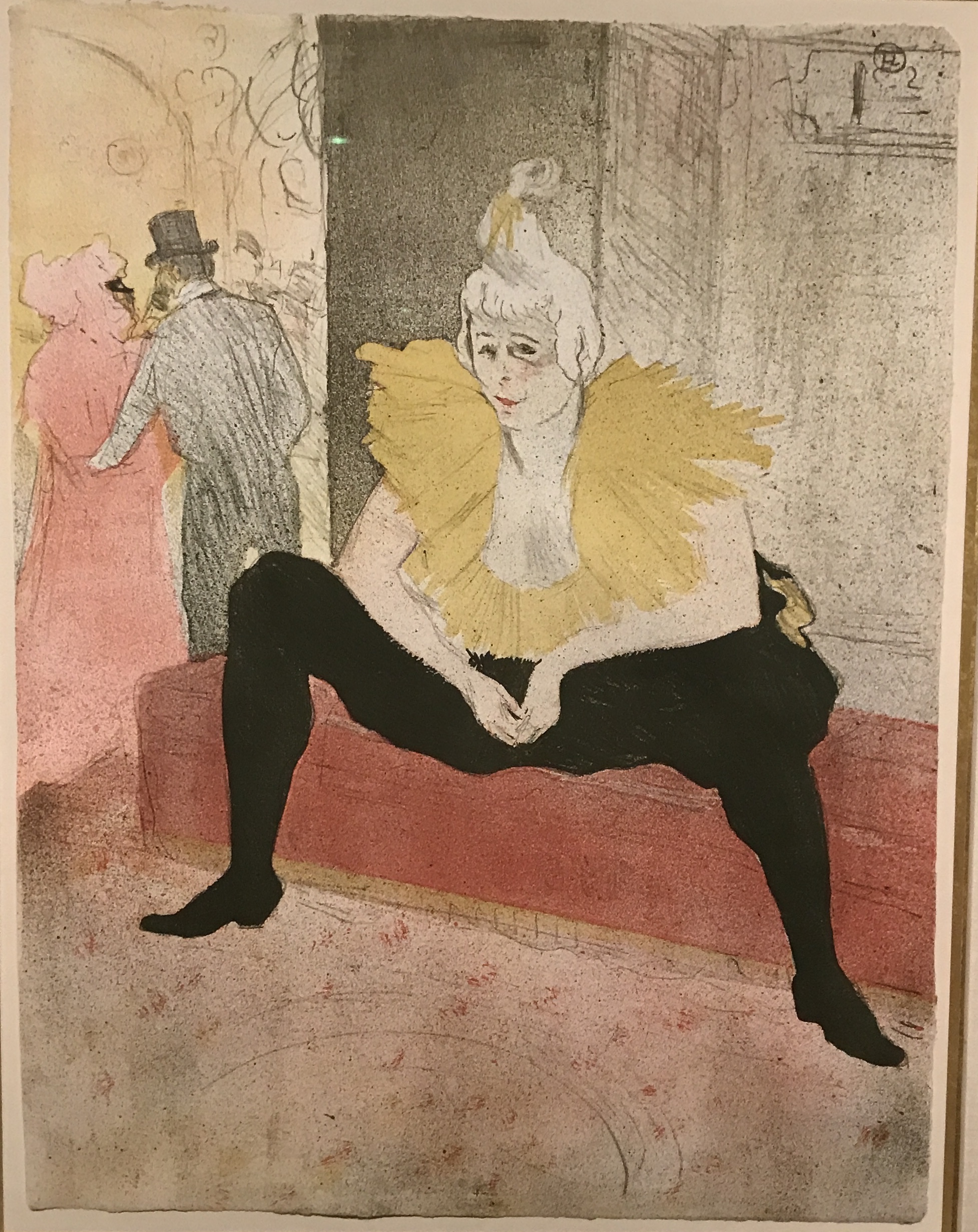
I sketched out the elements after covering the canvas with an ochre and orange background. I added in some white to indicate the stage and the walls. This color scheme triggered some echoes of Degas and Lautrec studies I had seen, but it didn't last very long. You can see the lamppost with the street signs. At this point I still was imagining John on the outside, but with a better filled out audience surrounding the band. It also wasn't clear that this was in a building, It might have been an open courtyard with street traffic.
I began to put some of the figures in and also try out some very thinned out bright colors on the wall and stage. I like working with the medium that lets me thin out the color and do layers, but I haven't fully figured out how to do that well. The dancers on either side of John came from some other sources and I started to put in the French Market elements in the background. Somewhere along in here, I began to frame this up as an interior scene.
I spent a good bit of time on the second day getting the figures and instruments of the band together. Unlike the first time out, I did the trumpet and sax players before finishing the trombone player. Working this way made for better results with overlapping of imagery. I spent way too much time trying to recreate a light effect on the stage that I had gotten in an early version of the first painting. Eventually I reached a place where the elements were beginning to balance out. But there were some things that bothered me.
I though the interior green pole was confusing and that it was something I was reluctant to let go of from the prior painting, so I took it out and extended the facade of windows opening onto the street - it also opened up some space on the floor. I also had made the drummer too small and had done a sloppy job of the drum kit, so I went back and enlarged the drummer, twice. I took some inspiration from a set of sketches I did at the Almanett last winter. I was still unhappy with the stage colors and the brushwork. Nothing about it worked, and so I decided to replace it with a bare wooden floor. Turns out that this allows the eyes to focus on the figures more. Finally, John and the woman behind him seemed to be on an elevated level from the rest of the audience, so I put in a black stair rail to indicate that one walks down into the dance floor. Then I did various clean up tasks and called it done.
