Redo and Repro

A redo.

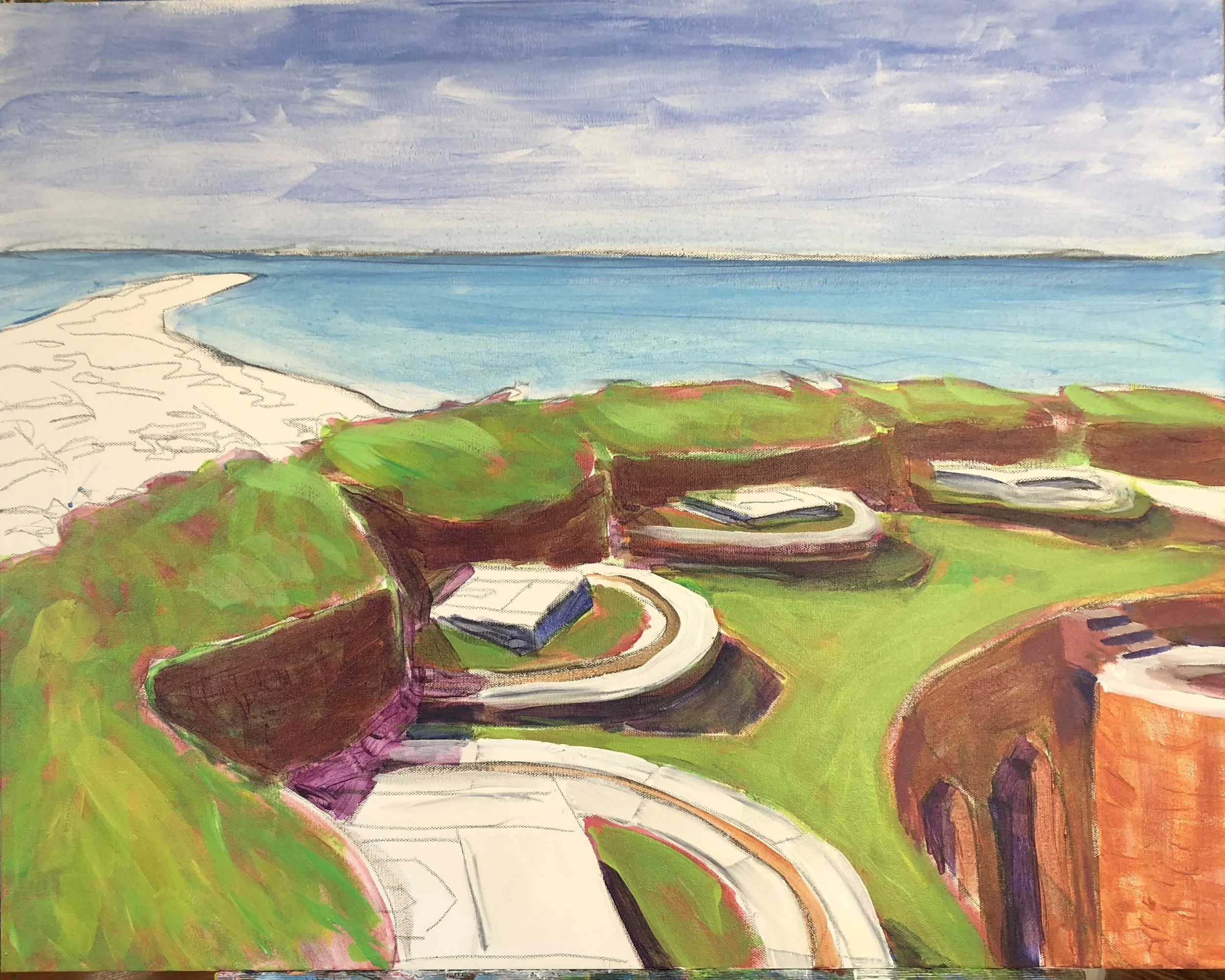
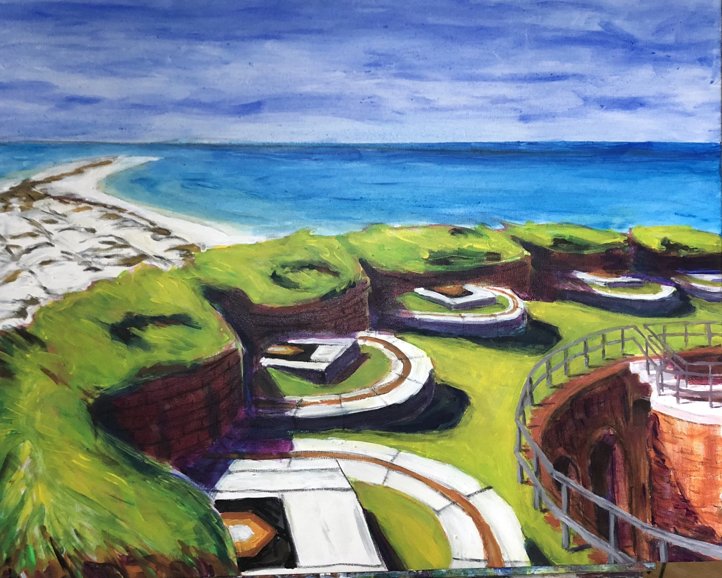
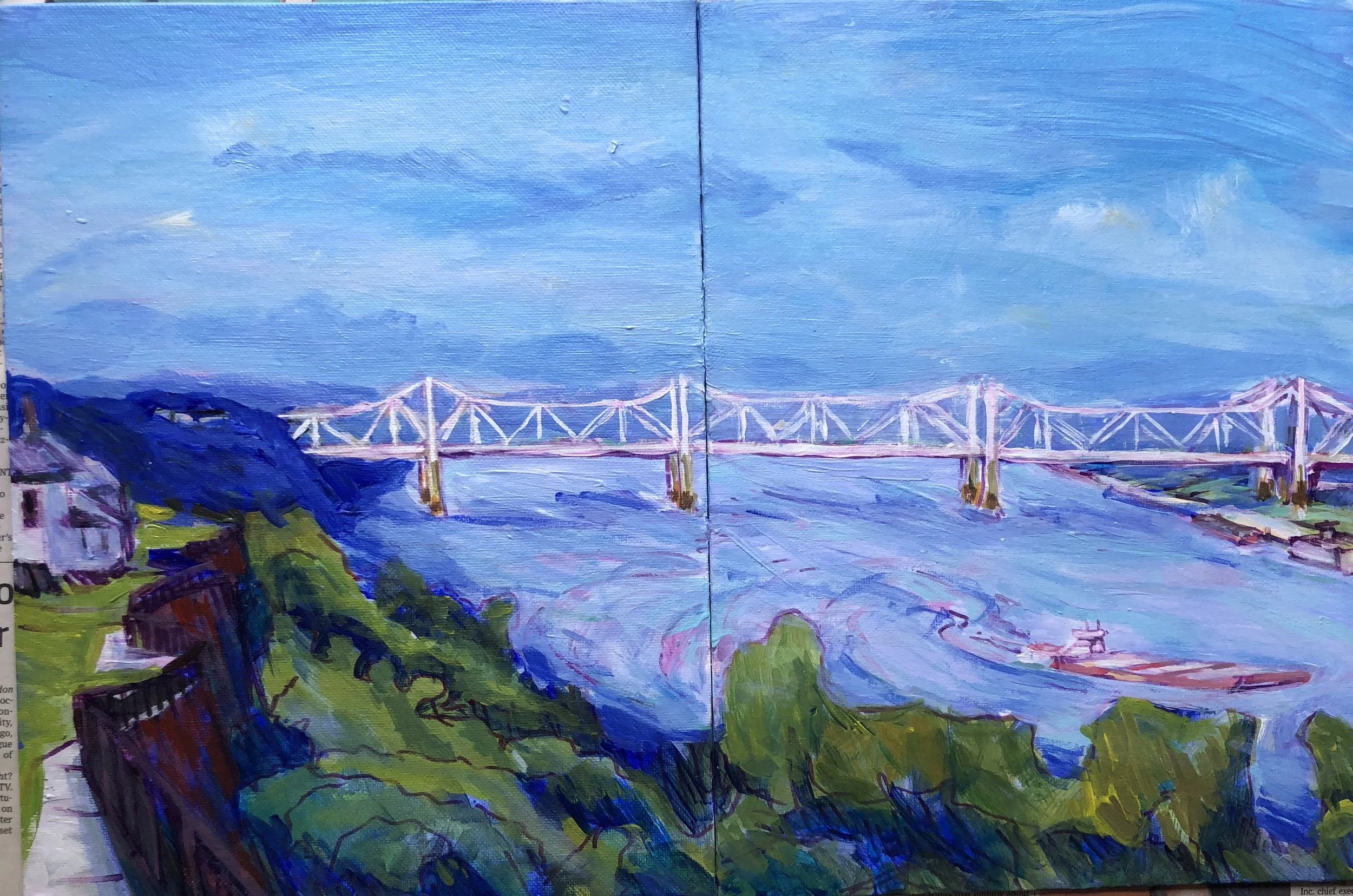
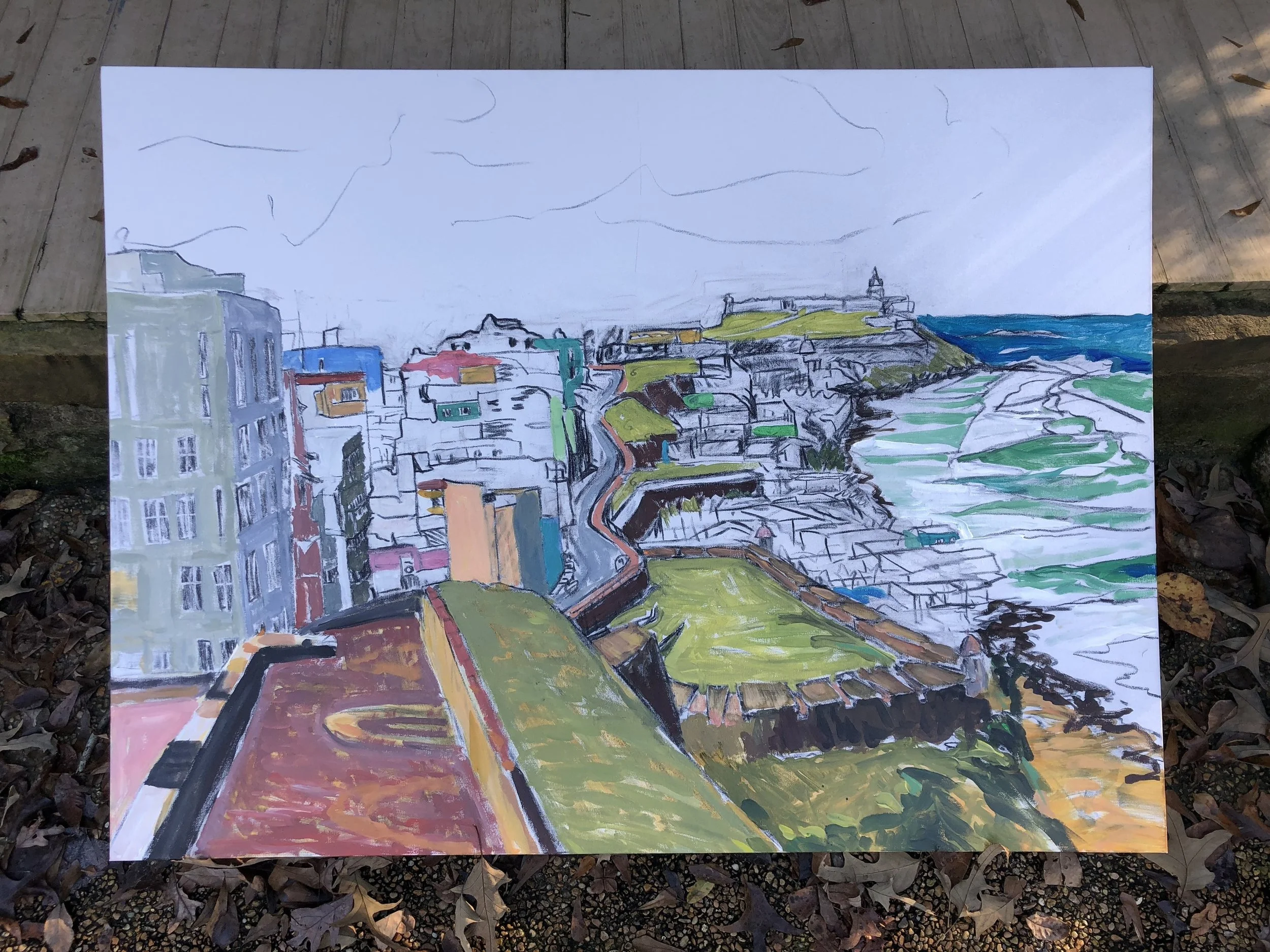
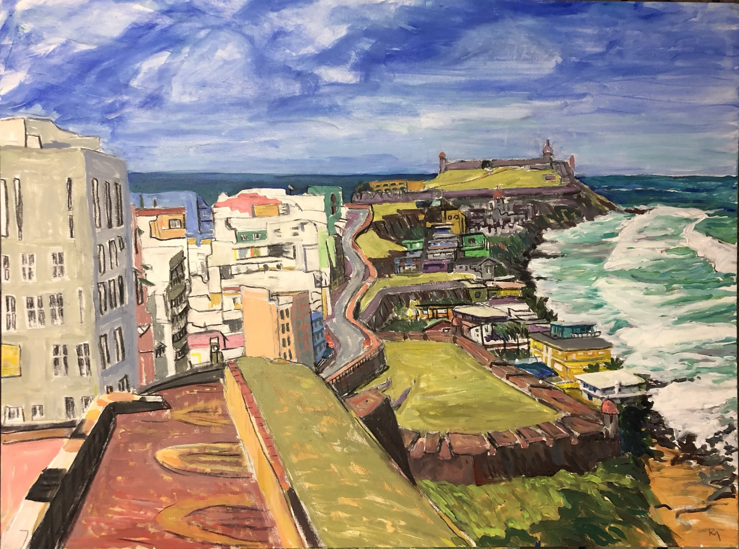
I wanted to make a gift to my brother Stan, since we are all that remains of our immediate family. I asked him to pick a piece from the gallery and he chose the Fort Massachusetts view from inside the fort looking west to the tip. There was one thing about the original scene that I wanted to improve - a better glimpse of the brick staircase on the right. So, I shifted the rest of the painting several inches to the left and put in half the column that holds the staircase. This is the stage with the reversed colors underpainting for the fort.

Nf2xyKnSTB6x82Aopt7o1w.jpg


I added the next layers of color and the preliminary shadows with a round brush. I did the water and sky with the blues lightened and limpid using zinc white and some medium. All this is in a rough cartoonish manner with some of the underpainting showing through. I wanted to keep the painting thin and flat like the original. 

fullsizeoutput_2e5a.jpeg


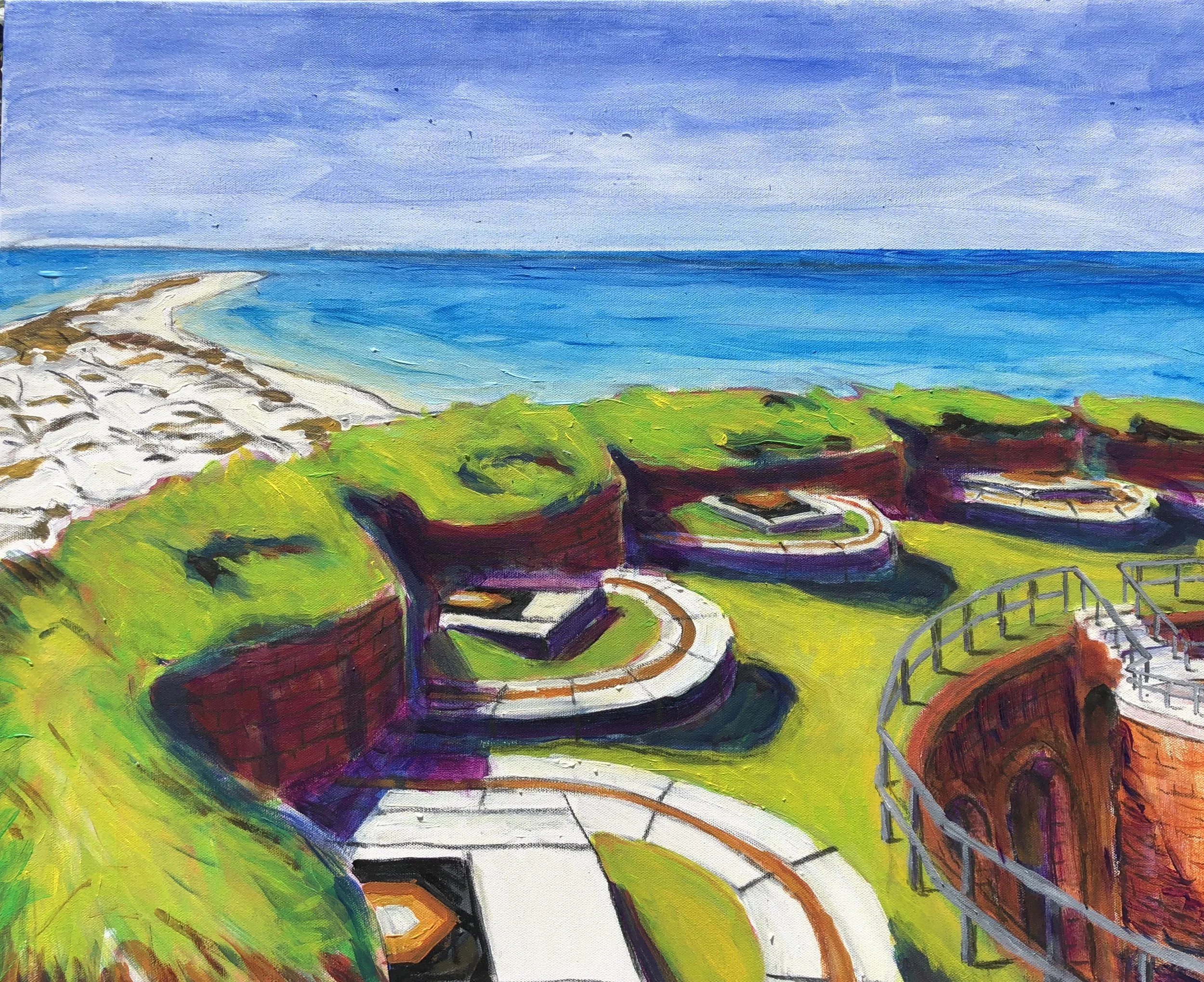
When I got back from North Carolina and New York, I sat down to get the painting finished. I liked how the brickwork shadows turned out on the stairwell and inner wall.   I spent a good bit of time on the rails and realized after the first try that I had made them too small on the stairwell. I also was aiming for a different effect on the shoreline. I used a mist spray to dampen things before putting in the sky.

fullsizeoutput_3042.jpeg


On the final effort, I used a measuring tool to help me get the stairs and the rails done correctly. I also reworked the water and the shoreline. In the end, I think I improved upon the original by adding the stairwell and rails. It's not a practice I plan to repeat, but it was interesting to rework a scene I had already done.

The repros. (Really, these aren’t reproductions as in duplications of the original. They’re more like more fully realized works, without the seam in the middle. Vistavision versions)

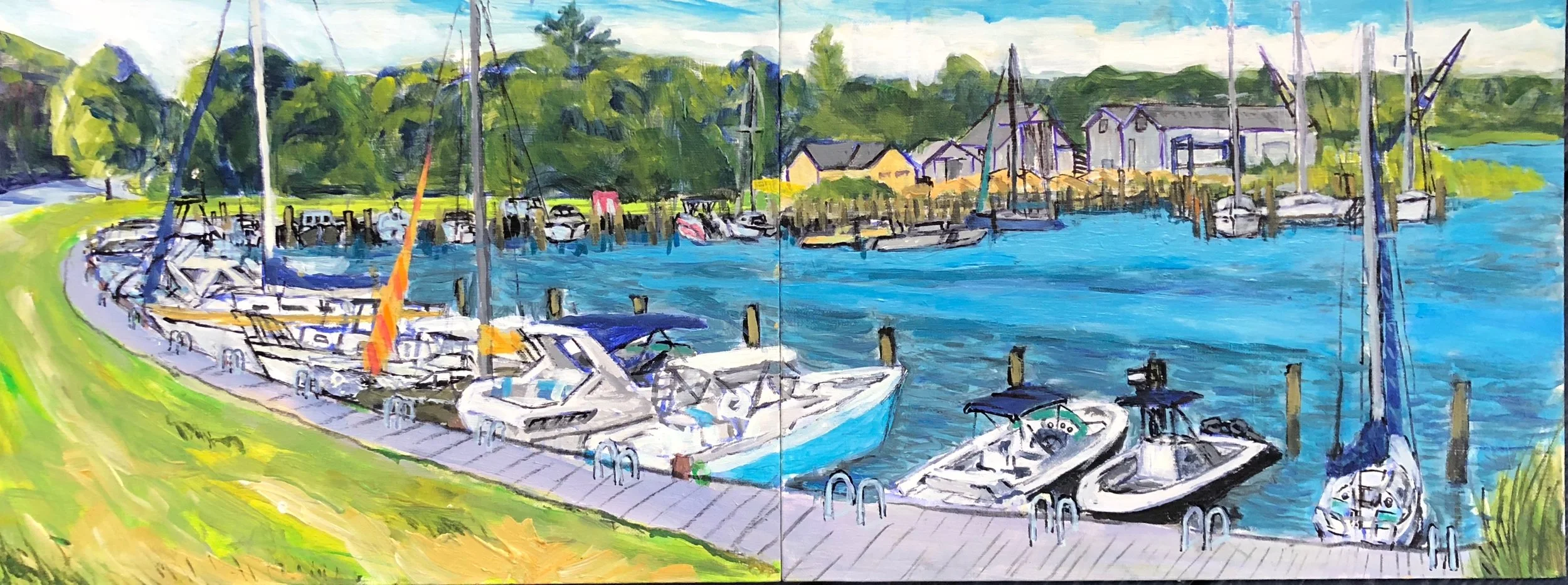
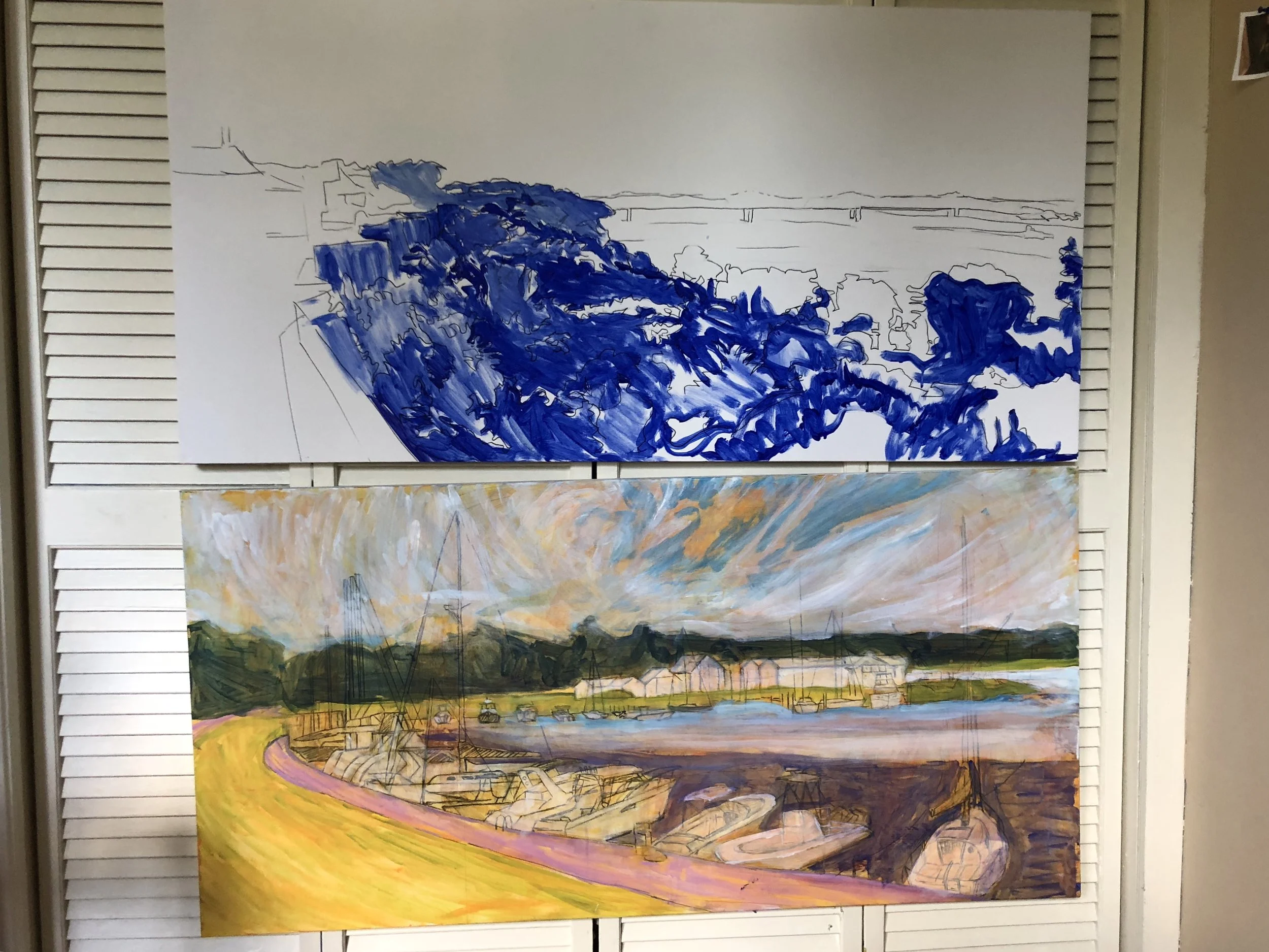
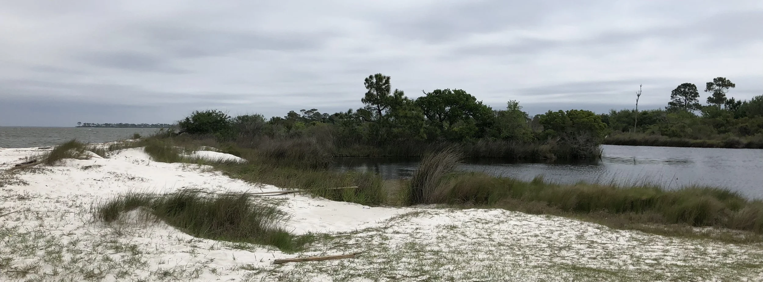
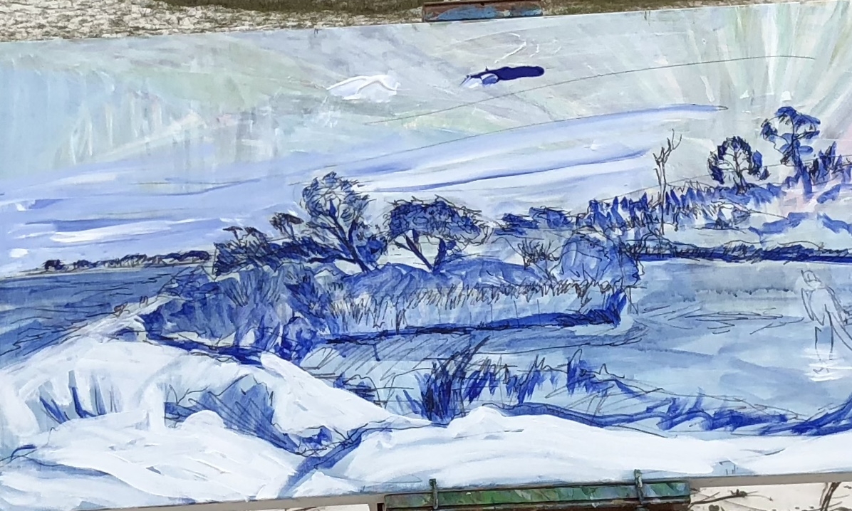
When I work with the pochade box the canvas panels are so small that I have to use two to get a scene done. I had two scenes I liked a good bit from Long Island and Natchez and decided to paint them on bigger canvases. So, this is a little like the previous episode, but I am not trying to reproduce a copy of the painting. Here are the two field studies.

IMG_6911.jpeg
fullsizeoutput_310d.jpeg

And I have started to put the full size paintings together with the beginnings looking like this.

fullsizeoutput_315d.jpeg

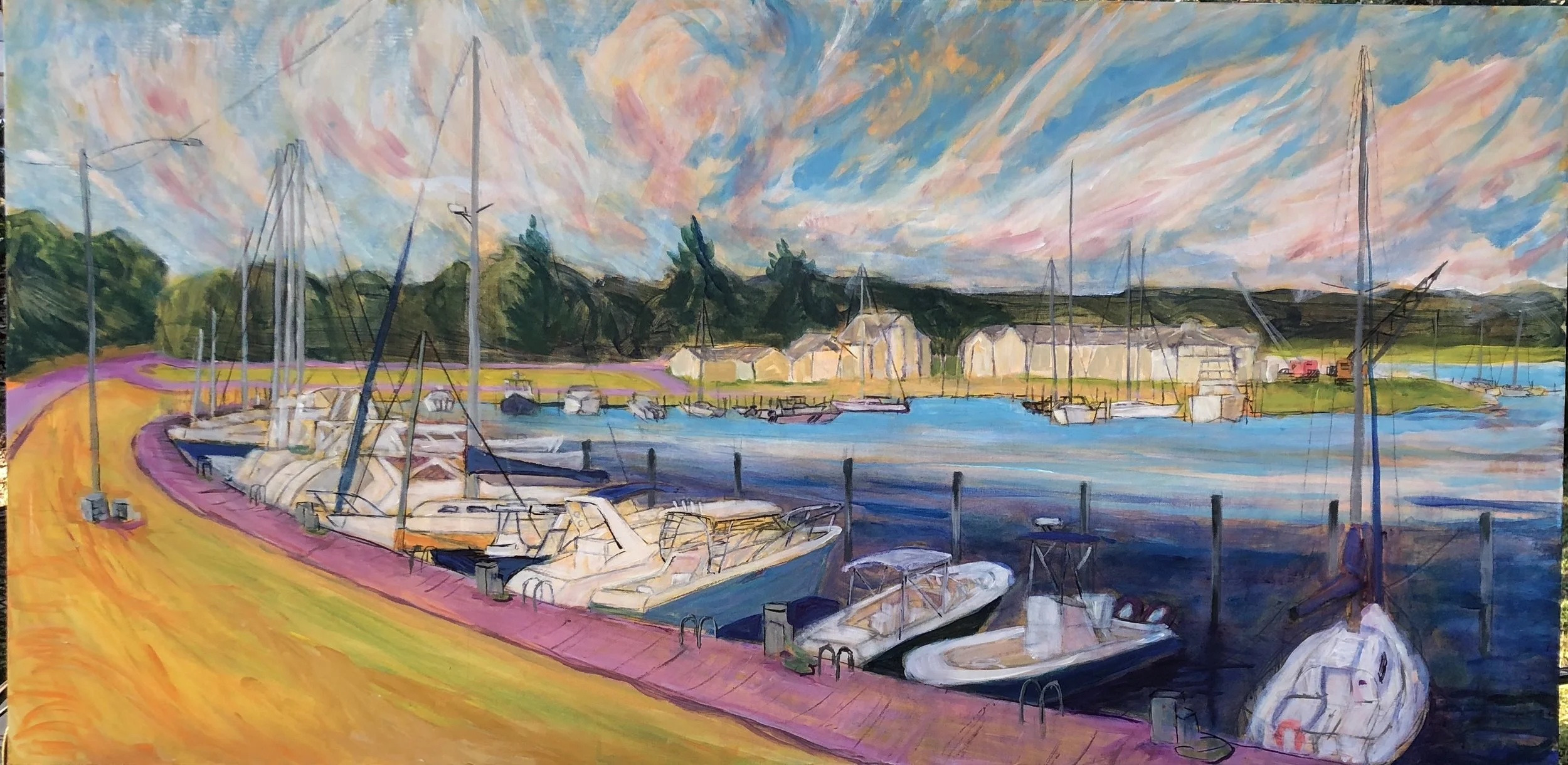
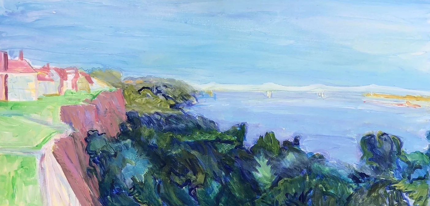
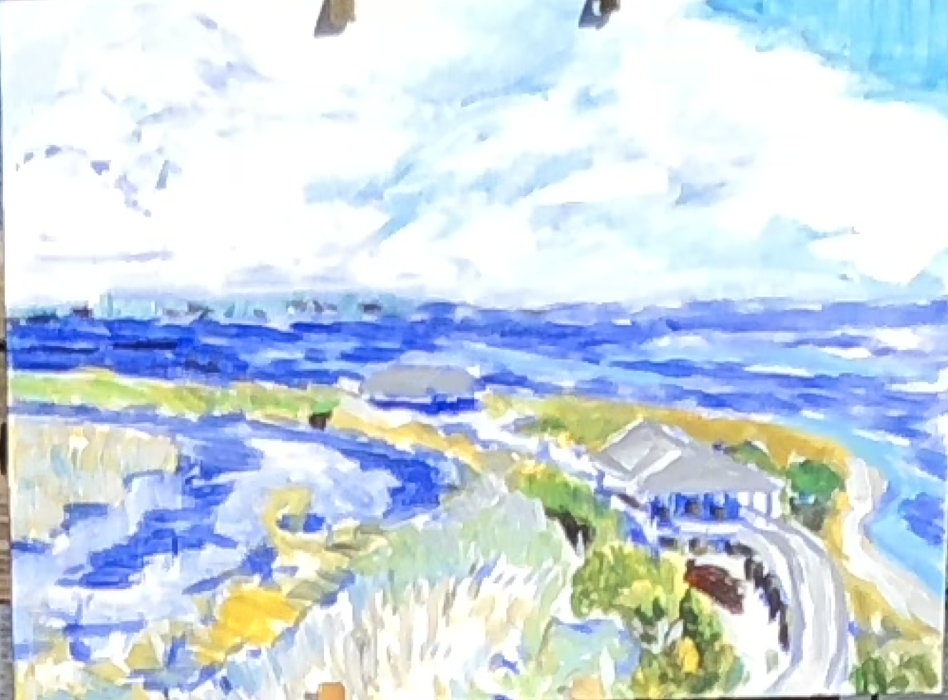
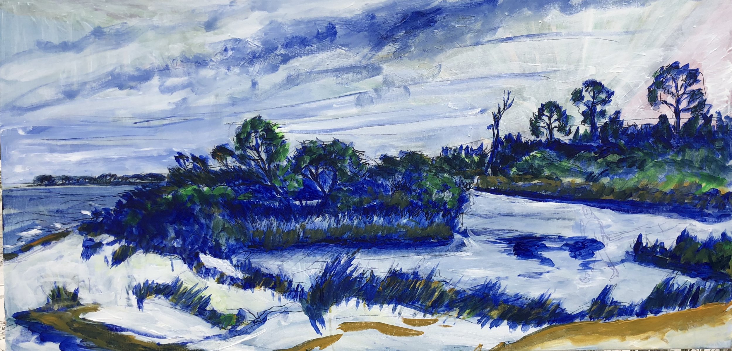
I worked more on the 3 Mile painting, and managed to hold onto enough freshness from the first pass and keep the overall approach thin. The thinness reminds me of the Fort Morgan scene overlooking Bon Secour bay, the first piece in this gallery.

fullsizeoutput_31e0.jpeg

One thing that has nagged at me is the yellow and pink in the foreground. I like it and value what it does for the overall color harmony. Still it seems wrong. I tried various alterations out using the tablet app and the only thing I learned was that burnt sienna and pink are an interesting combination - something I could have learned from any number of Matisses. Not the only thing, actually, I learned that whatever the issue with this yellow/pink foreground, every other choice I would make would weaken the painting.

One side effect of working on the pink bulkhead is that I accidentally added some diluted burnt sienna to the sky. This was a nice touch.

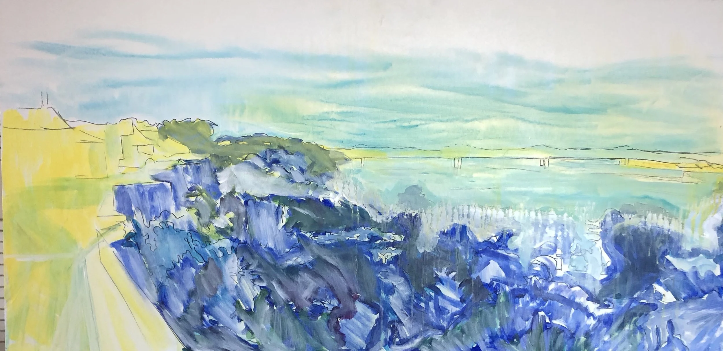
On the Natchez scene, I’m still working on the under painting. I had turned the foreground into a bank of blue cabbage. So I began to erase that. Also I worked on getting a sort of golden glow on the lower part of the sky using a mister and light passes of yellow. I let this drip down into the river and it kept going further down penetrating the white I had laid down to make room for more river.

IMG_8245.JPG

Several passes later I got to this level, thalo blue and some other tricks added to create the odd lighting. I decided to put this aside for the time being and return to it later.

IMG_7482.JPG

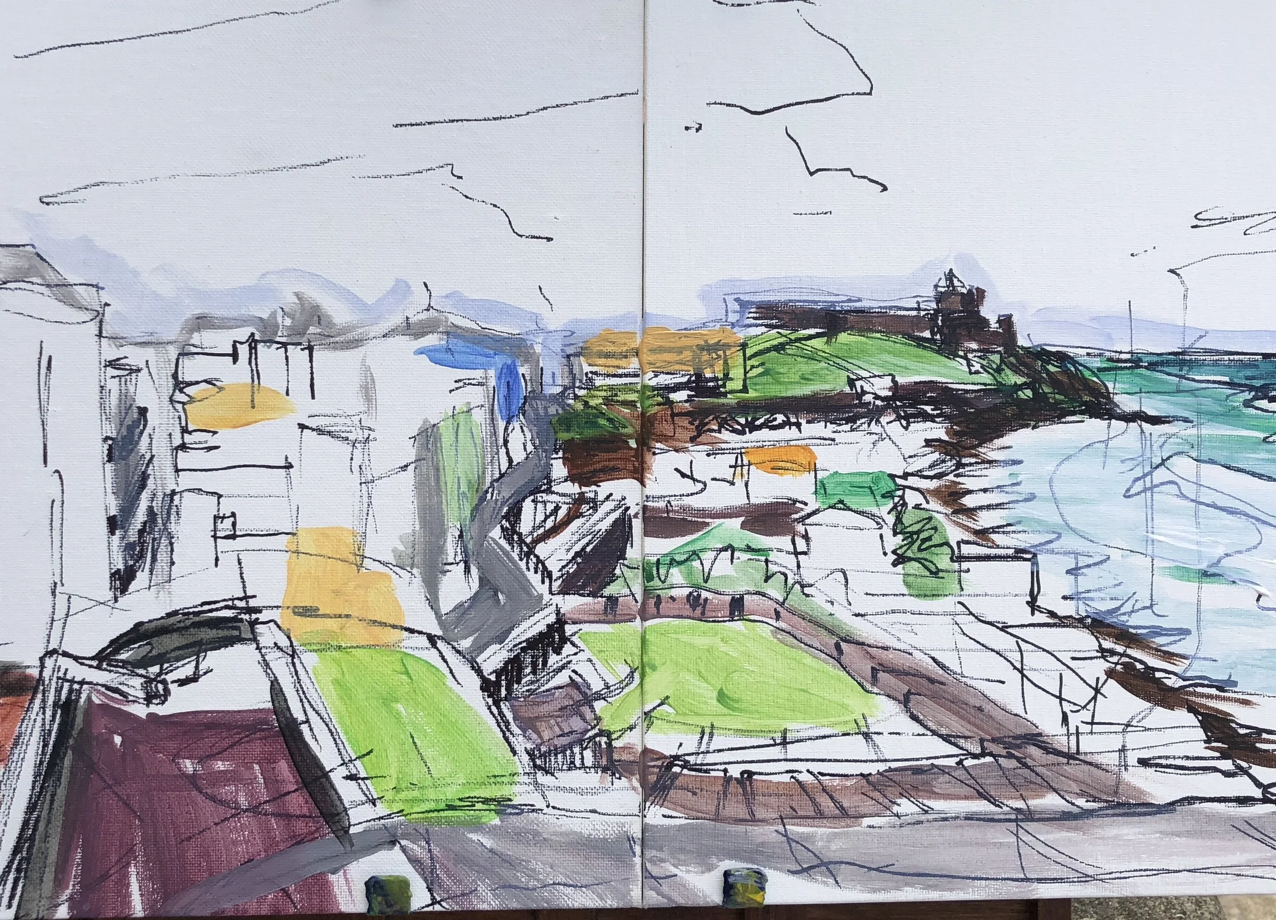
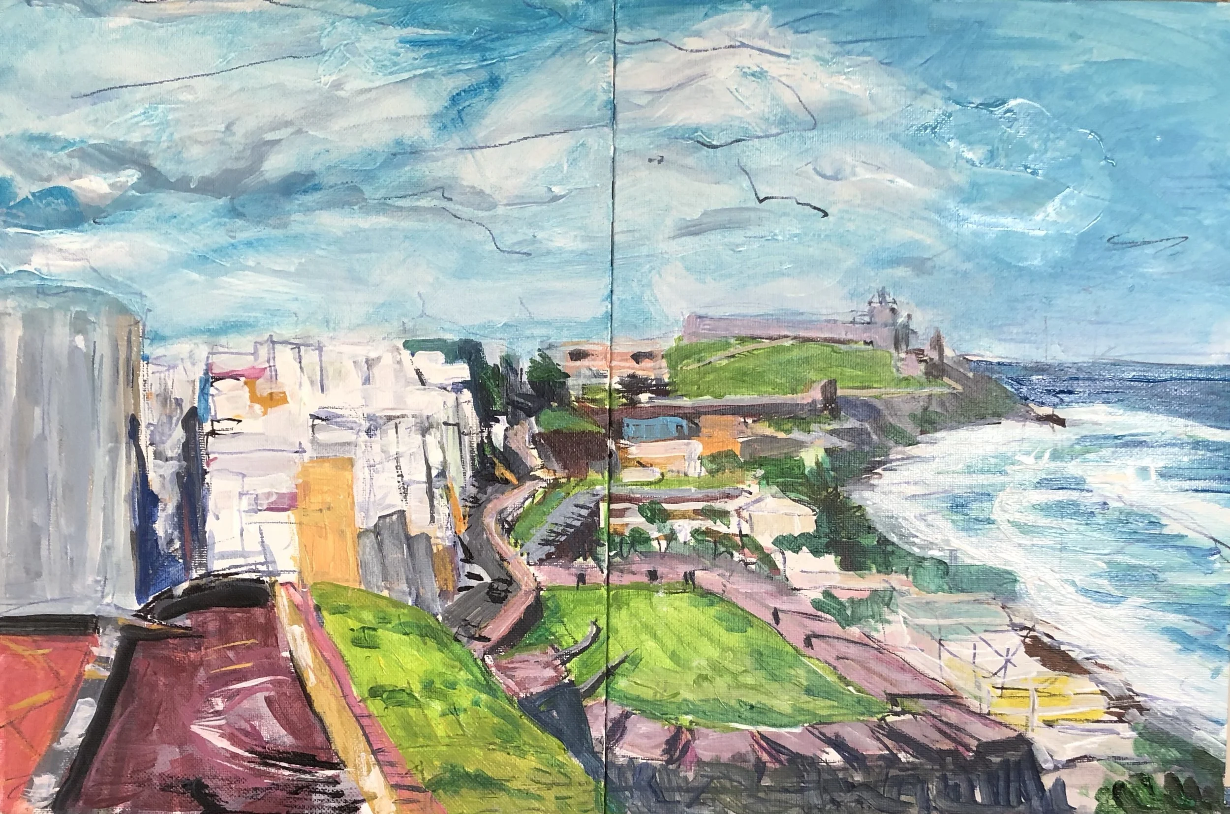
Next is this scene from the Castillo de San Cristobal. Something I noticed from my early days is that I tended to cram things into the scene especially when working small. This piece is a compacted version of what I saw and I will enlarge it by placing the composition into a large square canvas. Here is the sketch.

fullsizeoutput_3195.jpeg

And here is the scene filled further in. I must say I’d like to find a way to enable more of the sketch to show through when I go large. Stay tuned.

fullsizeoutput_3196.jpeg

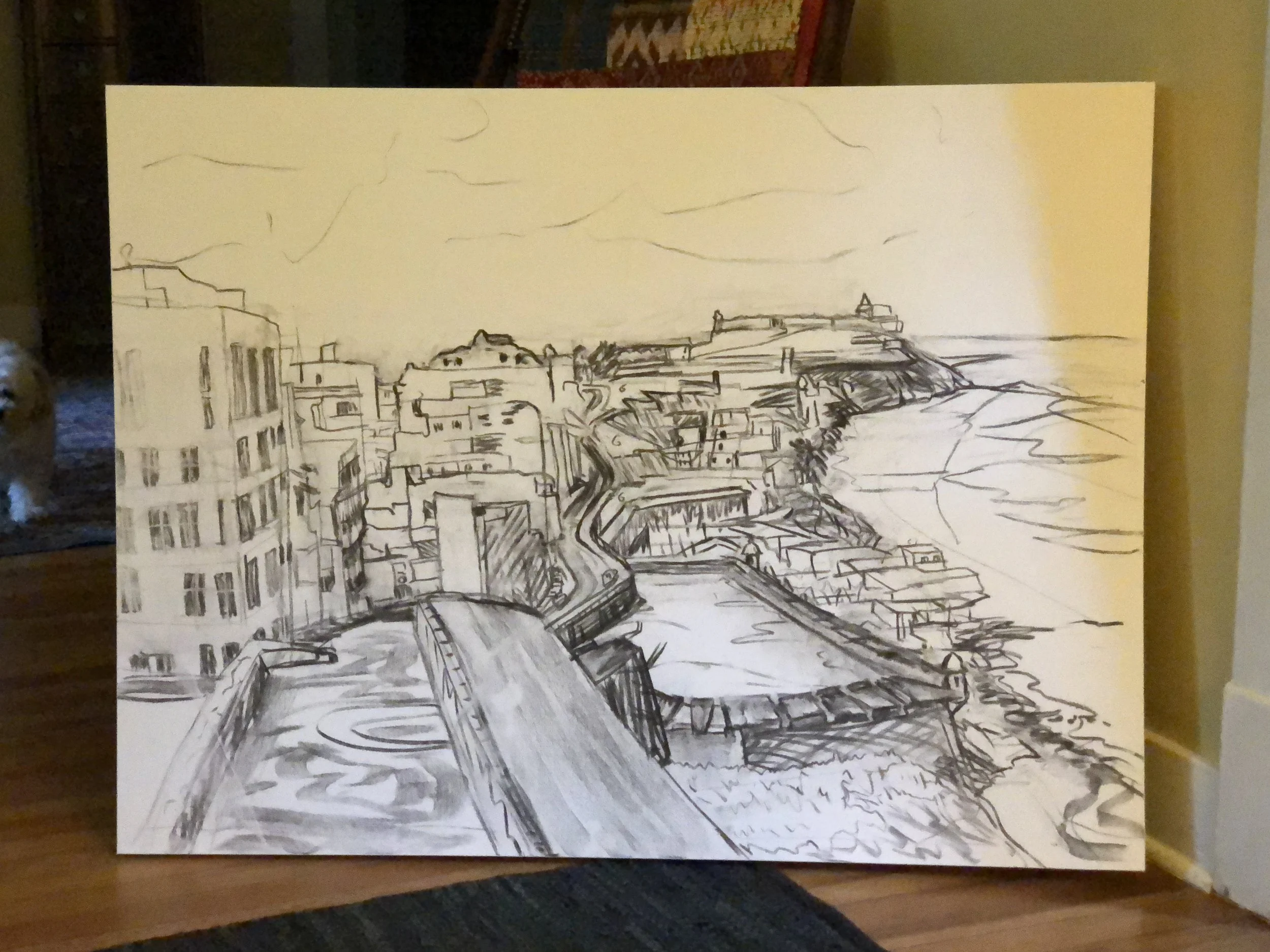
I moved this one up to a larger canvas as well, 36” by 48”. Here is the drawing.

IMG_7512.JPG

I worked this in with only a small amount of undercoating because it smeared the charcoal drawing. Fixative did not solve the problem.

IMG_7523.JPG

Left side stayed pretty thin and right side got a little looser. Here is where I am now.

fullsizeoutput_32d8.jpeg


Pisgah esquisses

Here are some sketches from our time off in the Pisgah National Forest plus one larger painting. In all but one case I began the scene in situ and then finished it the next day back at the cabin. This stretch up here has been closer to the pace of painting I had as a college student. I have enjoyed it a great deal. 

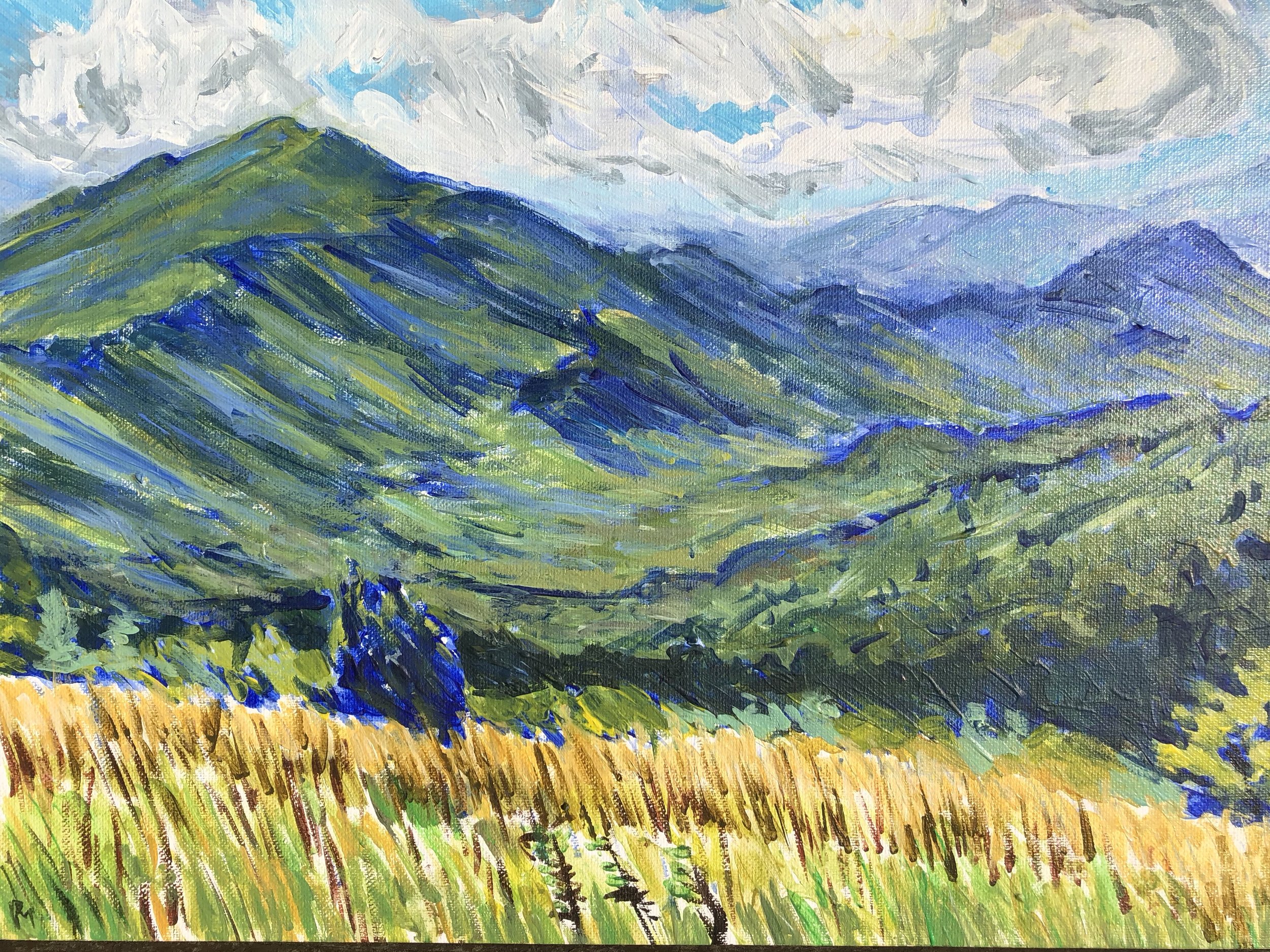
The first one is Max Patch looking west toward the Tennessee line. Christina and I went up there with Pearl and slowly made our way to the top. It was blustery and very cool. Lines of clouds swept past, surrounding us. For a memorable time we were alone. A young woman hiking the AT approached from one direction and then a group of about 30 teenage girls came from the opposite direction. Christina and I went down the hill and I set up to start a painting. 

I didn't go for the softer texture that the mountains usually have here. Instead I used the small paintbrush like a colored pencil and so the piece has a texture mostly of short slanted lines.  This stage has my favorite state of the distant pe…

I didn't go for the softer texture that the mountains usually have here. Instead I used the small paintbrush like a colored pencil and so the piece has a texture mostly of short slanted lines.  This stage has my favorite state of the distant peaks on the right. Those colors are so soft and beautiful. I laid it out in a blue drawing and spent about 3 hours filling it in and then walked down to meet up with Christina in the trailhead parking lot. 

Back home I worked on the contours of the mountain faces and tried to keep the colors on the light side. I also worked on the foreground and came up with a combination of layers that worked well. It ended up having a stubby line texture and a mixture of blues and wheat yellows that people sometimes associate with Vincent. 


fullsizeoutput_2eec.jpeg


On this same hike, I took a photo of Christina with Pearl lying down looking to the north. I sketched something out very rough but didn't paint it at the site. Instead I came home and worked on it sometimes using a reference picture. This is unlike how I usually work. The scene of Christina lying down before a bank of grasses has a little echo of Andrew Wyeth's Christina's World, and Christina would empathize with her namesake's affliction.  In any event, I knocked out the first version of this based on the drawing and tended to exaggerate the curves and paint in (for me) a comic book style.

fullsizeoutput_2eeb.jpeg

In he next stage I de-emphasized and moderated the curves of the hills in the middle distance, separated Christina a little more from Pearl and eliminated the backpack. I spent a while getting the mountain in the distance to a satisfactory state.  This is kind of a sentimental scene for me but I am looking for ways to add more humans into the work. 

I like this sky and the undulation of the mountain. I also like Christina's arms and the yellow straw hat. I regret leaving the bank of tall grass so underpainted, but I didn't want to risk making things worse.The third scene, also done on Max Patch…

I like this sky and the undulation of the mountain. I also like Christina's arms and the yellow straw hat. I regret leaving the bank of tall grass so underpainted, but I didn't want to risk making things worse.

The third scene, also done on Max Patch was from a visit several days later. I was alone and found a spot looking to the east near the place where the trail intersects the AT. I took a path about 30 yards down from the trail and that was enough to keep away most passers by. 

It was a day that threatened rain. I picked the scene because of the three trees in the foreground, and the layers of mountains behind them. I had fun exploring this scene and finding ways to simplify all the details before me. I used one of those viewfinders to frame the image and help me keep the composition within the proportions of this little canvas. I went through several stages quickly in this scene mainly because the sky was threatening rain and so the shadows cast on the scene before me shifted quickly. As that warning cold wave of air came along, I quickly covered the foremost mountain in a dark blue black and then packed out.  I like very much how the distant range blends in with the cloudy sky here. Wish I had held onto that.

fullsizeoutput_2f00.jpeg

 Something weird took hold of me on this one when I came back to it. I spent a while trying to get the mountains into balance and to make them look more realistic. Then at some point I was stuck on the sky and I turned the piece upside down to work on it- something I do when I need to detach from representational work.  After doing this I found a piece of charcoal stick and re-established the lines of the mountains and I liked that. It was very flat however and the scene seemed to have more of a color woodblock appearance. I went ahead and finished it in that spirit and ended up with this.

fullsizeoutput_2f26.jpeg


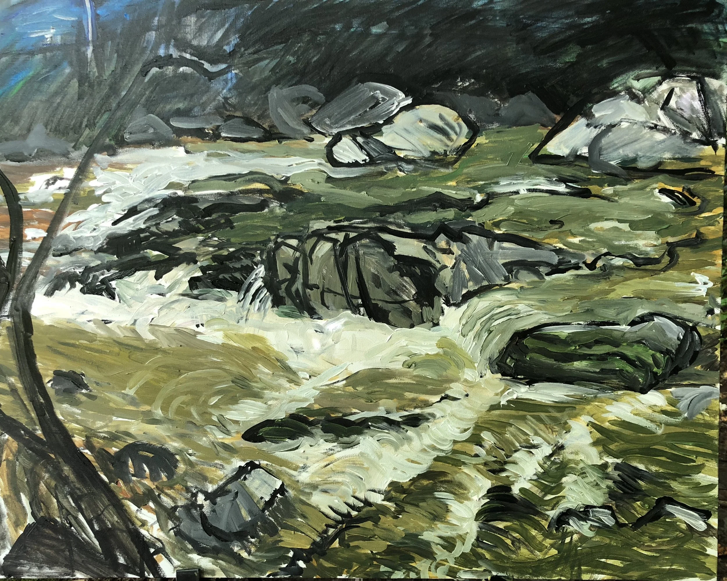
The final piece (unless I squeeze one more in on my last day here) was a view of Laurel River. For the first time, we were obliged to hike more than a mile down the path to get to the public portion of the river. I set up just in time for a rain that warped the little canvas board I had so I set that aside and waited. I unwrapped a 24x30"  canvas and set about studying how water moves among the rocks in the river.  I could probably do this for a long, long time. It is so hypnotic and calming. A few years back I had a success on a small scene from the Laurel River and so I wanted to try something larger and more complex. I spent about three hours on this and had to pack out. I was working on some painterly nuances in the river flow and becoming annoyed with how mushy it had become so I picked up a big round brush and used black paint to reestablish the lines of the scene. Some of those lines were really good and gave the work a zesty edge. 

fullsizeoutput_2f3d.jpeg

I liked this a lot but I wanted to do a better job on the water and finish the tree. I spent about 7 or 8 more hours on this over a couple of days to get the various paths of water to work together and this required very intentional (a cliché I hate) strokes of paint and a lot of close mixing of colors to get things to have volume and movement. I think this is a decent job and would love to have the chance to really master painting transparency, foam, and water movement. It is simply wonderful. 

fullsizeoutput_2f8a.jpeg

Turns out I did have one more to do. Christina and I went to Zimmerman's farm so she could pick blackberries. No one was there except a few cautious dogs and someone on a distant tractor. Christina strapped on a basket and walked down the rows marked with flags as approved for picking. She got beautiful results. I followed her with a little 9x12" canvas and did two Sharpie studies of her. 

IMG_6673.JPG
IMG_6677.JPG

Back home in Gulfport, I added some basic colors to this little study and will let this sit for a week or so before I finish it.

IMG_0703.JPG

Odogalisques

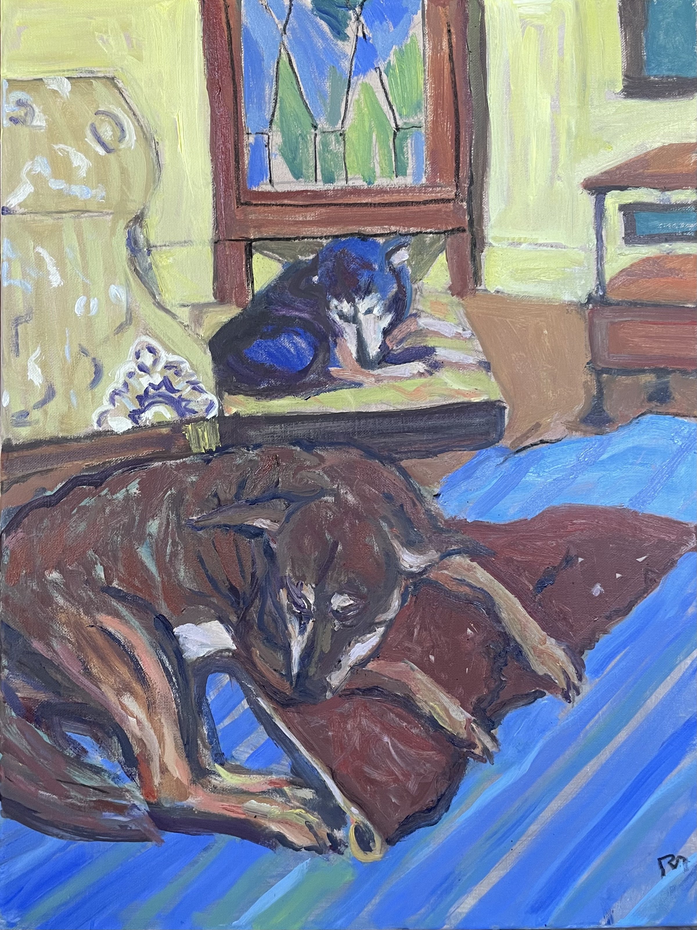
I will share a bit of history with green dogs. Here is Curvis, Cathy's dog, circled in red below. Curvis sits in the middle of the cul de sac at Bratton Circle, behind the Beacon restaurant in Oxford. He was a good dog, though I didn't appreciate him at the time. I was a highly distractible and confused law student who hadn't yet let go of the impulse to paint things. So when Curvis barked, which was often, I complained and became unruly. Neighbor Chris, always up for unruliness, joined me to hold Curvis and tint him with some green food dye color. It didn't make him bark any less. Later I did this painting. Apart from the carpet on the tin roof, and the garden stakes on the right, the interesting part is the patchwork of gravel, busted asphalt, and dirt. After putting in the shadows in an underpainting in deep blue, I did a series of quick strokes in cerulean blue, brown, and pale yellow. When it was over I "saw" in these strokes snakes  emerging from the painted gravel and the grass. In the middle of the cul de sac, I added Curvis. 
IMG_1667.JPG

In this painting below, I didn't paint the actual dog green, just the image on the canvas. I started out painting Nash with a green forehead and torso, but couldn't make this work. Then I painted over it with the browns and maroons.  I am still trying to work out why the green and blue underpainting works with the top coats of fur.. Perhaps it is that the reddish brown complements the green and the brownish maroon is an analog to the blue. I'm sure there is a finer theoretical explanation for it buried in a book or a color wheel. For now I am just happy with the end result. 

I don't have a history with odalisques, sad to say, except for admiring those of Delacroix and Matisse. A couple of friends thought this scene owed something to Matisse, so I cooked up a pun. These dogs can't be called odalisques because these are boys, and not ladies of the seraglio. But they are lounging lazily around on cushions, they do get lots of attention, and the painting style is bright, flat, and filled with  patterns, like some Matisses. So, ok, they are dog odalisques, or odogalisques.

IMG_6235.jpg

Several years later, my older daughter Meghan asked for a copy of this painting as a birthday present and I obliged. Not something I typically do, but I went for it. I like very much how it turned out.

I actually have a painting from my very earliest days that reminds me a little of this scene. It was of a Weimaraner named Wolfgang asleep on an easy chair in my teenage bedroom. It has a much more subdued palette (plenty of green, just none on the dog) and is the work of someone who had been painting less than 2 years.. 

IMG_4675.jpg


Analog>Digital>Analog

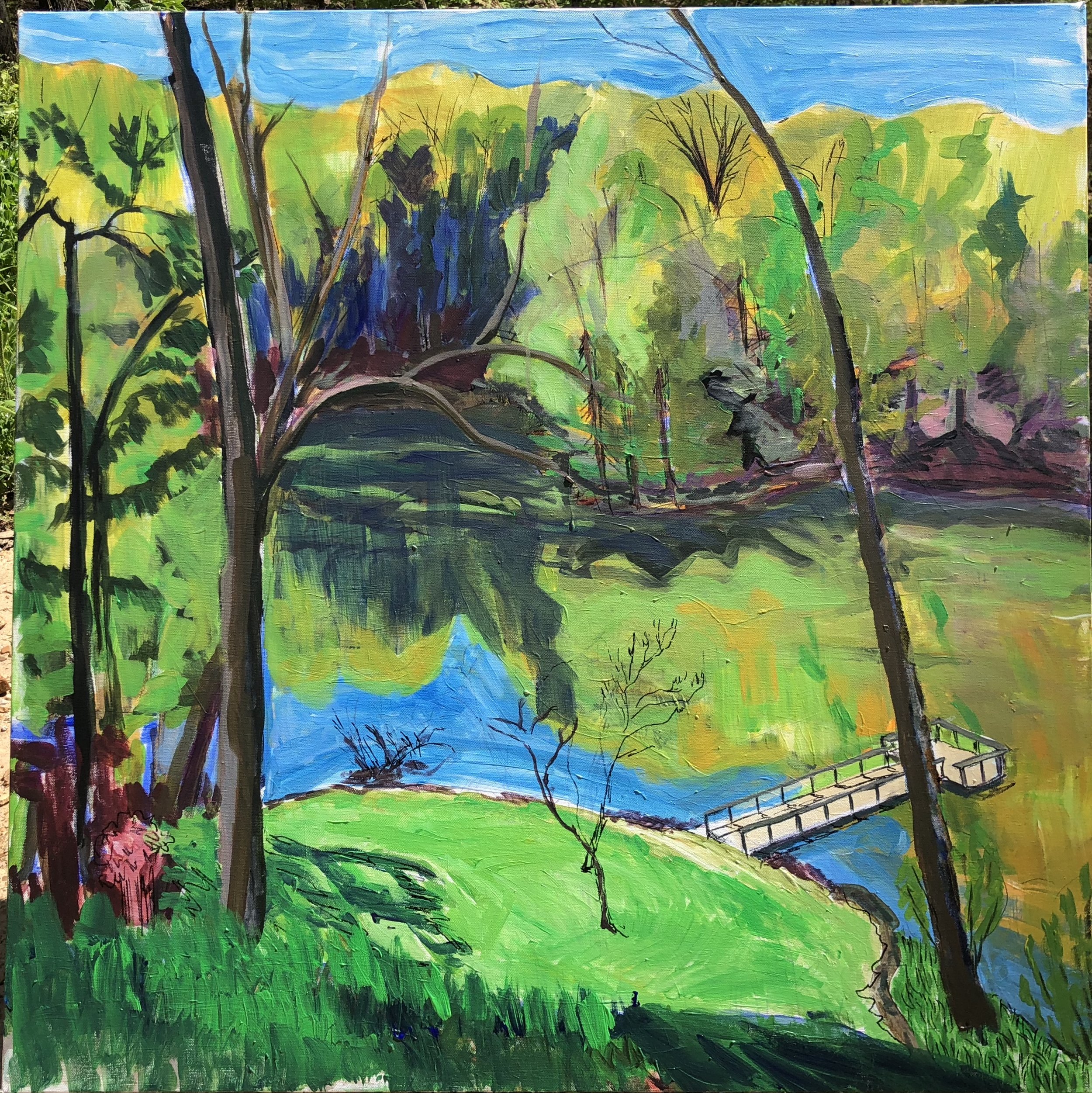
This painting started on Passover/Easter during a weekend break from my DC travel. The owner was kind enough to allow me to visit his place in Eden for a night and I started a canvas while I was up there.  I had an afternoon and the following morning to get something begun. Turned out the morning light was striking so I had to start over in the morning. This was my first square canvas in a very long time, and it was fairly big for me, 36" by 36".  Here is the view.

IsZSWXbgRYGeX23SjElA9w.jpg


At first I was a little under the spell of Hockney's California landscapes which I had seen at the Met early this year. I was using ultra-vivid colors and flat, cartoonish drawing. It was fun to explore for a little bit but it wasn't suitable for me so I pretty much abandoned it all in later work.

A nice aspect was having a trusted old friend quietly looking over my shoulder. Unlike with strangers, I was not defensive about making mistakes or having my privacy stepped on. And boy did I make mistakes. Still, a friendly presence was a great thing. It made me realize how solitary a pursuit painting generally is.

So I packed up what I got started and went to an event in Memphis and then back on the road to DC for more work, and the weeks rolled past without me being able to do much about it for quite a while. In fact, I did the Ft. Morgan overcast scene before I returned to this.

fullsizeoutput_2bad.jpeg

There still is a hint of Hockney's saturated hues in this palette and the winding bank of the lake. But that's about it. I did find a little time before my last trip to DC to work on some refinements at home in the studio. I liked very much the colors on the upper right portion of the scene and it was fun to add a tractor. However the painting had a chronic problem with perspective since nothing in the foreground gives you a clear appreciation of how far down the meadow and lake are from the vantage point. 

fullsizeoutput_2c5f.jpeg

While I was traveling, I imported the above scene into a tablet app that I use for sketching and experiments. This was the first time I did an extensive try to complete the painting digitally. I had a good time working with it and enjoyed especially the watercolor effect. I learned a good bit about color mixing that helped when I got back home and worked on the canvas. I could do some reference color checks to see what is the best way to mix some colors. 

Here is where the digital piece stood when I returned from DC. 

fullsizeoutput_2c62.jpeg

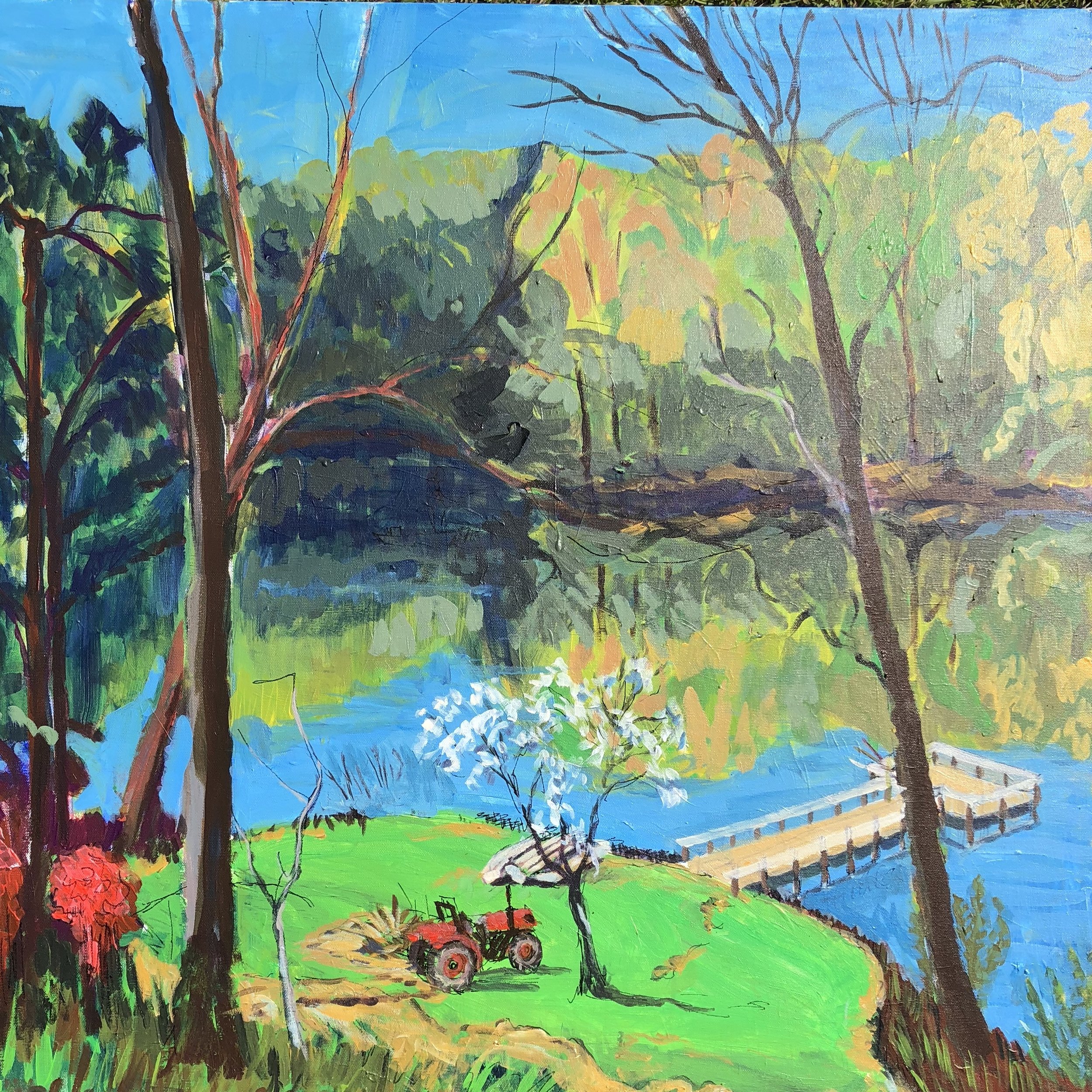
With this digital study in hand I had a vision of what I'd like the final state to resemble and so I set about making a series of adjustments and changes on the canvas today. It was generally pretty straightforward. It was great to have worked through all the mistakes in a digital setting where I could erase my problems and start over.   So, with a few variations from the digital version, here is where the canvas ended up. 

IMG_6123.jpg

This piece is a little more decorative than I usually do, but I still like the overall feel. To help with the perspective I worked the foreground with larger grasses and some stones to give it a different texture. I also added the tractor, the boats, and the fellow fishing from a kayak in the shadow. I used a tool to measure the height of a person on the tractor and then scale the pier and the fisherman.


Below is a video progression of the states of this painting.

Painting a Pluton

For close to 20 years, I have tried to capture a really good view from Whiteside Mountain near Cashiers. It's a great location for painting, because the perch is so uniquely situated. it's off the main trail, down between two large boulders and out over a rock face hundreds of feet in the air. 

S2400006_1.JPG

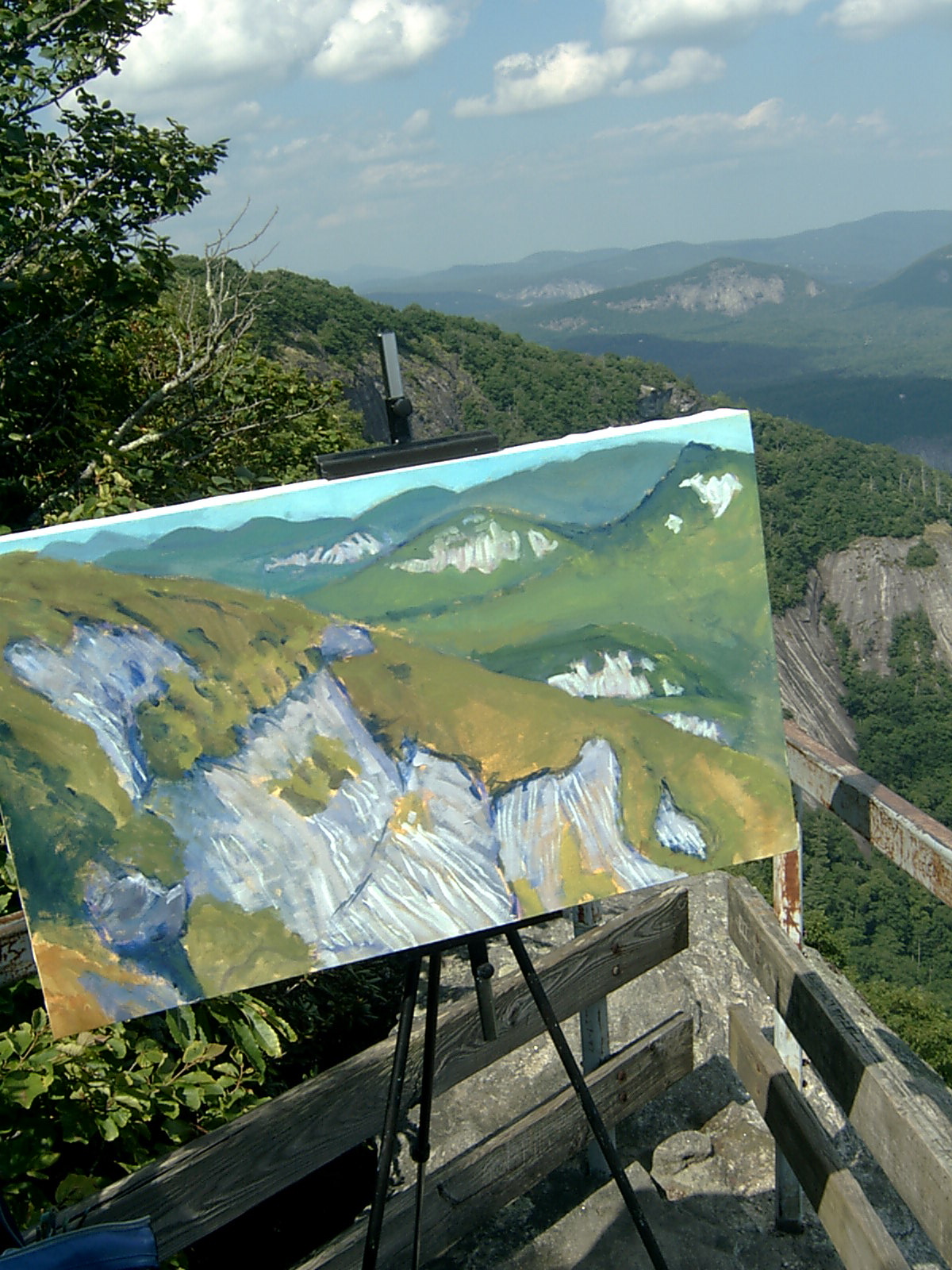
Some time ago on a little site called Cowbird I described the geology and the experience of painting at this location.  Here is the link (you have to use the navigation arrow to move right and see the text). And here is the image. I like its fresh and loose feel and the sfumato edges of the distant mountains.. But I wish it were a landscape format. It also is tilting off to the right a little too hard, made worse by the off kilter photo.

c059452f3f8e7a0fa0b1368c13425db90acacfc6c2c0bccbaf1de95e4c83499b-big.jpg

Here is the view looking out to the east.

S2400008.JPG

Here is an early stage and a final on an earlier version, now lost to the storm. These have nice soft treatments of the tree cover and interesting exposed rock faces, in the distance. But the horizon line was way too high in the scene and the nearby rock faces resembled waterfalls, as my curmudgeonly neighbor back home reminded me. 

S2400013.JPG
S2400020.JPG

More recently,  I began a scene out there and brought it home to finish. Instead of doing so, I set it aside for a considerable time and finally picked it up about a week ago. I'll skip the step by step and just say I tried to find a balance between the two prior paintings, freshness and perspective effects. Here is what I ended up with.

IMG_5464.jpg