Painting a Pluton

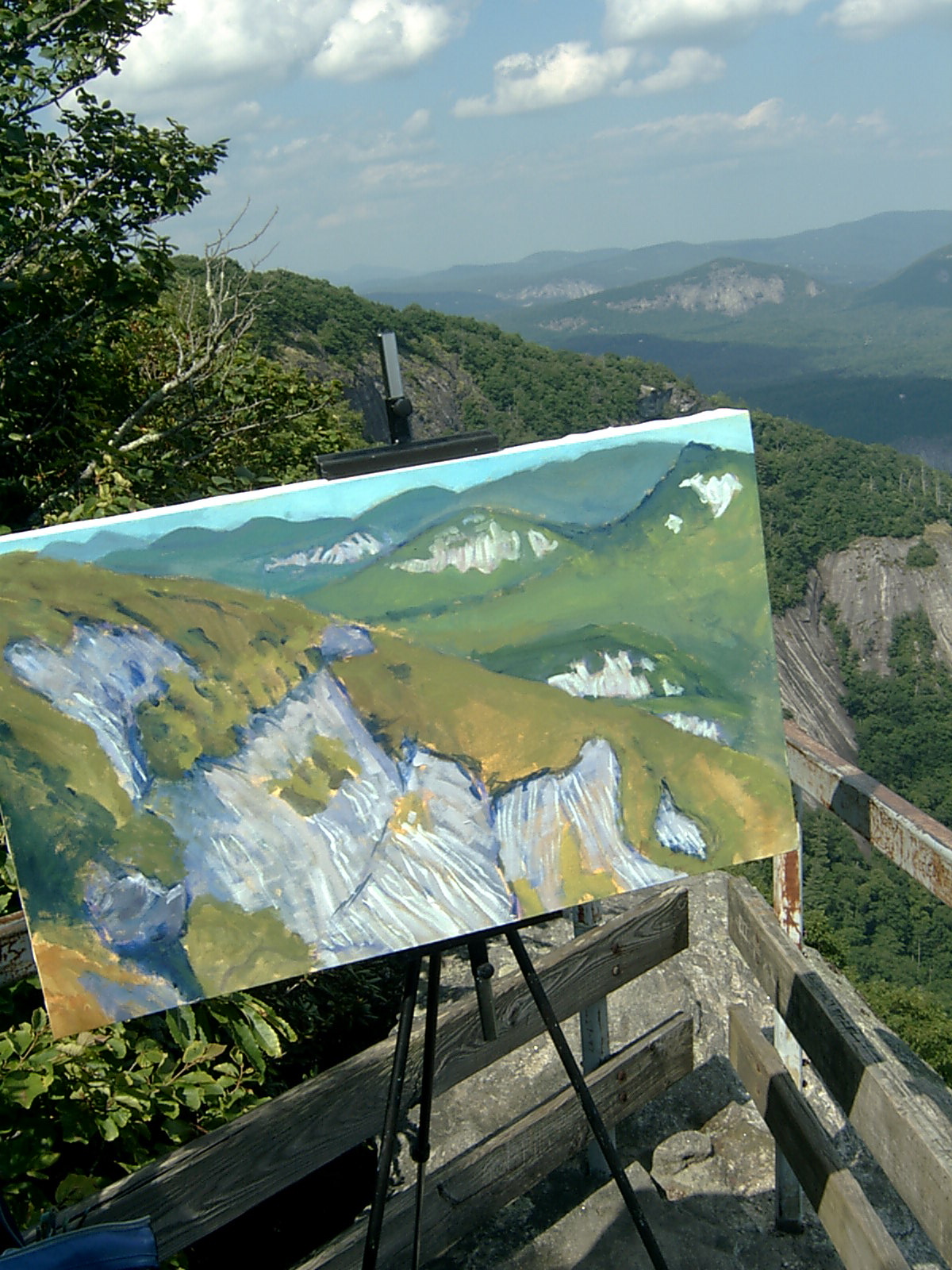
For close to 20 years, I have tried to capture a really good view from Whiteside Mountain near Cashiers. It's a great location for painting, because the perch is so uniquely situated. it's off the main trail, down between two large boulders and out over a rock face hundreds of feet in the air. 

S2400006_1.JPG

Some time ago on a little site called Cowbird I described the geology and the experience of painting at this location.  Here is the link (you have to use the navigation arrow to move right and see the text). And here is the image. I like its fresh and loose feel and the sfumato edges of the distant mountains.. But I wish it were a landscape format. It also is tilting off to the right a little too hard, made worse by the off kilter photo.

c059452f3f8e7a0fa0b1368c13425db90acacfc6c2c0bccbaf1de95e4c83499b-big.jpg

Here is the view looking out to the east.

S2400008.JPG

Here is an early stage and a final on an earlier version, now lost to the storm. These have nice soft treatments of the tree cover and interesting exposed rock faces, in the distance. But the horizon line was way too high in the scene and the nearby rock faces resembled waterfalls, as my curmudgeonly neighbor back home reminded me. 

S2400013.JPG
S2400020.JPG

More recently,  I began a scene out there and brought it home to finish. Instead of doing so, I set it aside for a considerable time and finally picked it up about a week ago. I'll skip the step by step and just say I tried to find a balance between the two prior paintings, freshness and perspective effects. Here is what I ended up with.

IMG_5464.jpg

Put In

Again to Fort Morgan and again perched on the back of our pickup truck. I looked out over Bon Secour bay from a location where kayakers and fishermen put in and saw a clear well-lit peaceful scene. I did a sparse underdrawing in gray after putting in some vertical and horizontal thirds. When I started I thought the appeal was going to be the water and sky. 

underdrawing.jpg


 I painted paler and thinner colors in the water and middle distance and had darker and more opaque color in the nearest point to shore. Most of this was done with small to medium angle brushes.  For the sky and some of the water I used rounds and brights. This shot's poor quality is because it was taken in the back of the truck bed on the ferry heading home.

flatbed.JPG

Back home the next day, I corrected the horizon and set to work on enlivening the water and sky. I was taken by the darker patches of water where the wind stirred up the surface into an interesting texture. I also wanted to have a vivid sky and so I did some loose brushwork with some unmixed colors. I did a fair amount of work on the nearest point of land, reworking it over and over. I also darkened the patch of shrubbery in the lower right but that turned out to be too much.. 

I deepened the cerulean blue in the sky and did some palette knife work to give the clouds some weight. I also spent a lot of time trying to get the foliage right on each of the strips of land. There is a risk in using the same brush to describe eve…

I deepened the cerulean blue in the sky and did some palette knife work to give the clouds some weight. I also spent a lot of time trying to get the foliage right on each of the strips of land. There is a risk in using the same brush to describe ever further away areas of the painting. The eye doesn't read these as being further away if they are the same basic width and length. I liked the water effect in this stage pretty well.  For scale, I added Christina putting in from shore, but it was immediately clear she and the boat were too small for the surroundings.

put in .jpeg

To bring this to an end, I had to replace the existing figure with Christina in the kayak coming to shore, eliminate the small sand bar on the left and the shrubbery in the lower right, and do a series of refinements on the sky, water, and greenery fringing the water.  With these changes I got to this point. 

This is another piece that was completed in the studio with less and less dependence upon a reference photograph.

final putin.JPG

Lately I have been checking the dynamics of the composition by flipping the scene horizontally. A number of times, I find myself more attracted to the flipped version. I am curious if others notice a preference like this as well. 

6C41A9C3-B735-44FE-8C3B-C7810FF2F0C6.jpeg

Bear Down

Sometimes it feels like a scene paints itself. All the work seems preordained and there aren't decisions as such. It just is a matter of putting the brushstrokes and colors where the moment tells you they belong. That is a great feeling and the work done that way has a sense of organic integrity and freshness that is unbeatable. Other times seem weighted down with many problems to solve or gaps between what I can do and what I need to do. I frequently used to paint over scenes that I could not figure out how to complete. So, anyone who has one of my pieces from my twenties possibly has two or three images, one atop another. Lately, I've tried to find a way through to the end, even if it's at the expense of the freshness of the observations at the scene. It's as valuable, maybe even more so, to work through all the puzzles and try new tools as it is to quickly knock something out. It's a matter of self-discipline to find a way to get what I need to make the piece work in some manner.

This painting took me a long time to finish, mainly because I had a hard time matching the tools to the image, but also because I didn't have a clear vision of the end state of the painting, which is pretty typical for me. I started out doing a ultramarine blue underdrawing on a cerulean blue background - 24" x 36". The original drawing got the shapes and volumes of the banks of the river pretty well.  This was painted on top of an overlook that required me to lug gear about a hundred feet up a very, very steep climb. To do the underdrawing, I had to leave behind everything except a brush, a tube of blue paint, some water, and the canvas.  On the way up I was stung by hornets, which put a dent in the old plein air mood.

(Photo: James Tucker)

(Photo: James Tucker)

If I could have preserved anything from the original it would have been something from the first pass at the river. I really liked the transition from brown to yellow ochre to pale ochre, all on top of that blue background. This set of deep blues reminds me of some of the late Cezannes that I like enormously. It would be fun to try this another time as a night scene.

blueunderpaint.jpeg

On a second visit with all the gear, I put some paint into the spaces for the trees on the mountainsides using a single brush, leaving the blue underpainting in view. Some I did in the straight green and some darkened, but the overall effect resembled piles of cabbages. I lost the thread of the drawing during this stage. I avoided the hornet's nest this time, sparing myself what would have been a brutal tumble down Paint Rock.

cabbage.jpeg

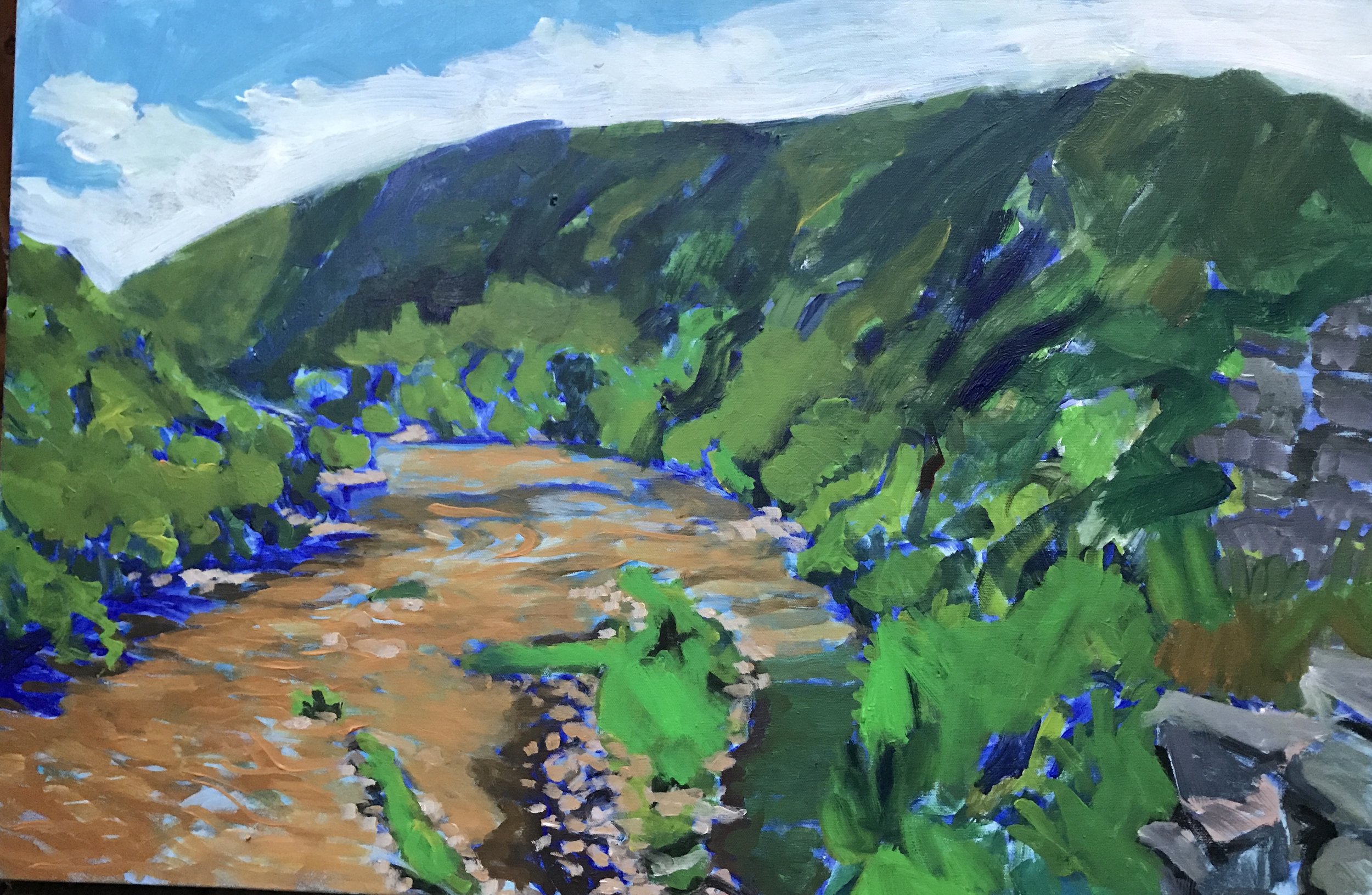
Continuing with the brush, I reworked the right side of the mountains to replace the cabbage with patches to suggest the contours of the slopes in some places and some prominent details of the foliage in others. In all this the colors were just me putting paint up there, not something derived from observation. I was trying to step into a space that is unfamiliar for me, a little in the spirit of John Marin, like the stabs and angles in the lower right corner. This was not a successful step. But a few things started here that survived into later states. First, I reworked the horizon to create a "V" where the two mountains meet. Second, the rock outcroppings in the foreground and middle distance persisted. Third, a few of the efforts succeeded in making the slope shapes. But, all this is done in the crudest manner. The one place I still liked was the water and the island in the lower center of the river.

fullsizeoutput_29e0.jpeg

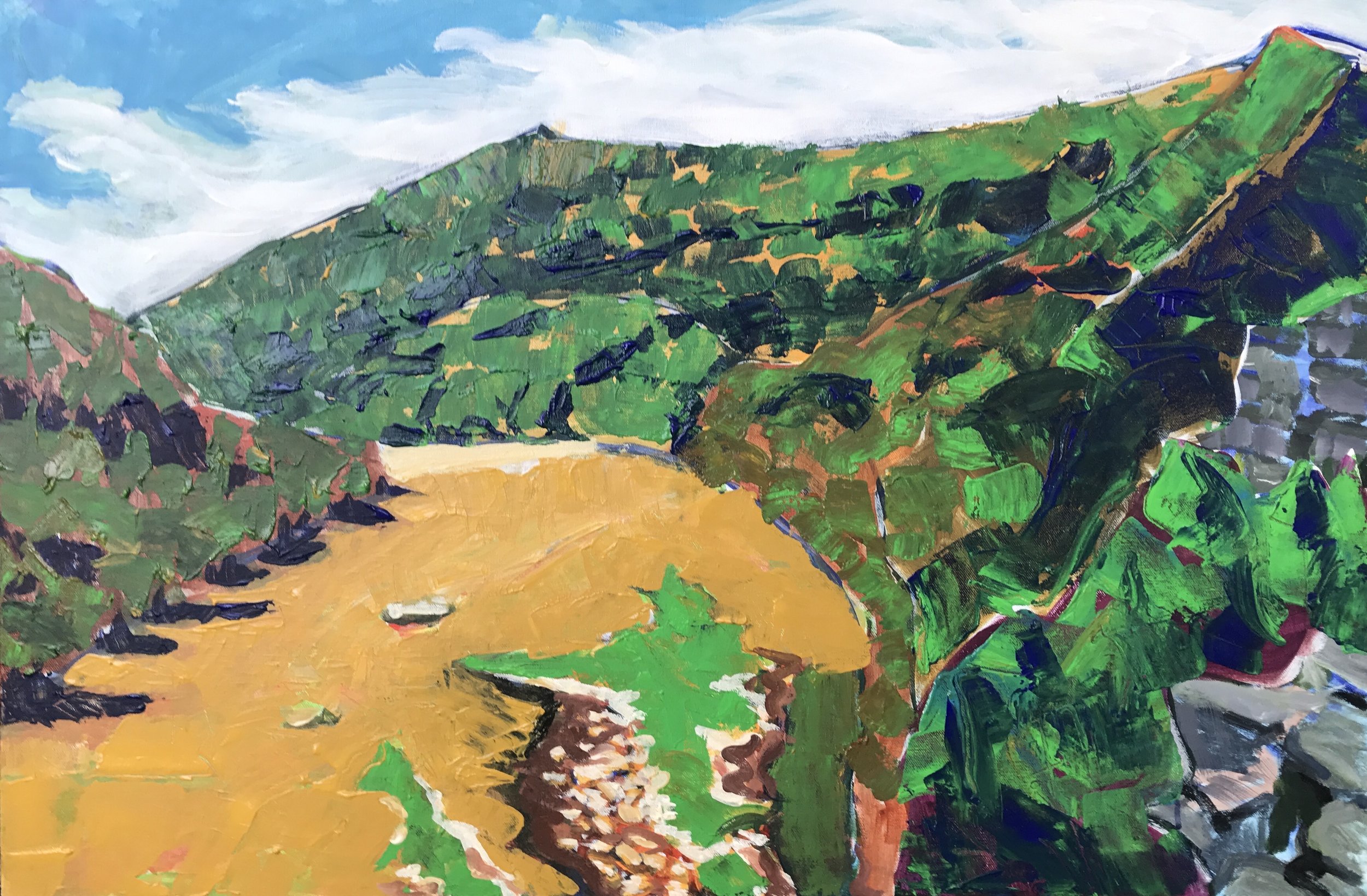
Getting stuck can make you do some absurd things. My next move was to drop almost everything   I had done to this point and try out some palette knife work with some odd choices for underpainting. Part of this goes back to how I painted one of my more successful views of Mt. Ste. Victoire. The other part may have come from a colored pencil workshop I did with a friend, where we used a random gouache color as a base for our drawing. I also wanted to try a flattened river surface- forget about trying to get the river to look like it's flowing. So, here's what that yielded. 

rework 1.jpeg
rework two.jpeg

I almost would have called this last stage a finished product, if I had had the nerve. I liked pieces of this painting a lot, and wanted to work more expressively with a palette knife again. But something left me unsatisfied. It seemed too spasmodic, too easy somehow. Kind of funny considering how much had gone on before. So I lived with this version for a while, but I wanted to get the tree in. It felt like the composition would be incomplete without it. I knew that would be nearly impossible given how chaotic the painting of the mountains behind the tree would be. So I began to imagine a way to keep some of the palette knife and interesting underpainting while getting the crazier parts to tone down enough to let me put the tree in. First I used a thinned out dark green wash to darken most of the right side of the mountain. I also went back in on the rock outcroppings and rendered them in a more traditional style, and from there it spread over the right side of the mountain, and down to the river and the islands. Later I picked up a Sharpie and began to add lines to the rocks and the river.

darker right side.jpeg

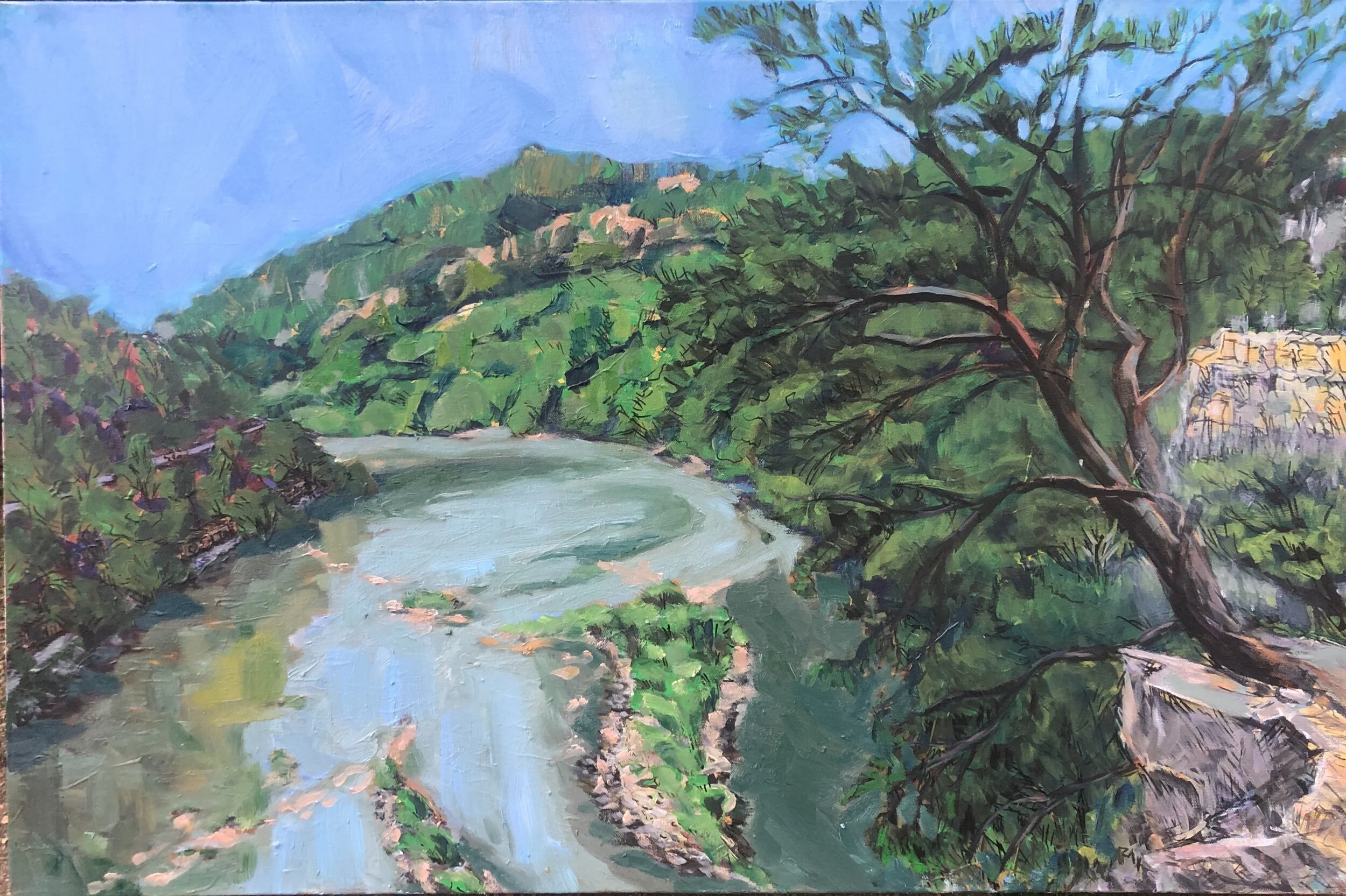
So then the character of the painting shifted increasingly to a conventional representational work. But what was curious is how many pieces of earlier stages persisted. I added more detail to the mountains, the trees, and the river. I took out the clouds and replaced them with a blue sky.  At some point I remembered there was a railroad that ran behind the trees. I caught glimpses of it as I was painting up there.  I added a railroad line and, above it, a road for traffic. I had a lot of fun working with the deep red browns, blues, and greens on the left side.  With some additional work on the water and some Sharpie details, I brought this to an end. 

paintrockfinal.jpeg

This place is called Paint Rock because there were Native American hieroglyphics found here. 

Painted Rock Boulder.jpg

Here is the view from which I worked on this painting. This is another case, similar to the Wolf River painting, where, except for the tree in the foreground,  I depended less and less upon a reference photo.

paint rock photo.jpeg

Over a year later I reworked much of this painting in oils. I never could reconcile myself to that yellow ochre water, even though that’s what it was. I couldn’t render it so that it registered as water instead of a creek bottom or arroyo. So, later, I went over it one more time with oils using a blue and green palette for the water. Then I reworked the island and some key parts of either bank of the river. And I lightened the tone of the sky. Here is how that ended up. I liked the reflection of the left bank in the water and the pink rocks. I also liked the distant rock outcropping after the right bank takes a turn. Right about there it changes from NC to TN. I also like the ridgeline better.

IMG_2049.JPG

Pruning

At the very beginning, I would take a sketch pad and a pencil or marker into some nearby woods, sit down in the brush, and draw what was right in front of my face without discrimination. I ended up with a lot of scenes of tangled bushes and grasses  as dense and chaotic as what I saw. There was no way in. Later on, I’d aim for the “perfect point of view" but there usually were flaws, things blocked, out of balance, or just unnecessary.  Getting to the point of leaving something out was a slow lesson for me. Like, years. 

Between the holidays, I went out to Delisle and did a scene of the Wolf River. It felt at first like I was regressing into old inspirations and themes- pine trees and bushes, but what I wanted was something to see between and through the pines. I started this one out with a gray under drawing and aimed to keep the colors thin and light. This is on a 24 x 30 canvas.

fullsizeoutput_296e.jpeg

As I moved ahead all the underbrush in the foreground and middle distance began to tug at me urging me to pay attention to its chaotic half shaped tumble weeds and I went along for awhile even though it obscured the opportunity to express the freedom of travel on the river. This took me to something like this. 


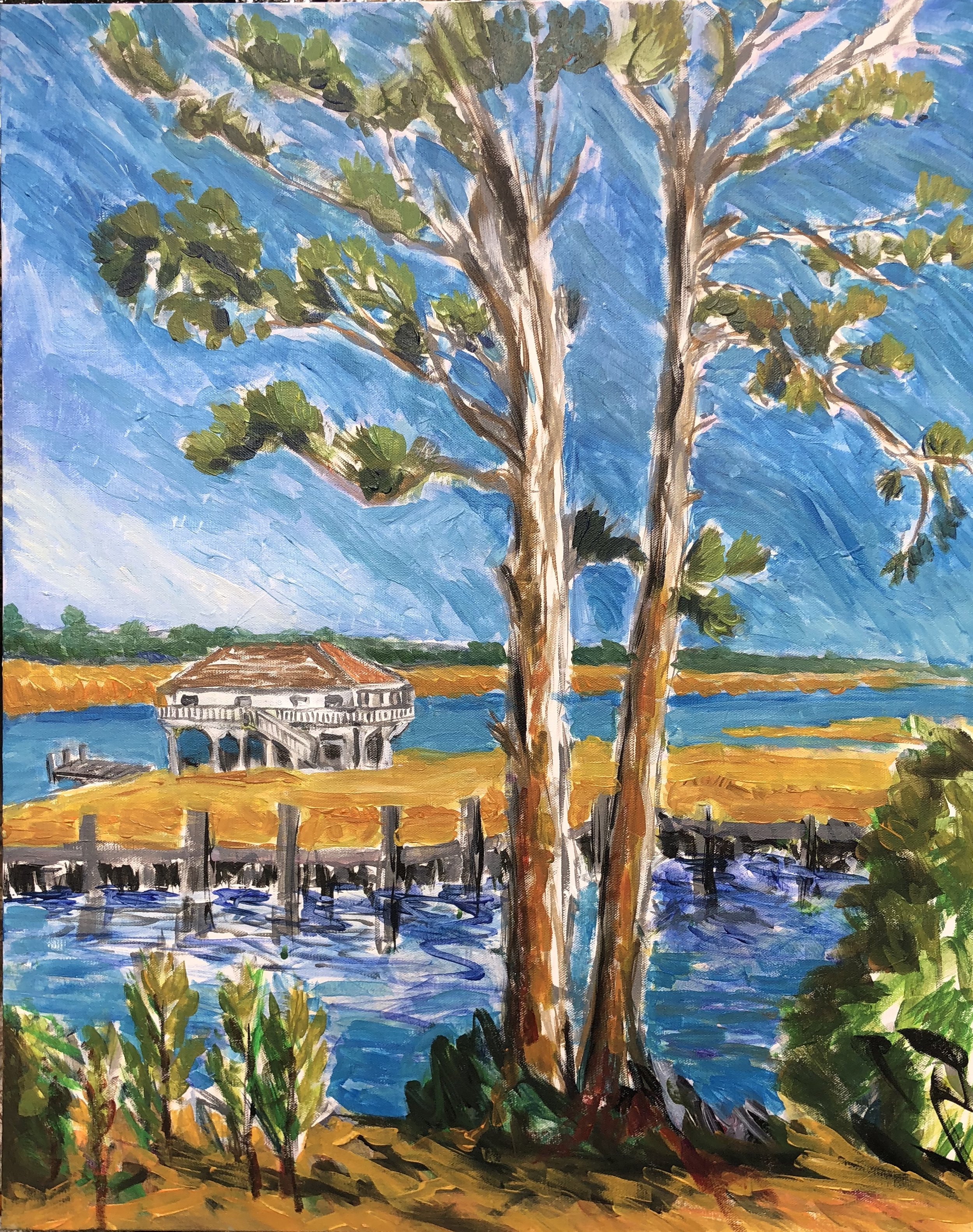
By this time, my time on scene had run out. Back home at the studio I decided to do some pruning. It began by doing the sky and cutting into the tree and leaves in places. At first I did it in a lavender sky but that didn't work and so I went from white to full on cerulean with touches here and there of ultramarine. I put it in with a very small brush that felt a little like Van Gogh at first (regression, maybe, but always plenty to learn) but it didn't have that effect when finished. It felt like the blue was more intense than the yellow green of the trees and was overpowering it, an effect I struggled with in the Bryant Grocery painting. So I darkened the fans of pine needles. The piece came together when I realized I should just clear away everything blocking the house and the horizon. I used the yellow ochre and orange to do the reeds and middle  and part of the foreground. I did some softer greens for the far tree line and added a few blue strokes in the space between the yellow and green. And then I added a sky blue for the water which worked nicely with the yellows and oranges. I painted the whole house, eliminating the two trees on the left side. I used the blue in the canal to push back on and shape some of the clutter and blockage of the underbrush.  I liked the light browns in the trunk and was hoping to hold on to some of those colors along the way. This took me to this point.

fullsizeoutput_296d.jpeg

I did most all of this without using reference photos. In the final push I added red browns into the trunks and branches, put some notches into the far marsh at the waterline, put in a small road and a figure on the pier in the middle distance and worked on the foreground bushes and saplings for awhile. I used charcoal to add some graphic accents on the pier and the tree trunks.  This got me to here, and here it will stop.

IMG_4967.jpg